Powder Room
Refine by:
Budget
Sort by:Popular Today
1 - 20 of 270 photos
Item 1 of 3
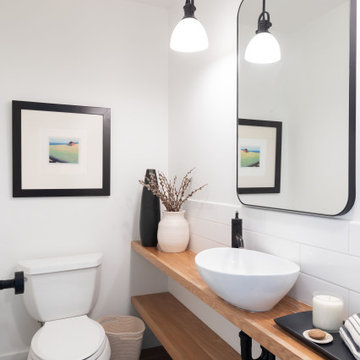
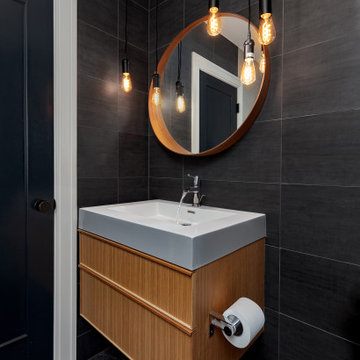
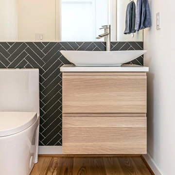
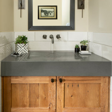
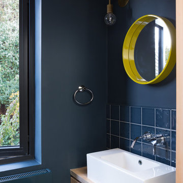
Large impact in a small powder. The dark tiles add drama and the light wood and bright whites add contrast.
Interior Design by Nina Williams Designs,
Construction by Southwind Custom Builders,
Photography by Phillip Schultz Ritterman
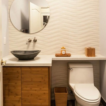
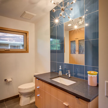
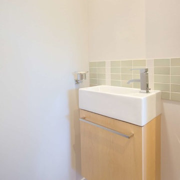
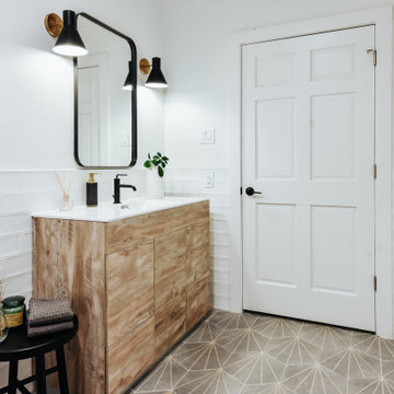
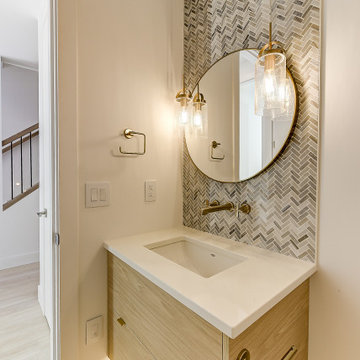
This conetmporary powder room has a ton of character. The wood vanity has a beautiful grain in it that makes it pop against the white counter and the white wave wall tile.
After the second fallout of the Delta Variant amidst the COVID-19 Pandemic in mid 2021, our team working from home, and our client in quarantine, SDA Architects conceived Japandi Home.
The initial brief for the renovation of this pool house was for its interior to have an "immediate sense of serenity" that roused the feeling of being peaceful. Influenced by loneliness and angst during quarantine, SDA Architects explored themes of escapism and empathy which led to a “Japandi” style concept design – the nexus between “Scandinavian functionality” and “Japanese rustic minimalism” to invoke feelings of “art, nature and simplicity.” This merging of styles forms the perfect amalgamation of both function and form, centred on clean lines, bright spaces and light colours.
Grounded by its emotional weight, poetic lyricism, and relaxed atmosphere; Japandi Home aesthetics focus on simplicity, natural elements, and comfort; minimalism that is both aesthetically pleasing yet highly functional.
Japandi Home places special emphasis on sustainability through use of raw furnishings and a rejection of the one-time-use culture we have embraced for numerous decades. A plethora of natural materials, muted colours, clean lines and minimal, yet-well-curated furnishings have been employed to showcase beautiful craftsmanship – quality handmade pieces over quantitative throwaway items.
A neutral colour palette compliments the soft and hard furnishings within, allowing the timeless pieces to breath and speak for themselves. These calming, tranquil and peaceful colours have been chosen so when accent colours are incorporated, they are done so in a meaningful yet subtle way. Japandi home isn’t sparse – it’s intentional.
The integrated storage throughout – from the kitchen, to dining buffet, linen cupboard, window seat, entertainment unit, bed ensemble and walk-in wardrobe are key to reducing clutter and maintaining the zen-like sense of calm created by these clean lines and open spaces.
The Scandinavian concept of “hygge” refers to the idea that ones home is your cosy sanctuary. Similarly, this ideology has been fused with the Japanese notion of “wabi-sabi”; the idea that there is beauty in imperfection. Hence, the marriage of these design styles is both founded on minimalism and comfort; easy-going yet sophisticated. Conversely, whilst Japanese styles can be considered “sleek” and Scandinavian, “rustic”, the richness of the Japanese neutral colour palette aids in preventing the stark, crisp palette of Scandinavian styles from feeling cold and clinical.
Japandi Home’s introspective essence can ultimately be considered quite timely for the pandemic and was the quintessential lockdown project our team needed.
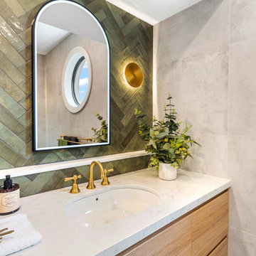
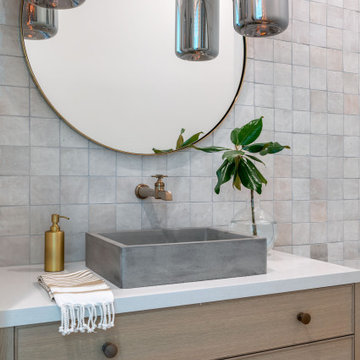
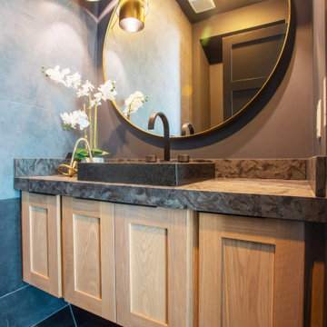
Installing under counter sinks into a quartz bench top is easy to clean. Constructing a nib wall behind the vanity provides a break-in the otherwise flat wall. Dimensional layering provides added interest to the vanity area.
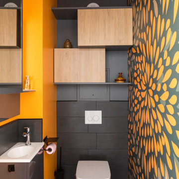
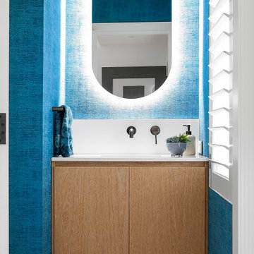
L'espace le plus fun et le plus étonnant. Un papier peint panoramique "feux d'artifice" a donné le ton pour un mélange de noir, orange et chêne.
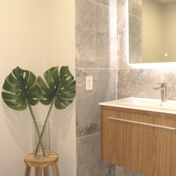
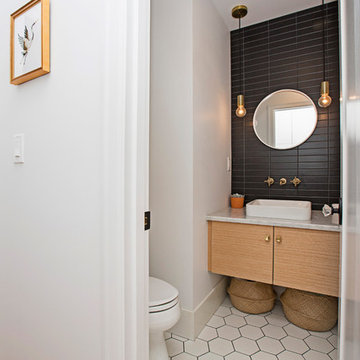
Organic textures bring a sense of warmth against the industrial concrete tile while the floating vanity and mirror bring lightness into the powder room.
Dans cet appartement familial de 150 m², l’objectif était de rénover l’ensemble des pièces pour les rendre fonctionnelles et chaleureuses, en associant des matériaux naturels à une palette de couleurs harmonieuses.
Dans la cuisine et le salon, nous avons misé sur du bois clair naturel marié avec des tons pastel et des meubles tendance. De nombreux rangements sur mesure ont été réalisés dans les couloirs pour optimiser tous les espaces disponibles. Le papier peint à motifs fait écho aux lignes arrondies de la porte verrière réalisée sur mesure.
Dans les chambres, on retrouve des couleurs chaudes qui renforcent l’esprit vacances de l’appartement. Les salles de bain et la buanderie sont également dans des tons de vert naturel associés à du bois brut. La robinetterie noire, toute en contraste, apporte une touche de modernité. Un appartement où il fait bon vivre !
1