

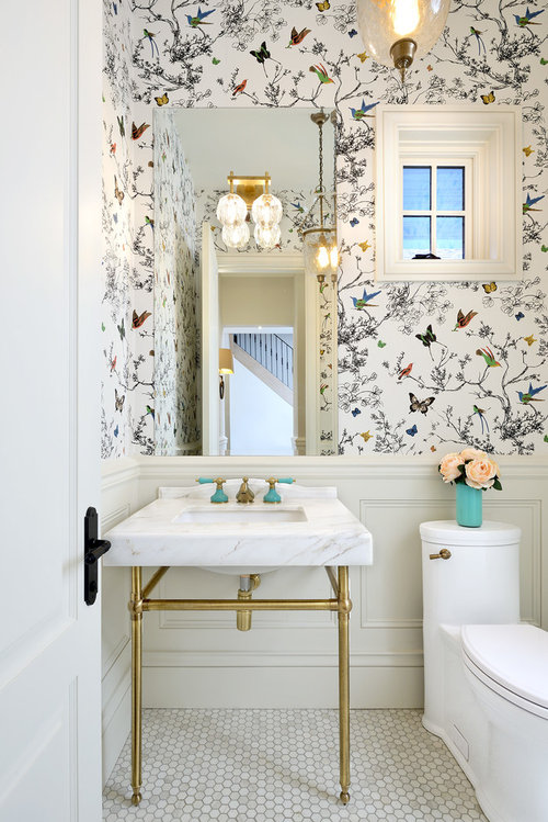
Wall paper source?
8 years ago
Featured Answer
Sort by:Oldest
Comments (6)
 8 years ago
 8 years ago
Related Discussions
Complementary colour for the gold(ish) walls in my living room?
Comments (11)Hi---since you want to keep it bright and rich, I suggest Muted aqua/turquoise blue. Pics for inspiration-second pic the furniture and drapery hues would look great with the gold. Good Luck! Love the BOLD Yellow... :) [houzz=][houzz=][houzz=]...See More1940's NZ kitchen - small, awkward-ish layout.
Comments (121)I would suggest you take out the cabinet that is to the right of the stove and use it elsewhere in the house -- perhaps in the bathroom or dining room with a hutch above it. Then, I would suggest you have someone install a lazy susan cabinet in the corner between the sink counter and the stove, meaning you would move the stove down a bit and have a small cabinet/counter top to the right of the stove. I would suggest you have the cabinets refinished in white and then paint the walls a pastel you like. If you would prefer white walls, then add white-painted crown molding and paint the ceiling a light neutral blue, such as Sherwin Williams Niagara Falls Blue. Then, I would suggest you choose a favorite accent color and use this sparingly in accessories like towels, pot holders, small vases or floral arrangements, and a valence above the triple windows. For a genuine 1940s look, you might have white ceramic square tiles with a rectangular red border installed as a back splash behind and above the stove. If you are replacing counter tops, I would suggest a light color such as white with a beige or light grey vein or striation for some sort of pattern. You might be able to find the same color and design in floor tile OR opt for a wood floor as another poster suggested....See MoreIdeas needed to finish the living room?
Comments (8)Mona you have seen exactly the dilemmas I'm facing with this room so I really appreciate your comments. I was focusing on no1, but really 2 and 3 are on my mind too. In terms of getting some continuity between the rooms I was planning on recovering the dining chairs in a fabric to tone with cushions/throws on the white couch, ottomans in a matching tone, and pulling this colour scheme through into cushions in the formal lounge. I love the spring colours at the moment (greens, blues etc) which you can see i'm playing with at the moment but you might be able to see the painting in the formal room which is orange, red and yellow with a blue/purple base. So I'm very keen on colour and so tired of the brown carpet and neutral walls. I was also going to restain the dining table and chairs to a dark mahogany colour, and change the bar stools to something more modern. re: rug closer to sofa, I've done this and it looks off-balance with nothing else in the space. It seems to work better in the middle of the carpet area at the moment. Perhaps thats because I haven't ordered the ottomans yet. I don't want to add a coffee table to this room as prefer Ottoman to put feet up on. I've attached a pic of a rug, do you think something like this would work better? re the wall: yes this is the major for me at the moment. It is a TV room so tv and speakers stay and I wont be adding any custom cabinetry. The idea was to increase the space in this room by removing all of the cabinets and they are now in the adjoining room. The speaker covers have not been painted as I needed to work out what wall covering to apply, and colour etc. so once they are painted the wall colour they will blend in better. The idea of shelving has merit, I'll have to have a think more about that... Any other thoughts you have are appreciated....See MoreRemoving wallpaper that's been painted over.
Comments (1)I'm sure there's a lot of information out there thanks to a quick Google....See More- 8 years ago
- 6 years ago
 PRO6 years ago

N JohnsonOriginal Author