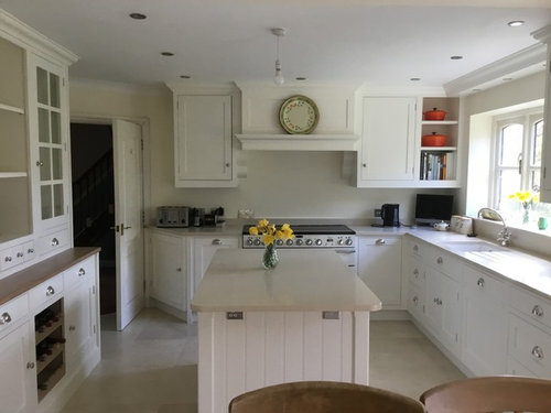
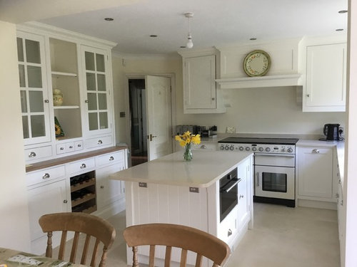
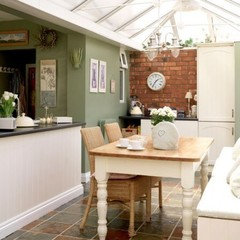
Splashback and wallcolour advice for a Wimborne White kitchen please
We have just had a hand painted kitchen installed painted in F and B Wimborne white with a light beige Bottocino worktop from Classic Quartz and light ivory limestone floor. Am struggling now on 2 counts - what colour to paint the walls and what to use as a splashback behind the cooker. We originally painted the walls in Paint and Paper library Ivory 1 as wanted a creamy ivory but not sure they look right now and our designer wants us to paint them Joas white which I don’t want to do as don’t want to go any more brown. Any other suggestions? Dont want to go grey as kitchen is quite dark which is why we’ve gone light units but not sure what else goes or could just keep the current colour.
Also any splashback suggestions please - was thinking the Ca’ Pietra mirrored Roccoco tile in mercury or Winchester Tiles Pendragon tiles in soft green but not sure if need some more colour in the kitchen. Any help gratefully received please Thank you very much
Comments (17)

A J
5 years agoWe had units similar to yours in our previous house- also painted in Wimborne white. We chose farrow and balls ‘borrowed light’ for the walls. It looked beautiful. I think it would look really nice in your kitchen x
Cas B thanked A J
Cas B
Original Author5 years agoThank you for the advice - have looked at borrowed light but not sure if the blue goes with the worktop which is quite beige - browny but will have a think about it - thank you - what splashback did you have ?

E D
5 years agoLovely kitchen!
I do agree with colourhappy, try out a darker colour as well. It may well add some interest.

torcrest
5 years agoIf you fancy something unique, art on tiles can hand paint you anything you like. ( https://artontiles.co.uk ), here’s what they did for me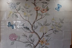
 PRO
PROHome Interior Design
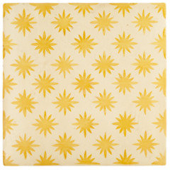
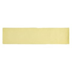
5 years agoHi Carolyn, What a beautiful kitchen, you must be very pleased. I was thinking a good colour for the splash back could be yellow. Have a look at this tile designed by Neisha Crosland for Fired Earth, I would then choose your paint colour around the tile that you like. There is also a nice option of a brick cut tile from Mandarin Stone.. I would be happy to put together some options for you. Please feel free to message me on my Houzz page. Best of luck.
 PRO
PROCroydon Window Company Ltd
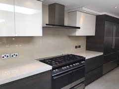
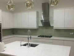
5 years agoHave you thought of glass splash backs? Here are some of our installations...
 PRO
PROSUN STUDIO.London - Glassworks and Prints
5 years agoHi Carolyn,
Tomorrow our interior designer will be in the office, call us at 20 3870 4399 and introduce him into your idea, I am sure he will propose you some amazing solution.
Just make sure to call tomorrow as our interior designer visits us occasionally on Wednesdays and Fridays.
Just ask for Avengy, he should be here since 10am.
 PRO
PROBespoke Frameless Glass ltd
5 years agoHi Carolyn,
I understand your dilemma, have you considered an antique mirror? the traditional look of it would fit the style of your kitchen and it would reflect light giving the illusion of a brighter space? We fit one recently that really suits the kitchen.
Hope this helps! Many thanks BFG
christineacy
5 years agoHello, I have just finished DIY-ing my small white kitchen, but your lovely kitchen is large enough for you to play with colour. But also can be costly if you do not like what you have chosen. There is so much out there, it can be taunting. Take your time as there is no hurry (unless you have self imposed one) as the kitchen seasons change and you must have this and that NOW! Looking at your pictures you seem to like yellow, orange and there seems to be some greens (Ornaments, pots and plates) plus some woods. Start with those colours to compliment and pull it all together. What are your favourite colours, flowers? Or a favourite piece of fabric, pattern, design style or era ? Start with things you like then eliminate. If you are not sure as depending on your kitchen orientation the colours will change with the light, also due to shelving, cupboards a lot of shadows will darken the colour. I could experiment with some colour pots or and get some made up of a colour you like or take the ornament to a DIY store. They can make up the colour for a couple of pounds. Paint some paper A4 or bigger with whatever colour you think will work. If you think glass splashbacks put a piece of glass over it (an picture frame glass will do, if you do not have one they are pennies at a charity shop and you can donate it back), hang them at different places in the kitchen at different times of the day with lights on and off. If tiles, get samples. Do the same thing. If you cannot return the tile samples use as place mats or to protect your kitchen surface. If there is a wall paper that you think will give your kitchen a kick. You can use it and then seal it by putting clear acrylic or glass over it, if going for clear glass check if it has a green hue or pure clear, a green hue will change the colour underneath it. And the inside of your shelves can be a colour or pattern too. If you have children or grandchildren, you can now with laser technology get templates and photos of them and or their art work on paper an seal it. I hope this helps to do what you want and not influenced by "designer fashion". Have fun!

Sonia
5 years agoStunning kitchen. Just my kinda thing! I think your walls could take a bolder shade. How about something like Overtly Olive by Dulux? Similar shade to the plate on your cooker hood. I would then keep the splash back quite calm and neutral so it doesn’t clash.
 PRO
PROAll 4 Property
5 years agoHi Carolyn! Your kitchen looks great! I like the colour you have chosen for the units. Your two dilemmas are everyone's dilemmas when redoing a kitchen. For the wall colour, I can suggest F&B James White. It's an off white but with a green underlying tone. This would be a more subtle colour shade to introduce then a plain duck egg, for example. We have used it in a sitting room and it looked amazing. Colour changs depending on the light outside.
For the splashback I would recommend going for tiles. You have some traditional looking cabinets, and from what I can see the dining table and chairs are as well. Glass or mirror are too sharp and will look contrasting in this setting. White tiles will look great, I like your Winchester Tiles option, but in white. Not sure if you should try darker grout, in trend now, as that might be too much. You can then play with accent colour with the kitchen accessories. These will be much cheaper and easier to change when you'll want to refresh you kitchen again. I hope it help.
minipie
5 years agoWe have our kitchen walls painted Wimborne White and our cabinets are painted in Paint & Paper Library Slate II which is a pale warm neutral - I think they go well together.
I do agree the room could take a bolder colour on the walls if you want, something warm such as the olive green mentioned above. The winchester tiles look right for this kitchen, I can't see Pendragon but they seem the right style.
Cas B
Original Author5 years agoThank you to everyone who has commented and tried to help me - I will think about all your contributions over the coming days as don’t want to rush a decision and make a mistake after all the effort of getting to where we are. Your help is much appreciated
 PRO
PROCelery. Visualization, Rendering images
5 years agoYour kitchen looks lovely with colours now. I would go with simple metro tile, white or ivory as your island top.
HU-561780563
last yearHi Cas B! What color did you end up going with on your kitchen walls, and have you been happy with it in the years since? All best!

angelavdavis
last yearLook at an app like the Dulux visualiser to help you choose different wall colours. I find it a great help to give a rough idea what shades are likely to work.


Juliet Docherty