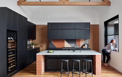
11 Ways to Work Deep, Dark Green into the Kitchen
See how to use this elegant, earthy colour in your kitchen, creating a space that's as fresh as the meals you make in it

Dark or sludgy green is expected to be big in 2017 (even though Pantone’s Colour of the Year is the vibrant acid ‘Greenery‘). Here on Houzz, it’s a colour we’re especially seeing in your kitchens. Here are 11 ways Houzzers have gone for seaweed, moss or juniper shades in their cooking spaces. If this colour appeals to you, consider one of these approaches for your kitchen.
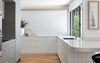
2. Tie in the floor
Patterned floor tiles indoors remain hugely popular, and these geometric ones are a nice twist on the more traditional encaustic tile designs that have led the way. They’re perfect for a fresh, modern kitchen like this.
For a more contemporary look, opt for details such as flat-fronted, handleless cabinets and a slightly less historic shade of green, as shown here. Instead of having a vibrant floor, you also could try hanging a large, framed abstract print or advertising poster in complementary colours to create a similar effect.
Seeing green: the latest colour trend
3. Highlight the history
The historic look is another kitchen trend emerging on Houzz, and inky green is the perfect shade if you want to hark back to simpler times. Black and navy are two other popular options, but there’s something about British racing green that instantly conjures up the past.
Pair it with marble benchtops or splashbacks to enhance that built-to-last feel, and choose your lighting with care. Vintage originals or thoughtful reproductions with a gentle industrial edge will top off the downstairs-at-Downton-Abbey effect.
4. Boost your room design with art
A touch more marble, some antique oil paintings, a bit more brass. This kitchen is an excellent example of historic styling. Art can enhance a kitchen and can cement references to any era you might be tapping into – whether Colonial, mid-century modern or anything in between.
A touch more marble, some antique oil paintings, a bit more brass. This kitchen is an excellent example of historic styling. Art can enhance a kitchen and can cement references to any era you might be tapping into – whether Colonial, mid-century modern or anything in between.
5. Flirt with grey
Picking a shade that borders on deep grey is another way to use green in a modern space, as grey has such contemporary connotations.
There’s a convention in kitchen design when using two colours of cabinet that the lower units are dark, while the upper ones are the paler shade. Although there are no real wall units here, the painted wall fulfills the same function. And this reversal of the unspoken rule works because the kitchen is large and airy, with a high ceiling. In a small room, you may find that having a dark top section and a pale lower section gives you the feeling that the walls are falling in on you, so research carefully before committing to a colour scheme.
6. Go for all over
Intensify your chosen green by painting all your woodwork in it too. Here, there are no door frames or cabinet doors in white or cream to break up the star colour. This effect steers the kitchen into homey, rather than smart-classic territory, and it works wonderfully.
If you’re giving a 19th-century look a nod, as this kitchen does, the ideal lighting is a little industrial. Victorian kitchens like this one were busy, functional spaces, not the rooms we now socialise and eat in. Searching online for factory-style lighting is a good place to start.
7. Stick to a strip
Perhaps you already have your kitchen in place and fancy just a refresh? Or maybe you’re not up for committing to green as your cabinet colour? You can still let this mossy shade shine in your cooking space, and a green-tiled splashback is one way to do it.
If you have wood accessories or features in a pale stain, consider sprucing them up with a new stain (always try out stains and coloured wood oils on an out-of-sight patch first, regardless of the shade pictured on the label). The very dark brown seen here on the floor, shelf and support works because it’s a comparable saturation to the shade of green in the tiles.
See more tiled kitchen splashbacks
8. Play with a trio
Mix up a selection of greens to create depth in your design. Here, forest-green tiles mingle happily with a sage dining set and a pale pistachio wall.
To find compatible shades, try picking three from a paint colour card. Try them out on sheets of paper, and tape them on different walls and surfaces around your kitchen to see how each looks in the light and how well they work together.
9. Wow with a feature wall
Look around your kitchen space to see if you have a full-height wall you could paint seaweed green.
Here, the homeowners have an empty wall adjacent to their dining table. If you don’t, you could choose one floor-to-ceiling cabinet to turn green, and tie it into your design with a narrow splashback in the same shade. You could use tiles for your splashback if you can find ones in exactly the same green, or paint the backs of cut-to-size tempered glass to match.
10. Nail the new Nordic look
If you love the clean lines of Scandinavian design but are ready for a variation on monochrome, then dark green is for you. This pale wood, white and inky-green kitchen is a bit like a Norwegian pine forest on a snowy day (with a little imagination).
Don’t be afraid to mix up your eras and design references, but do it with conviction. Taking style cues only from this historic-look island on legs, with its panelled Shaker-esque doors, and putting an industrial-style pendant in here would throw the rest of this pared-back contemporary space off course.
The trick is to look for another theme to follow: clean, boxy lines for example. Focus on this secondary style and you’ll more easily build a coherent space. Here, the historic style is updated by the concrete-look benchtop and contemporary lighting above.
The new Nordic: Scandi style embraces colour
11. Deviate from white in a small space
This kitchen trounces the so-called rule that small spaces should be pale in colour. This luscious olive-sludge green features on every cabinet right up to the ceiling on three walls, and it doesn’t overwhelm the space at all.
However, there’s a little trick at play. The cabinets ahead and on the left are glass-fronted, with a pale shade inside and interior lighting. This little touch creates depth where solid green could have felt a touch top-heavy. The crisp white ceiling and pale marble ‘sandwich filling’ also play a key part in providing visual harmony.
TELL US
Does your kitchen feature green? If not, would you like it to? Tell us in the Comments below.
MORE
Be inspired by more green kitchens
Green is a happy partner with earthy tones, which bring out its warmer side. Here, a variety of shades complement the striking bottom-of-the-pond green of the central cabinet: strong orange and soft terracotta in the leather handles and earthenware pot; barely-there beige in the pale wood walls, floor and benchtop; ochre bottles on the shelf.
If you take no other tips from this kitchen, be inspired by the power of small accessories in helping to build a colour scheme.