Popular Houzz Series
Popular Houzz Series
Appears in
See also
Fun HouzzFrom The ProsHouzz Around The WorldProject Of The WeekStickybeak Of The WeekQuizzesCreatives At HomeAt Home With...Best Of The WeekRoom Of The WeekDesigner Profiles3 Things I Wish My Clients KnewHow Do I...Buyer's GuidesExpert EyeInnovation AlertSo Your Style Is...Spotted!Picture PerfectBefore & AfterBudget BreakdownHome TimeMade Local
Room Of The Week
Before & After
Before & After: A Sophisticated & Soulful Kitchen Renovation
A timeless monochromatic palette, beautiful detailing and a new layout took this kitchen from dated to delightful

In a Q&A format, we talk to the designers – and examine the creative thinking – behind some of Houzz’s most loveable rooms.
The kitchen before works.
What was the kitchen like originally?
Situated in high-rise 1990s apartment block, the kitchen/dining layout was dated and felt quite jarring, with a small L-shaped kitchen and a separate dining space beside it. The kitchen was only big enough for one person to use at a time and there was hardly any storage.
Is this the year you redo your kitchen? Find a kitchen designer near you on Houzz
Apartment floor plan before works.
What did you identify as the main issues?
Structurally, our focus was on opening up and connecting the kitchen/dining/living spaces and levelling out the uneven floor levels and ceiling junctions. These changes to the kitchen were a big part of the overall apartment renovation, but the results were worth it.
What look and feel did the client want?
They wanted better flow throughout their home, a bigger kitchen with more storage, and to give the kitchen some scale in comparison with the rest of the apartment.
Apartment floor plan after works.
What was your brief?
The client wanted to make the most of their incredible views from the kitchen and to give the space a fresh, modern and sophisticated look.
They never used the dining and sitting areas and found it difficult to entertain friends and family – things they wanted to rectify with the renovation too.
The kitchen before works.
Which existing features did you need to work around?
A fixed window, sliding doors to a balcony, and structural walls and services pertaining to the whole building.
What was your starting point for the new kitchen?
Optimising the view from the kitchen and connecting the cooking area to the adjoining dining and living spaces.
What was your thinking behind the new layout?
I looked at relocating the kitchen by flipping it with the living area. While we all loved this concept, the drawcard of leaving the kitchen where it was, opening up the space and pinching some of the wardrobe space from the main bedroom behind it to create a butler’s pantry was too good to bypass.
How important were the finer details to the overall look?
Beautiful hardware is everything in a sophisticated kitchen such as this one. We chose Hepburn Hardware’s Surrey handle in Acid Washed Brass. The handle profile and the aged nature of the brass complement the linear look of the slim Shaker-profile joinery and the fluted glass.
What exactly did you do?
- Gutted the old kitchen and replaced it with a sophisticated new kitchen.
- Opened up the kitchen and dining areas to connect them with the living area and take in the views.
- Evened out the floor levels and ceiling junctions between the kitchen/dining/living areas.
- Removed the bulkheads and cornices in the kitchen to create a more open, fuss-free look.
- Created a sense of symmetry around the new kitchen island to add to the sense of calm.
- Borrowed some space from the main bedroom to create a new butler’s pantry.
- Installed new engineered oak flooring throughout the apartment for a sense of cohesion.
Key design aspects
Colour palette:
Colour palette:
- White walls and wall joinery in Dulux Lexicon Quarter two-pack polyurethane.
- Black-stained oak with a clear polyurethane finish on the kitchen island.
- Black-stained oak.
- Stone.
- Brass.
- Super White Dolomite for the island benchtop.
- Smartstone Nieve White engineered stone for the rear and butler’s pantry benchtops.
- Hepburn Hardware Surrey handles in Acid Washed Brass.
- Tiles of Ezra zellige mosaic tiles in Snow on the splashback.
- Chevron engineered oak floors in Delft from Plank Floors.
- Turner Hastings Cuisine sink in black.
- Brodware Manhattan kitchen mixer in Brushed Nordic Brass.
- Lights Lights Lights Arch pendant.
- Dunlin Minster 1 wall lights.
Tell us about the black sink
The black finish of the sink connects with the black-stained oak of the island and helps visually ‘ground’ the kitchen island. A black sink is practical too; it hides mess better than a bright white sink, which can be helpful when the client entertains.
Your turn
What is your favourite feature in this kitchen redesign? Tell us in the Comments, like this story, save the images and join the renovation conversation.
More
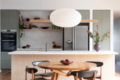
If you like this transformation, you won’t want to miss this Before & After: From “Awkward Angles” to Open-Plan Paradise
The black finish of the sink connects with the black-stained oak of the island and helps visually ‘ground’ the kitchen island. A black sink is practical too; it hides mess better than a bright white sink, which can be helpful when the client entertains.
Your turn
What is your favourite feature in this kitchen redesign? Tell us in the Comments, like this story, save the images and join the renovation conversation.
More
If you like this transformation, you won’t want to miss this Before & After: From “Awkward Angles” to Open-Plan Paradise
Who lives here: A couple
Location: Milsons Point, NSW
Room purpose and size: An open-plan kitchen/dining/living area. The kitchen measures around 20 square metres
Interior designer: Alanna Smit at Alanna Smit Structural Interiors
Builder: Bluestone Homes
Joiner: Northern Kitchens and Joinery