Houzz Tours

Houzz Tour: Humble Worker's Cottage Gets a Fun and Functional Revamp
As playful as it is purposeful, this charming renovation made a tiny home far more liveable for a teacher and her scuba-diving-mad partner

Houzz at a Glance
Who lives there: Lawyer Ben Hall and schoolteacher Pippa Cocks
Location: Albert Park, Melbourne, Victoria
Size: 110 square metres (77 square metres pre-renovation) on a 116-square-metre site
Budget: $400,000
While Pippa and Ben lived and worked in London for three years, their tiny, unrenovated worker’s cottage lay waiting patiently for their return. The single-storey existing abode managed to squish in two bedrooms, a living room, and tiny kitchen and bathroom, but the couple craved more space so they called on Nest Architects to help them come up with a plan of action. They wanted the two bedrooms and bathroom moved upstairs, and the downstairs rejigged to include a study and utility room, along with a light-filled kitchen and living room. With such a small space with which to work, not to mention strict building regulations, architects Imogen Pullar and Emilio Fuscaldo had their work cut out for them.
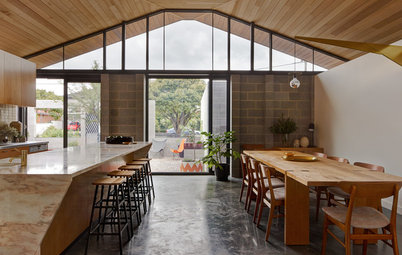
Fuscaldo acknowledges that having the kitchen facing the street is a little unconventional, but says this way the owners can watch the street while they cook. “It took the pressure off their tiny 30-square-metre backyard,” Fuscaldo says. “Having communication with the street is a really lovely part of living in a pretty dense area; it’s a nice community spirited thing to do.”
From the inside, plantation shutters on French doors allow Pippa and Ben to control how open the kitchen is to the street. The doors were installed in place of a window.
From the inside, plantation shutters on French doors allow Pippa and Ben to control how open the kitchen is to the street. The doors were installed in place of a window.
Open shelving and joinery is a signature feature of Nest Architects’ work. “People have stuff – they like to show it off and we see decoration as a really valuable part of the home,” Fuscaldo says.
Rather than slick shelving and cabinetry where only the most stylish accessories are worthy of display, the architects opted for open storage solutions that welcome a homeowner’s many and varied knick-knacks, objects and decorative elements.
“We don’t want to compete with their lives; what we create is just meant to be a backdrop to their life – it’s their house, not ours.”
This cabinet has a sliding panel that can reveal and hide different contents as wanted, and juts out to create an entry hall behind it for people coming in the front door.
Pippa and Ben like that the kitchen is separate from the rest of the house. It’s a design move that bucks the trend of open-plan kitchen/living/dining areas.
“I like that about the house, too,” Fuscaldo says. Not only does a separate room give you more corners and wall space with which to work (for displaying artwork, for example), Fuscaldo points out that it also splits the small house into zones so Pippa or Ben can get away for some time to themselves if they want to.
Freestanding oven and rangehood: Ilve
The open shelving is Victorian Ash finished with clear oil. Stainless steel was the material of choice for the benchtop – the homeowners like the look and feel of stainless steel, and it was a functional and cost-effective option. The custom cabinetry is flat laminate, chosen for its cost and durability. “It suits the humble tone of the house,” adds Fuscaldo.
The custom-designed sink sits seamlessly in the benchtop and the table gives the kitchen a country feel. Fuscaldo had suggested the kitchen have an island bench instead (as you can see on the floor plan at the end of this story) but the homeowners were keen to use their table and chairs in the kitchen – a move that Fuscaldo says has worked out well.
Between the kitchen and the living room is a big wet room/laundry. “Ben is a mad keen scuba diver so this room was designed so that he can clean off all his wet and sandy equipment and hang up his wetsuit after a session in the bay,” Fuscaldo says.
Eva ceramic sink: Seima; Posh Solus mixer: Reece
Eva ceramic sink: Seima; Posh Solus mixer: Reece
Visual trickery used in the living room manages to make it feel much larger than it actually is. Fixing white timber battens to the ceiling and painting the ceiling behind the battens black is one such tactic. “This way people can’t get a sense of how tall the ceiling is as the battens trick the eye – if you can see through something it looks further away,” Fuscaldo says. A skylight running along the edge of the room fills the space with natural light, as do the new bi-fold doors opening to the back yard.
‘Capella’ Teak Sofa: Angelucci 20th Century; green vintage Hans Wegner sofa: twenty21
‘Capella’ Teak Sofa: Angelucci 20th Century; green vintage Hans Wegner sofa: twenty21
The suspended TV shelving is a trick often used in small bathrooms to give the illusion of more space, and the furnishings were chosen in line with keeping the space feeling light and open – Mid-century Modern furnishings fit the bill.
“A lot of the details that lend themselves to the style came through because of the house itself – it couldn’t be hard and heavy and it didn’t want to be slick because it wasn’t that kind of existing house.”
“A lot of the details that lend themselves to the style came through because of the house itself – it couldn’t be hard and heavy and it didn’t want to be slick because it wasn’t that kind of existing house.”
The white battens open over the dining and living areas to delineate them into separate zones and make room for light fittings. The bull poster is an original that Pippa and Ben bought in Paris during their travels. It is advertising an exhibition at the Musee de la Publicite.
Dining Table One: Luke Furniture; Hal Chairs: Space Furniture
Dining Table One: Luke Furniture; Hal Chairs: Space Furniture
More open shelving allows Pippa and Ben to display their wares. “We don’t close many things behind closed doors,” Fuscaldo says. “It’s an opportunity to put their lives on display and bring a lot of colour and texture to the space.”
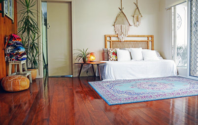
The polished pine floorboards have been left in place downstairs, while the upstairs addition is carpeted.
The polished pine floorboards have been left in place downstairs, while the upstairs addition is carpeted.
A home office is cleverly tucked under the stairs leading to the first floor and is one of Fuscaldo’s favourite parts of he house. “I really like the study and how it’s integrated into the house; instead of just another room, we thought we had the width, so why not put it in a more public space – under the stairs seemed appropriate,” he says. “You step onto the desk as you go up.”
Fuscaldo likes the idea of a centrally located desk in most homes. “The idea is that when you’re working from home or studying you want to be part of the rest of the house and to observe what’s going on.”
Fuscaldo likes the idea of a centrally located desk in most homes. “The idea is that when you’re working from home or studying you want to be part of the rest of the house and to observe what’s going on.”
Like the front of the house, two doors open up the living room to the outside and let the light shine in.
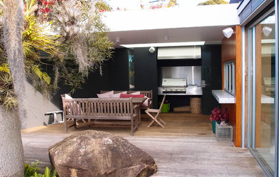
The tiny backyard manages to squeeze in a garden shed and a seating area for conversation and relaxing in the sun.
A 1.5m gap between the home and its neighbour to the right gave builders room to move during the renovation.
The home’s simple shape reminded Fuscaldo of a house a young child typically draws. “It has a kind of Spanish mission feel from the street, a very flat masonry facade which we took inspiration from for the design of the new rear facade,” he says.
The home’s simple shape reminded Fuscaldo of a house a young child typically draws. “It has a kind of Spanish mission feel from the street, a very flat masonry facade which we took inspiration from for the design of the new rear facade,” he says.
Fuscaldo and Pullar played on the child-like front by designing a just-as-simple shape at the back, with a twist.
“It was taking the principles of how we interpreted the front and using them to create something at the back so the two would speak to each other in conversation,” he says. “But it was also about having a bit of fun.”
“It was taking the principles of how we interpreted the front and using them to create something at the back so the two would speak to each other in conversation,” he says. “But it was also about having a bit of fun.”
The coloured porthole windows serve the upstairs bedroom, along with a door screened with timber battens to prevent overlooking into the neighbours’ yards, but also make a space for the owners to plant some greenery. Council regulations are strict in such a densely populated area when it comes to protecting privacy.
Tolix stool: Tolix; Scout iron bed: Scout House
Tolix stool: Tolix; Scout iron bed: Scout House
Coloured glass in the round windows lets in the light and creates a feature wall, without impacting on the neighbours’ privacy.
“It was a bit of a challenge to come up with a design for that rear wall that was fun and interesting and that referenced the front – I was happy to see it looking good,” Fuscaldo says.
“It was a bit of a challenge to come up with a design for that rear wall that was fun and interesting and that referenced the front – I was happy to see it looking good,” Fuscaldo says.
The main bedroom is on the south side and the guest bedroom on the north.
While the colour and materials palette in the rest of the home is simple to keep the overall effect light and airy, Fuscaldo set out to make the bathroom feel like being underwater, just as Ben does when scuba diving. A skylight brings out the colour in the tiles to make the bathroom positively luminous.
Tiles: Bisazza; basin, toilet and tapware: Reece; towel: Nordic and Sons
Tiles: Bisazza; basin, toilet and tapware: Reece; towel: Nordic and Sons
Heated towel rail, shower rose and shower taps: Reece
Plywood shelving adds warmth to the bathroom – just what it needed to balance out all that cool blue.
The floor plan prior to renovation.
The post-renovation floor plan – everything but the kitchen went ahead as planned.
The upstairs addition.
Photography: Lauren Bamford