
Irish Houzz: Modern Makeover for a Georgian Home in Dublin
This stunning period property combines traditional style with modern glamour, thanks to an amazing extension

Think of a Georgian townhouse and you probably imagine beautiful period features, generous windows and tons of traditional character. This elegant property in central Dublin, Ireland, certainly has all of these things. However, a large conservatory extension to the rear gives it a whole new dimension, adding even more light and a touch of modern glamour, thanks to its eclectic interior.
“When we began, the house was an empty shell,” says managing director and lead designer Roisin Lafferty of interior architects and designers Kingston Lafferty Design. “We wanted to avoid creating a standard period property that could have been built years ago; it was really important to mix old with new.”
“When we began, the house was an empty shell,” says managing director and lead designer Roisin Lafferty of interior architects and designers Kingston Lafferty Design. “We wanted to avoid creating a standard period property that could have been built years ago; it was really important to mix old with new.”
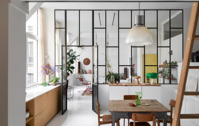
Central to the property’s considerable makeover was the impressive new extension at the rear, along with an upgraded garden leading on from it. The conservatory style complements the original architecture, featuring traditional lines that don’t look too contemporary or out of place.
Lafferty explains the thinking behind the expansion: “Although the house is large in scale, there’s only a relatively small number of rooms.”
The conservatory, made from a hardwood frame, is situated where the basement originally was – not previously a usable, liveable space. “Due to an original height restriction of 2 metres, it wasn’t a place anyone wanted to spend much time,” Lafferty explains. “By excavating the entire basement to improve head height and adding on the full-width conservatory extension, we were able to provide a generous kitchen/living/dining space.”
The basement level originally lacked natural light, so creating a bright space that flowed into the garden was the goal. “We wanted a lot of glass and to strongly landscape the garden in a tiered way, to funnel as much natural light down as possible,” Lafferty continues. “Overall, the entertainment space has more than doubled. It really has become the hub of the house.”
Moooi Raimond pendant lamp: Cait Alise
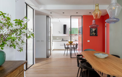
There’s a strong blue theme in this home – and for a reason. “My boyfriend’s parents are big fans of blue. We’ve used a lot of different tones to add depth, variety and richness,” says Lafferty.
Here, an intricate collage of tiles in the doorway, sourced from Seville in Spain, creates a striking, almost exotic look, along with the blue rug and designer chairs. Of the vibrant tiles Lafferty says: “We wanted to define the archway leading from the kitchen into the extension,” the designer adds. “We used the same tiles on the splashback in the kitchen.”.
Overall, there’s a real sense of grandeur in this high-ceilinged, light-filled space. “I’ve always been interested in playing with height and scale as well as juxtaposing contrasting styles to form something interesting and original,” says Lafferty. “I’m also a big fan of designers such as Ilse Crawford and Abigail Ahern. Both of them do incredible work and really appreciate the importance of materials and styling a space.”
Rocking chair: Ligne Roset;
Nuage Swivel chair by Roberto Tapinassi and Maurizio Manzoni: Roche Bobois; Teal Paintbox rug: Bluebellgray
The rotund Pumpkin chair by Pierre Paulin is Lafferty’s favourite place in the house in which to curl up. “Sitting here is the cosiest spot and allows views to the garden as well as the living and dining areas,” she says. “Because of the spiral staircase nearby, it feels as if you can see and hear all around the house. It’s also the place with the most natural light and the most colour.”
Conservatories can sometimes get too hot and stuffy in summer sunshine, or too chilly in the depths of winter, but not here. “Underfloor heating works very well within the space to ensure an even temperature,” Lafferty explains. “As the garden is north-facing, there’s never direct sunlight on the extension, so it doesn’t get too hot either.”
Pumpkin chair: Ligne Roset
Bright paintings add an arty, gallery feel to the dining area in the conservatory-style extension. “Easels are a beautiful way of displaying artwork without damaging walls,” says Lafferty.
However, the real star here is the cast-iron spiral staircase, which was sourced from a salvage company. “It’s the thing people notice most of all when they walk in,” the designer adds. “The petrol blue colour makes it stand out and it looks very striking when viewed from the garden. We designed the platform and additional handrails to match the existing steps.”
The light is Marcel Wanders’ Skygarden pendant. “We got to be quite creative with the lights throughout the house,” says Lafferty. “Contemporary light fittings combined with antique chandeliers ensure no room is the same.”
Skygarden pendant light: Flos
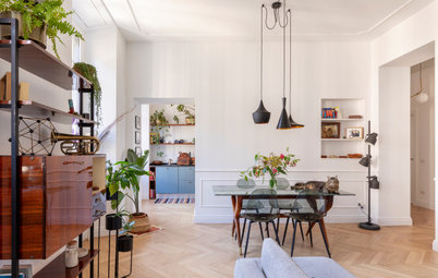
The living room exudes sumptuous warmth and effortless charm. Elements such as the gramophone, gilt-framed mirror and patterned curtains add to the cosy, heritage feel.
“This is the most traditional room in the house,” says Lafferty. “We wanted to retain the original functionality. We sourced a lot of antique furniture pieces and had them reupholstered. There’s also a lot of navy and gold – we wanted to layer up different patterns and textures to give a rich feeling.”
“This is the most traditional room in the house,” says Lafferty. “We wanted to retain the original functionality. We sourced a lot of antique furniture pieces and had them reupholstered. There’s also a lot of navy and gold – we wanted to layer up different patterns and textures to give a rich feeling.”
What makes this house really sing are the numerous beautiful and quirky design details that add personality, as well as a sense of heritage – it’s not quite maximalist, but it doesn’t do plain minimalism either.
Every corner has been lovingly designed and considered, such as this golden side table overflowing with battered antique books and glass candlesticks. “My boyfriend’s mum certainly has eclectic taste, as well as a real interest in antiques, so she was full of ideas,” says Lafferty.
Gold side table: Zara Home
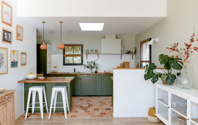
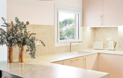
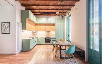
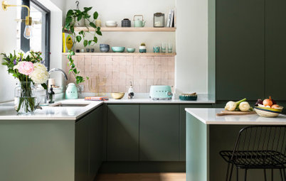
As with the rest of the house, the kitchen manages to effortlessly walk the line between heritage character and modern chic.
A display of wall-mounted plates adds a dose of quirky charm. “We used the plates to accentuate the brasserie feel of the kitchen,” Lafferty explains. “A lot have a history and are antique; we mixed these older plates with contemporary designs to add to the eclectic feel.”
Kitchen: Mooney’s Kitchens; Silestone quartz worktop: Miller Brothers Stone; CL Railway glass pendant lights: Hicken Lighting & Interiors.
If only all kitchen cupboards looked as neat as this… The positively Warholian tin can stacks look brilliant in this bespoke modern pantry storage wall. “We were brave with the blue colour,” says Lafferty. “I particularly like how each cabinet is a different depth to disguise the slant of the wall behind it. The joiner thought we were mad at the time, but it worked out well!”
The master bedroom has a boutique hotel feel, with a wall of floral paper and a plush quilted bedhead. A high ceiling finishes off the job, along with a decorative light. “We wanted to create a spacious, subtle, yet opulent bedroom,” says Lafferty. “The wallpaper and oversized chandelier add an element of femininity to the space.”
A neat walk-in wardrobe leads off the bedroom and features a mixture of hanging rails, drawers and shelving to keep clothes in order.
The panelled archway may look as if it’s always been there, but it was actually added to hide clothes from view in the sleeping zone.
The panelled archway may look as if it’s always been there, but it was actually added to hide clothes from view in the sleeping zone.
The creative tiling in this home is one of Lafferty’s favourite things – and in general, she’s a fan of using interesting tiles to add colour, pattern and impact. “You can buy cost-effective tiles and lay them in unusual ways, such as a parquet effect, or create your own patterns of borders, for a more expensive look,” she says.
“There’s a lot that can be done with bathrooms by playing with mirrors and tiles to add personality – they don’t need to be big spaces either.”
“There’s a lot that can be done with bathrooms by playing with mirrors and tiles to add personality – they don’t need to be big spaces either.”
What’s lovely about this house is the way it does traditional and vintage without feeling fusty or formal. In this bedroom, piles of pretty pillows, subtle sheeny wallpaper and a cluster of mirrors help create a vintage feel.
Once again, blue is the relaxing backdrop. “It’s important for us that the bedroom is a serene sanctuary in which to escape,” says Lafferty. “The soft blue-grey walls create a calming environment.”
Once again, blue is the relaxing backdrop. “It’s important for us that the bedroom is a serene sanctuary in which to escape,” says Lafferty. “The soft blue-grey walls create a calming environment.”
This office space has a formal, ‘clubhouse’ feel that works with the period of the house, partly thanks to the brown leather chesterfield sofa and library-style shelves.
“We wanted to create a gentleman’s smoking room feel,” explains Lafferty. “This room is all about drama. We used two Marcel Wanders Skygarden pendants to define the space, and designed the mint green panelling and bookcases to add texture and depth.
“Although there are traditional elements, we juxtaposed them with contemporary furniture and lighting. Taxidermy – butterflies, birds – was also used to add further colour and interest.”
The basement bathroom has a luxe, vintage feel in line with the style of the rest of the house.
Bathroom fittings: The Victorian Kitchen Company; tiles: TileStyle
Bathroom fittings: The Victorian Kitchen Company; tiles: TileStyle
The final piece in the puzzle of this house is the glorious garden. “Landscaping the garden was a huge part of our job,” says Lafferty. “Previously, it was overgrown and on ground-floor level, with the basement a cold, dark dungeon.
“The garden is very much an extension of the house. We wanted to create the feeling of outdoor rooms, and included a lot of lighting so it can be enjoyed throughout the year and at night-time too.”
“The garden is very much an extension of the house. We wanted to create the feeling of outdoor rooms, and included a lot of lighting so it can be enjoyed throughout the year and at night-time too.”
The garden is cleverly tiered to create interest and a sense of space. “You can have a different experience on each of the three levels,” says Lafferty.
“All the walls in the garden are retaining concrete walls,” she continues. “This garden is 2.5 metres lower than the gardens on either side, so a lot of structural work was required. As it’s north-facing, there’s limited sunshine. We wanted to maximise the amount of natural light that came into the house, and by designing the garden over three tiers, we’ve funnelled in as much daylight as possible.” The walls are rendered in ecocem cement, which has a lovely off-white finish.
“All the walls in the garden are retaining concrete walls,” she continues. “This garden is 2.5 metres lower than the gardens on either side, so a lot of structural work was required. As it’s north-facing, there’s limited sunshine. We wanted to maximise the amount of natural light that came into the house, and by designing the garden over three tiers, we’ve funnelled in as much daylight as possible.” The walls are rendered in ecocem cement, which has a lovely off-white finish.
The lion-head fountain was sourced from a salvage firm, while the metal garden furniture continues the vibrant blue theme beyond the house.
Who lives here: Designer Roisin Lafferty and her boyfriend
Location: Ranelagh, Dublin
Property: A two-storey Georgian house, dating back to 1817, with a basement extension
Size: 3 bedrooms, 3 bathrooms
Designer: Roisin Lafferty of Kingston Lafferty Design
The house is in a fantastic location in Ranelagh, one of Dublin’s most historic Georgian Squares. “It’s part of Dublin 6, which has a great balance of urban and residential components,” says Lafferty. “The village centre, with its lovely boutiques and cafes, is only a three-minute walk away.”
However, the house was in a terrible state when Lafferty and her team were drafted in for a top-to-bottom renovation – the property was originally her boyfriend’s parents’ – and required a serious amount of TLC.
“Before we started work, the house was in serious disrepair, full of damp and mould, with dangerous and outdated fittings and plumbing,” recalls Lafferty. “It had been a rental property for more than 15 years and, by the time we began work, had been uninhabited for a year. The construction was in terrible condition too, so structural safety was a huge concern.”
Lafferty and her team set about putting things straight. She describes the project as a real labour of love. “Basically, the entire place needed to be gutted, then rewired, re-plumbed, excavated, completely reconfigured and redeveloped,” she says. “We did all of the construction drawings, electrical plans and all the interior design. It was a fantastic experience.”