
Decorating

Stuck in a Neutrals Rut? Try These Fail-Proof Colour Techniques
If you're battling an addiction to neutral tones, adopt these surefire ways to inject a little feelgood colour into your home

Colour is the most important design element in a home, and the right selections can really bring interiors to life. Get the colours wrong, however, and you’ll be cringing rather than rejoicing every time you enter a room. Here’s some guidance on how to mix and match colours with confidence.
2. Let artwork be your inspiration
If you love an artwork enough to buy it, ask yourself if you love it enough to design a whole room around it. Here, the colour choices in the cushions, sofa and rug have all been inspired by the artwork over the sofa. The result is a collected look that’s completely captivating.
TIP: If timber makes an appearance more than once in a room, be sure the tones don’t clash. The chair legs and coffee table here match nicely and help the room achieve perfect harmony.
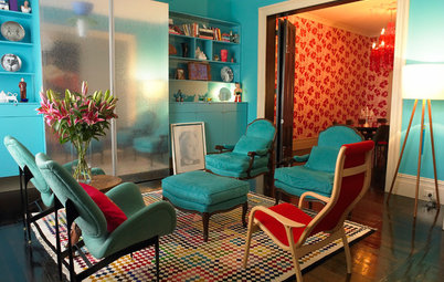
3. Consider the colour wheel
Artwork doesn’t necessarily have to match furnishings in terms of colour, and it can work as a detail rather than a highlight when there are other star attractions in the room. A harmonious look can be achieved, however, when the features of a room complement each other.
Dusty pink and green are best friends in this room because they are opposing colours on the colour wheel. Meanwhile, a soft grey backdrop soothes the eye. Consider light fittings in a colour used elsewhere in the room and hey presto, your look is complete!
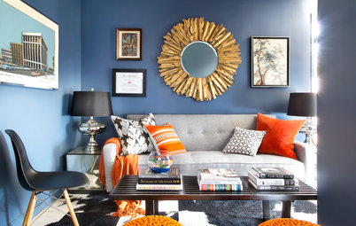
Choosing any two colours that sit opposite each other on the the colour wheel is a guaranteed success. Blue and orange, in this case.
More complementary colour combos
More complementary colour combos
4. Start with a large-scale pattern
Choosing one or two patterns can be a starting point to colour match the rest of the scheme.
TIP: Keep a neutral tone on the bigger items to pull back the intensity of the patterns.
Choosing one or two patterns can be a starting point to colour match the rest of the scheme.
TIP: Keep a neutral tone on the bigger items to pull back the intensity of the patterns.
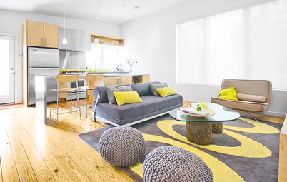
5. Go for analogous colours
Analogous colours are any three colours that sit next to each other on the colour wheel. In this room the colours are inspired by nature – wattle-leaf green and yellow are calming on the eye. Using a different highlight colour in adjoining rooms is a neat trick that defines the zones, even as it creates perfect harmony.
Mood-boosting colours
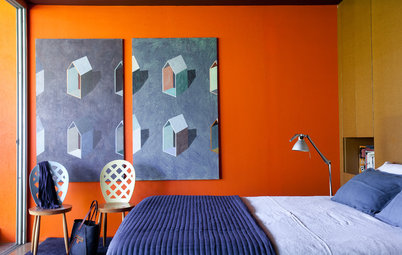
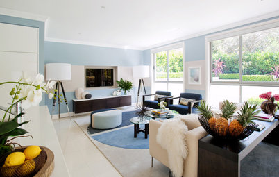
6. Let tonal strength be your guide
If sophistication is your end goal, play down your colour scheme. In this living room, caramel and muted blue work because they oppose each other on the colour wheel, but their soft hues add elegance.
If sophistication is your end goal, play down your colour scheme. In this living room, caramel and muted blue work because they oppose each other on the colour wheel, but their soft hues add elegance.
When the colours chosen for adjacent rooms (or even throughout for the whole home) are of a similar intensity, it’s like linking a necklace together for a full circle of perfection. In this home, the red rug and the green feature wall seen through the doorway work together like a dream.
Curate a colour collection with contrast
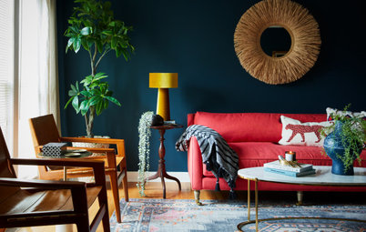
Cool blues play a trick on the eye and you can use them to your advantage – they tend to recede into the background and make other colours stand out. In this rug, for example, the brighter and warmer colours jump into the picture with the help of the cool blue backdrop.
TELL US
What has inspired your colour choice at home? Share your thoughts and photos in the Comments below.
MORE
Colour Metamerism: When Colours Are Not What They Seem
5 Fool-Proof Steps to a Spot On Colour Scheme
The Case for a Colour-Coded Home

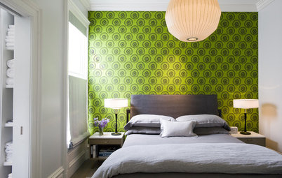
If you lean towards a minimalist look with neutral tones, stick to one muted highlight colour. A colour must be introduced, however, lest a neutral-toned room appear dull and boring. In this case, pale green adds interest without overwhelming the scheme.
TIP: Incorporate light and dark neutral colours to balance the scheme.