How to Choose Your Wall Colour to Complement Floors and Furniture
Which colour should I paint my room to suit the flooring and furniture? We've all asked it – and here are the answers
Deciding which paint colour to select for a room or the best colour combos can be a tricky business, particularly when there are fixed elements to consider, such as flooring, sofas, cabinetry finishes and curtain fabrics. We asked three paint experts for practical advice on how to choose the right paint colours for your home, as well as some insights into 2023 colours and more. Here’s what they had to say.
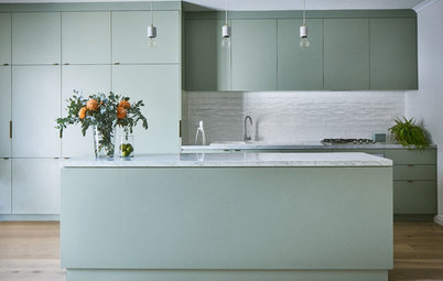
Image by Martina Gemmola. Styling by Ruth Welsby. Haymes Botanist Green on walls.
“Never look at colour in isolation – even the experts can get caught out when this is done,” says Wendy Rennie, colour and concepts manager at Haymes Paint.
“The main thing to keep in mind is that a white is just a white until you put it with another white. For example, a white laminate sample and a white wall colour may clash if one is cooler, and the other one has a warm undertone.
“This concept can also be applied to neutrals across the spectrum. If you put what you think is a warm beige with a cool grey, the two will clash and make the space feel disharmonious,” she says.
Image by Martina Gemmola. Styling by Ruth Welsby. Haymes Balsa 1 on walls.
“This can often happen when you select what you believe to be the perfect white without considering the colour of your wooden flooring. If you have, for example, mahogany floorboards and pair them with a cooler white, the white can appear almost lilac-toned because of the red undertone of the mahogany. This is speaking from experience!” says Rennie.
For rich timber floors, like mahogany or jarrah, seek out a warmer white such as Dulux Whisper White or a warm neutral such as Haymes Oak Buff 1. For lighter timber floors, such as warm oak, seek out white with a gentle greige undertone, such as Dulux Natural White; or go bold with accent colours such as navy, charcoal and sage.
“Failing to consider the colours of fixed elements within a room can cause costly mistakes that require time and effort to resolve,” says Rennie.
Love colour but not sure how and where to use it? Find an interior designer near you on Houzz to help
Image by Lisa Cohen. Styling by Bree Leech. Dulux Balance palette. Paint colours used: Dulux Pure Blue Half and Dulux Kimberley Sea.
The key fixtures
“The most important elements to consider when choosing new paint colours are those that can’t easily be updated, such as kitchen laminate finishes, stone, concrete, tiles, flooring, drapes or blinds, and furniture such as sofas, chairs, dining tables, bedheads, cabinetry,” says Lucena-Orr.
If you’re looking for a white to pair with a concrete floor, try a fresh, cool white such as Dulux Lexicon or one with a hint of blue-grey, such as Dulux White on White. For colours, consider dusty blue, navy and greens with a hint of grey.
Wattyl Baby Seal on walls.
“Also consider what is directly outside any window in the space as these colours, say a green lawn or a dark-coloured high fence, will be reflected onto the walls of the room and could change the colour,” adds Katherine Champion, Wattyl colour ambassador.
Looking for a huge that will harmonise with the rich greens in your garden’s foliage or a dark-painted back fence? Try nature-drawn tones of olive, burnt terracotta, indigo and touches of charcoal.
Browse more images on Houzz of small Australian dining rooms
Image by Martina Gemmola. Styling by Ruth Welsby. Haymes Green Lily on walls and lower joinery.
How to ‘read’ colours next to fixed elements
“The best way to ‘read’ colours next to fixed elements is to get samples of each material in a room [such as flooring, fabrics and cabinetry finishes], and put them next to your chosen paint colours on a mood board. This will allow you to see how the colours and textures affect each other.
“If the elements are fixed [and can’t go on a mood board], you can compare the colours in-situ, using the largest colour paint sample you can get – around 1-metre square on a piece of card is ideal,” says Rennie.
Image by Lisa Cohen. Styling by Bree Leech. Dulux Balance palette. Paint colours used: Dulux Nephrite and Dulux Kimberley Sea.
Lighting can dramatically change how a colour looks, so look at it different times of day and night, and also under artificial light, says Lucena-Orr.
Rennie concurs, adding; “A shade of white that you find bright and fresh in the morning can begin to look pink or blue in its undertone as the light fades. So be sure to test this by checking how the sample reacts to the light at different times of the day and how that interplays with the fixed elements around it, such as wooden flooring, panelling or furniture.”
“You can ‘read’ paint colours by determining the temperature, tone, undertone, how much light they reflect and [how they work with] the natural and artificial light available in a space,” says Champion.
So what is the difference between warm and cool colours? “It’s the temperature of a colour, which is either warm or cool. Warm colours are associated with sunshine and fire and cooler colours with the sea, sky and shade. As a rule, we say reds and oranges are warm and blues and greens are cool, but all colours have warm and cool variants.
And tone? “Tone is the lightness or darkness of a colour, and it is how we create mood and atmosphere in a space. Lighter tones such as whites feel airy and feminine while darker tones such as dark blues and blacks feel more moody,” she says.
“To determine the undertone of a paint colour, our best tip is compare, compare and compare,” says Champion. “Look at it in different lights and angles and hold it next to a pure white piece of paper. It is important to keep the undertones in your base colours (paint and furnishings) the same for a harmonious colour scheme. Everything has colour in it, which is why it is so important to consider flooring, furniture and décor when selecting a paint colour.”
“Also look at the LRV (Light Reflectance Value) of the colour, which indicates the amount of light a colour reflects. The higher the LRV of a paint colour, the more light it will reflect around a space,” she says.
“Also look at the LRV (Light Reflectance Value) of the colour, which indicates the amount of light a colour reflects. The higher the LRV of a paint colour, the more light it will reflect around a space,” she says.
Image by Lisa Cohen. Styling by Bree Leech. Dulux Connect palette. Paint colour used: Dulux Reservation.
“Some whites and neutrals have very subtle undertones that look quite neutral until you see them against another colour,” says Lucena-Orr. “Undertones are important as they are fundamental to making the colour either sit on the cool, warm or neutral side of colour. For example, a white can have a warm undertone (in yellow or pink) or a cool undertone in (blue, grey or green) while sometimes they can sit in the neutral white space.
“Some people find identifying undertones easier when they compare colours against Dulux Vivid White. Personally, I feel you need three or four paint colours to help identify undertones, as different colours will help to pull out different undertones,” she says.
Image by Lisa Cohen. Styling by Bree Leech. Dulux Connect palette. Paint colours used: Dulux Whisper White, Dulux Wasabi and Dulux Stilted Stalks.
When to ‘read’ colour
“The best time to look at colour swatches in your home is during the day,” says Lucena-Orr. “North-facing afternoon light provides the most accurate lighting to see the true colour. However, you still need to view the colour swatch in every room it will be painted in as lighting will differ in each aspect. Also look at the paint swatch on a vertical angle as it would be painted.
“The hardest lighting in a home is normally in south-facing spaces as it can give colours slight bluish undertones,” she says.
Image by Lisa Cohen. Styling by Bree Leech. Dulux Revive palette. Paint colours used: Dulux Lexicon Quarter, Dulux Day Glow, Dulux Golden Sand and Dulux Perplexed.
Paint trends 2023: what’s coming?
Paint colour trends are moving in a few different directions in 2023, says Bree Leech, stylist and Dulux colour forecaster. “Nature–inspired palettes are emerging, inspired by our landscape and seascape. At the same time, retro-futuristic influences are bringing bolder and more expressive colour to the fore.
“Colours drawn from nature always resonate with Australian homeowners so for this reason I think the colours in the Dulux Connect and Dulux Balance palettes will be popular in 2023,” she says.
Image by Lisa Cohen. Styling by Bree Leech. Dulux Connect palette. Paint colour used: Dulux Namadji.
“The nature-inspired Dulux Connect palette is very easy on the eye – even the bolder hues are soothing and calming. Combine them with layers and texture, botanical prints and plants to help integrate them into a space.
“The colours in Dulux Connect work well with warm whites such as Dulux Whisper White or Dulux Natural White,” says Leech.
Image by Lisa Cohen. Styling by Bree Leech. Dulux Revive palette. Paint colours used: Dulux Perplexed, Dulux Lexicon Quarter and Dulux Paper Brown.
“Just as there is talk of ‘dopamine dressing’ the bright colours in the Dulux Revive palette can truly uplift your interior. Try adding pops of your favourite hues to spaces where you get ready in the morning fir an instant great start to the day,” says Leech.
“Just as there is talk of ‘dopamine dressing’ the bright colours in the Dulux Revive palette can truly uplift your interior. Try adding pops of your favourite hues to spaces where you get ready in the morning fir an instant great start to the day,” says Leech.
Image by Lisa Cohen. Styling by Bree Leech. Dulux Balance palette. Paint colours used: Dulux Sea Kelp and Dulux Terrace White.
“Dulux Balance is an elegant and calming palette. It works beautifully in a bedroom where you can create a wonderfully immersive space with colour on all walls and the ceiling.
“Dulux Balance sits equally comfortable in traditional and modern homes – it’s very versatile. Pair it with cooler whites or whites with a hint of green,” says Leech.
Other colour combos to love in 2023
“Visiting the Design Show in Sydney in October 2022, exhibitors’ colour palettes included a mix of the design styles ‘soulful minimalism’ and ‘natureverse’, which will be trending in 2023 and beyond. Colour palettes featured off-whites and warm, earthy neutrals with touches of sage and greyed blue, which are reminiscent of the Australian landscape,” says Champion.
Soulful minimalism is soothing, calm and uncluttered – a warmer take on classic minimalism, with cosy textures and cocooning features.
Natureverse includes everything from underwater to undergrowth, such as moss, lichen and earthy surfaces,” she says.
Image by Martina Gemmola. Styling by Ruth Welsby. Haymes Sand Storm on walls.
We’ll become more adventurous with colour in 2023, predicts Rennie; “We are pushing the saturated tones further and harnessing the power of colour even more. I also think we are entertaining more, which is having a big impact on our colour decisions – we’re leaning more towards fun and exciting tones.”
Haymes Carefully Nurtured is a liveable and harmonious palette of softer pastels, which can easily be used as full colour in a room and paired with natural materials, like wood and leather. I think people will be using this palette a lot in their homes in 2023,” she says.
Image by Martina Gemmola. Styling by Ruth Welsby. Haymes Seed on walls.
“Haymes Livewire is also a very playful, bold palette that can really reinvigorate the mood of a space. We have seen lots of people mixing eras and styles within their homes as of late, and I think this palette lends itself to that perfectly,” she says.
“Haymes Livewire is also a very playful, bold palette that can really reinvigorate the mood of a space. We have seen lots of people mixing eras and styles within their homes as of late, and I think this palette lends itself to that perfectly,” she says.
Wattyl Scallopini on walls.
Your turn
Which 2023 trending colours are you tempted to try? Tell us in the Comments below. And don’t forget to save these images, like this story and join the conversation.
More
Want more paint colour advice: Don’t miss this story Flying Colours: How to Pick the Best Paint Colour for a Dark Room
Your turn
Which 2023 trending colours are you tempted to try? Tell us in the Comments below. And don’t forget to save these images, like this story and join the conversation.
More
Want more paint colour advice: Don’t miss this story Flying Colours: How to Pick the Best Paint Colour for a Dark Room
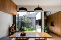
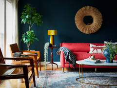
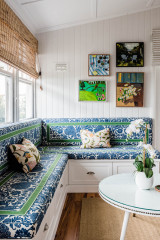
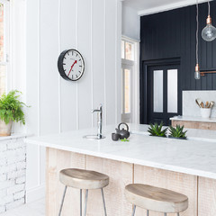

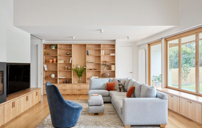
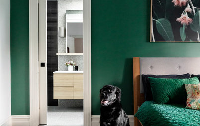
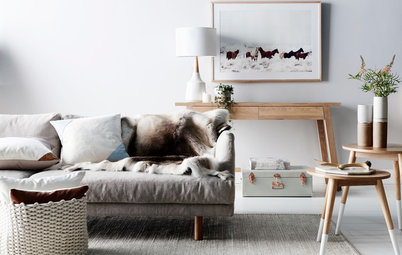
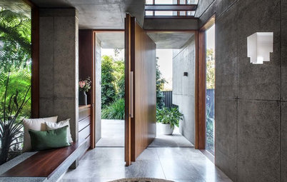

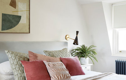
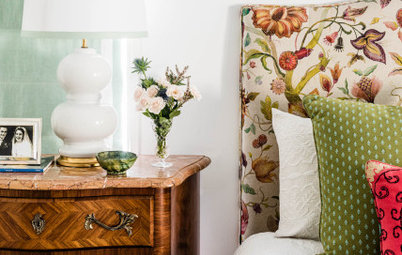
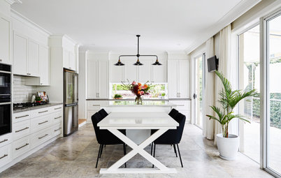
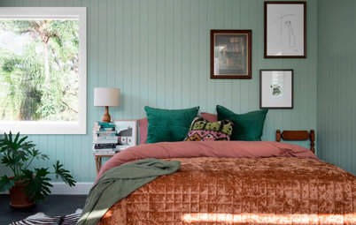

Consider the surrounding tones when you pick paint
“When selecting new paint colours for a room, it is crucial to factor in the colours of any fixed elements that won’t be changing. Doing this will make a huge different to the end result, and will ensure that your new colour blends in seamlessly,” says Andrea Lucena-Orr, Dulux colour and communications Manager.