Architecture
The Clever Redesign of a Tiny Worker's Cottage in Melbourne
In an edited extract from 'Small House Living Australia', we poke around a beguiling worker's cottage in Melbourne

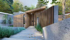
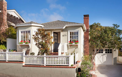
Architect Ben Edwards’ client wanted the inner-city location, despite the home he bought being a mere 70 square metres – the smallest on the street. Here’s how Ben brought in the light and made the space flow…
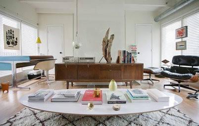
The horizontal boards across the floor in what is now the living area give an indication of the size of the two rooms that formed the original cottage. Partially exposed brick walls and inexpensive plywood shelving are both a design statement and an acknowledgment of the historical roots of the neighbourhood.
Ben Edwards’ client was typical of the newcomers. “The client wanted the location – its proximity to the CBD and the local amenities. It didn’t matter that this was the smallest house in the street. It came with the typical linear site so making use of this was the obvious way to address the lack of light while adding to the footprint.”
Ben Edwards’ client was typical of the newcomers. “The client wanted the location – its proximity to the CBD and the local amenities. It didn’t matter that this was the smallest house in the street. It came with the typical linear site so making use of this was the obvious way to address the lack of light while adding to the footprint.”
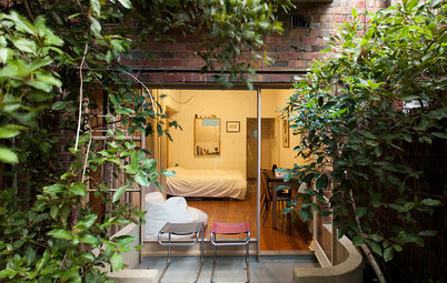
Outlook to the bedroom is provided by one of the two gravelled courtyards.
The new larger footprint is still merely 70 square metres, but retaining the street frontage and structure of the original cottage, while separating it from its utilitarian rear, has allowed light and an intimate connection with the revealed outdoor spaces, where previously there was none. All internal walls in the original structure were demolished, so that what was once a minuscule dwelling now functions as a well-proportioned living space. With the entrance straight off the street, and no hallways or internal doors to clutter or obstruct, it feels surprisingly spacious. The original loft above – accessible only by a ladder to avoid the need for a space-guzzling staircase – has been retained as occasional guest accommodation.
The new larger footprint is still merely 70 square metres, but retaining the street frontage and structure of the original cottage, while separating it from its utilitarian rear, has allowed light and an intimate connection with the revealed outdoor spaces, where previously there was none. All internal walls in the original structure were demolished, so that what was once a minuscule dwelling now functions as a well-proportioned living space. With the entrance straight off the street, and no hallways or internal doors to clutter or obstruct, it feels surprisingly spacious. The original loft above – accessible only by a ladder to avoid the need for a space-guzzling staircase – has been retained as occasional guest accommodation.
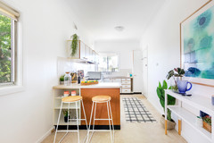
A change in level between the rear addition and the kitchen adds interest to the simple rectilinear structure.
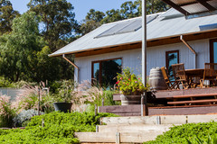
Two new additions placed along the full length of the long southern boundary make full use of the depth of the site. The rearmost of these is a generous bedroom, while the innermost – connected to both front and rear structures by a pair of truncated passages – contains the kitchen and dining area. Both walls of this central core are fully glazed oblique angles, allowing ample room for the two resultant courtyards to act as what Edwards describes as ‘lungs’ to ventilate and light the spaces on either side. The outer wall of the rear of these courtyards is also glazed, and the additional light through the central kitchen and dining area makes the house appear larger than it in fact is.
Two new additions placed along the full length of the long southern boundary make full use of the depth of the site. The rearmost of these is a generous bedroom, while the innermost – connected to both front and rear structures by a pair of truncated passages – contains the kitchen and dining area. Both walls of this central core are fully glazed oblique angles, allowing ample room for the two resultant courtyards to act as what Edwards describes as ‘lungs’ to ventilate and light the spaces on either side. The outer wall of the rear of these courtyards is also glazed, and the additional light through the central kitchen and dining area makes the house appear larger than it in fact is.
When budget permits, the rear wall to the original structure will also be opened up and glazed, allowing uninterrupted sightlines through the full depth of the site. While such deft manipulations enhance the impression of spaciousness, so too do the raw interior finishes in the original part of the building, where partially exposed brick walls contrast with simple plywood shelving and cafe-style wiring. In contrast, the new areas are distinctly Scandi-modern, with white paint and clean lines. These could be viewed as a fashion statement, given this is a location where industrial grunge has almost become an art form in its own right. Edwards’ version is rather more than that. Instead it is a design ethos that celebrates imperfection, while acknowledging the historical roots of the neighbourhood.
A ladder (out of picture at left) takes the place of a staircase to the loft (which doubles as both occasional guest accommodation and storage). The original fireplace alongside the line of exposed brick indicates where this area was once two rooms.
It also has the advantage of making best use of a tight budget. “Raw and untreated finishes are obviously a cost-effective way of completing interiors – this is a prime example of architecture on a budget – but used like they have been here, and by leaving the arrangement of the previous spaces apparent, they retain the memory of what’s gone before.”
And while broken plaster and exposed wiring acknowledge the historical context, small areas of beaten brass and gold Alucobond playfully lend a contemporary touch of luxe. These elements focus attention onto how the site as a whole has been repurposed for contemporary use. They also work overtime to bounce light into the deepest corners – even into the shadowy depths of the front room. A small change of level, and a change from recycled timber flooring to polished concrete between the old and new, further emphasises how the historical importance of the original structure has been allowed to inform, but not dominate, the narrative of the building itself.
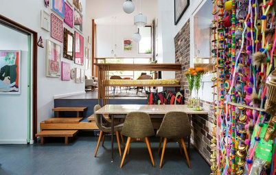
The asymmetry of the purpose-built kitchen table echoes, but does not replicate, that of the central addition that houses the kitchen.
In terms of floor space, this is still a modest home. But while it was once dark and woefully uninterested in the possibilities of its site, it now serves as a clever reminder that the basic principles of good architecture can rescue even the most problematic of dwellings. Edwards, by allowing light and flow to interact with volume and aesthetic pleasure, has enabled 21st-century living to intermarry with 19th-century pragmatism. The result is quirky, clever and altogether beguiling.
In terms of floor space, this is still a modest home. But while it was once dark and woefully uninterested in the possibilities of its site, it now serves as a clever reminder that the basic principles of good architecture can rescue even the most problematic of dwellings. Edwards, by allowing light and flow to interact with volume and aesthetic pleasure, has enabled 21st-century living to intermarry with 19th-century pragmatism. The result is quirky, clever and altogether beguiling.
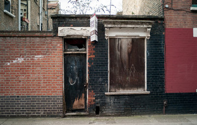
No wider than a car is long, the modest dimensions of houses of this sort were once the norm for this suburb.
Design notes
Tell us
What do you love about this home? Tell us in the Comments below. And don’t forget to save your favourite images, bookmark the story, and join in the conversation.
Design notes
- Two courtyards inserted between the three living zones light and ventilate the interior spaces to each side of them.
- Setting the glazed doors which access the courtyards on angles allows the deep, narrow site to appear wider than it is.
- Internal finishes in the original part of the structure are deliberately left seemingly unfinished to reflect both the historical context and the owner’s contemporary desire for an uncomplicated way of life.
Tell us
What do you love about this home? Tell us in the Comments below. And don’t forget to save your favourite images, bookmark the story, and join in the conversation.
This is an edited extract from Small House Living Australia by Catherine Foster, Penguin Random House, $39.99.


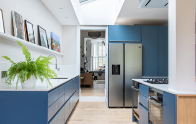
The kitchen, in one of two new additions, links the original cottage at the front to the new bedroom at the rear.
The doll’s house
Deep narrow sites with laneways to the rear were the city plan of choice for nineteenth-century urban planners in Australia, as they allowed a cost-effective solution for sewerage and rubbish disposal. Unlike the crowded cities of the old world, however, land in Australia was comparatively plentiful. Working-class suburbs could remain low level, with narrow houses placed close to the street frontage extending back into deep, narrow sites. For a settler society unused to the Australian sun, the consequent lack of light was a bonus. But the needs of twenty-first century Fitzroy are a far cry from those which shaped its urban plan.