Dining Room Design Ideas with Brick Walls
Refine by:
Budget
Sort by:Popular Today
101 - 120 of 181 photos
Item 1 of 3
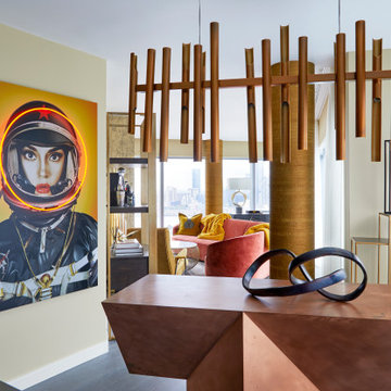
Travel back to 70s galactic with this fun space girl artwork, complete with light up red neon helmet to highlight her alluring gaze. Wearing a black NASA space suit with yellow background this image has been printed into aluminum for extra sheen, and mounted onto board for a three dimensional effect against the wall. This big poster board style artwork adds playful humour and slick, urban cool to a room.
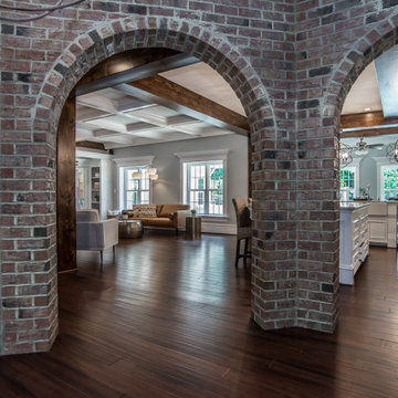
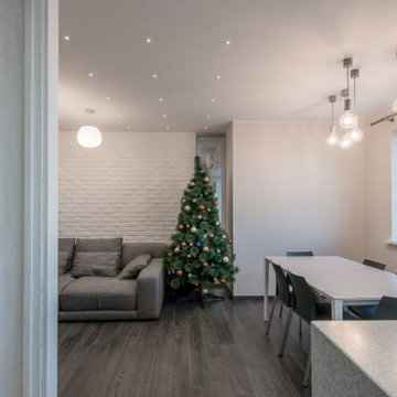
When marketing your home it's the details that count! The views from the dining room into the rest of the house was key to creating a one-of-a-kind impression through the marketing photos. Working hand in hand with the photographer, Charles Dickens Photography, allowed me to share my vision of what details I believed should be highlighted. Charlie captured this homes wonderful mixture of rustic and sophisticated details beautifully in this photo.
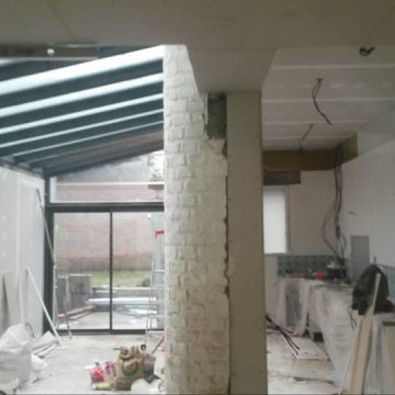
Reforma integral en un piso de 63 m2 en Arguelles, Apostamos por utilizar el espacio distribuidor como comedor conectado con el salón para optimizar al máximo los m2 del piso. Espacio diáfano, luminoso y sencillo, dejando que la propia estructura del piso y los muros de ladrillo destaquen.
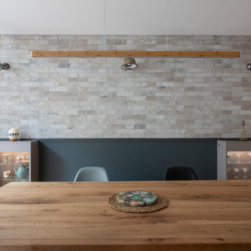
Плитка из дореволюционных руколепных кирпичей BRICKTILES в оформлении стены в столовой. Поверхность под защитной пропиткой - не пылит и влажная уборка разрешена.
Дизайнер проекта: Кира Яковлева. Фото: Сергей Красюк. Стилист: Александра Пиленкова.
Проект опубликован на сайте журнала AD Russia в 2020 году.
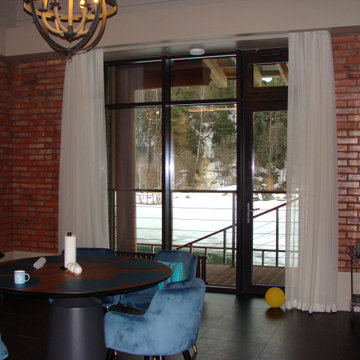
La salle à manger. Les appliques Jielde faisaient partie de la déco existante du couple à intégrer. Nous avons proposé le soubassement gris profond avec le parement brique au dessus. Les Jielde mettent très bien en valeur la brique.Les vitrines sont sur mesure.
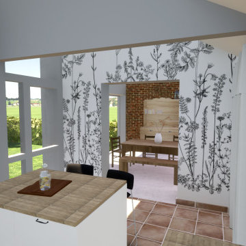
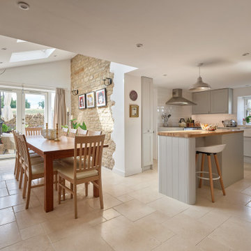
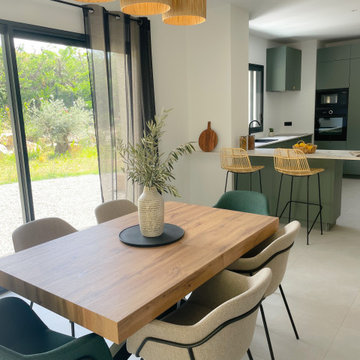
We were commissioned by our clients to design a light and airy open-plan kitchen and dining space with plenty of natural light whilst also capturing the views of the fields at the rear of their property. We not only achieved that but also took our designs a step further to create a beautiful first-floor ensuite bathroom to the master bedroom which our clients love!
Our initial brief was very clear and concise, with our clients having a good understanding of what they wanted to achieve – the removal of the existing conservatory to create an open and light-filled space that then connects on to what was originally a small and dark kitchen. The two-storey and single-storey rear extension with beautiful high ceilings, roof lights, and French doors with side lights on the rear, flood the interior spaces with natural light and allow for a beautiful, expansive feel whilst also affording stunning views over the fields. This new extension allows for an open-plan kitchen/dining space that feels airy and light whilst also maximising the views of the surrounding countryside.
The only change during the concept design was the decision to work in collaboration with the client’s adjoining neighbour to design and build their extensions together allowing a new party wall to be created and the removal of wasted space between the two properties. This allowed them both to gain more room inside both properties and was essentially a win-win for both clients, with the original concept design being kept the same but on a larger footprint to include the new party wall.
The different floor levels between the two properties with their extensions and building on the party wall line in the new wall was a definite challenge. It allowed us only a very small area to work to achieve both of the extensions and the foundations needed to be very deep due to the ground conditions, as advised by Building Control. We overcame this by working in collaboration with the structural engineer to design the foundations and the work of the project manager in managing the team and site efficiently.
We love how large and light-filled the space feels inside, the stunning high ceilings, and the amazing views of the surrounding countryside on the rear of the property. The finishes inside and outside have blended seamlessly with the existing house whilst exposing some original features such as the stone walls, and the connection between the original cottage and the new extension has allowed the property to still retain its character.
There are a number of special features to the design – the light airy high ceilings in the extension, the open plan kitchen and dining space, the connection to the original cottage whilst opening up the rear of the property into the extension via an existing doorway, the views of the beautiful countryside, the hidden nature of the extension allowing the cottage to retain its original character and the high-end materials which allows the new additions to blend in seamlessly.
The property is situated within the AONB (Area of Outstanding Natural Beauty) and our designs were sympathetic to the Cotswold vernacular and character of the existing property, whilst maximising its views of the stunning surrounding countryside.
The works have massively improved our client’s lifestyles and the way they use their home. The previous conservatory was originally used as a dining space however the temperatures inside made it unusable during hot and cold periods and also had the effect of making the kitchen very small and dark, with the existing stone walls blocking out natural light and only a small window to allow for light and ventilation. The original kitchen didn’t feel open, warm, or welcoming for our clients.
The new extension allowed us to break through the existing external stone wall to create a beautiful open-plan kitchen and dining space which is both warm, cosy, and welcoming, but also filled with natural light and affords stunning views of the gardens and fields beyond the property. The space has had a huge impact on our client’s feelings towards their main living areas and created a real showcase entertainment space.
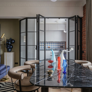
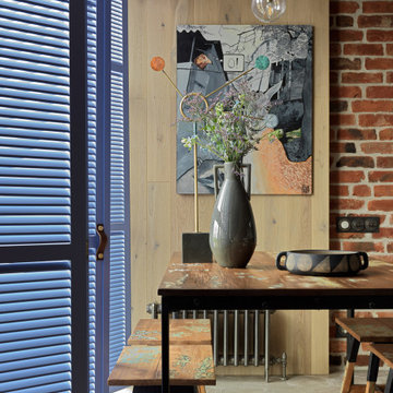
Артистический интерьер для яркой пары.
Общие параметры:
Тип недвижимости: Квартира в доме 1956 года.
Где находится (если не секрет): Москва, Соколиная Гора
Метраж: 80 м2
Стиль (как бы вы его сами определили): Артистический интерьер
Основная идея проекта: создать яркое артистичное пространство с множеством деталей, подчеркивающее характер его владельцев.
Цветовая гамма: смешанная гамма, композиция теплых и холодных оттенков.
1. Особенности планировки.
В квартире имеется спальня с эркером, гостиная и отдельная кухня. До перепланировки помещения были мало освещенными и тесными. За счёт объединения гостиной и кухни, а также цветовой палитры удалось создать достаточно светлый, жизнерадостный интерьер.
Кухню с подведенным газом, как и требуют правила, отделили от гостиной герметичной перегородкой.
В квартире присутствует помещение, в котором находится законсервированный мусоропровод, который не удалось удалить, без согласования всех жильцов дома, а их, к слову, оказалось не мало (в 135 квартирах). В итоге в этой комнате расположился гардероб и дополнительные места для хранения.
Прихожая продолжается длинным коридором, имеющим большой шкаф с множеством мест для хранения одежды и костюмов, которые наши герои создают для музыкальных фестивалей. С противоположной стороны расположен вход в спальню
2. Если можно, пару слов о заказчиках. Основные пожелания заказчиков.
Владельцы квартиры – творческие и неординарные молодые люди, приобрели себе квартиру площадью 80 м2 в доме 1956 года, которая отчаянно требовала ремонта.
Ребята круто играют на гитарах, ежегодно участвуют в музыкальных фестивалях и фестивалях Burning Man, а еще успешно занимаются созданием световых инсталляций. Заказчики в первую очередь хотели создать необычное пространство, которое вдохновляло бы их на творческие порывы и отражало их внутренние миры.
3. Какие декораторские и архитектурные приемы вы использовали в оформлении этого интерьера.
Особую атмосферу при входе в спальню создают парадные двустворчатые двери, которые привносят особую эстетику и дополняют образ спальни.
Пол и фартук в кухне декорированы орнаментом английской плитки, которая напоминает советскую.
Спальня светлая, свежая и яркая, как и ее обитатели. Цветовая гамма - чистые ясные оттенки голубого и синего.
В изголовье кровати Обои с узором по мотивам керамики местечка Кап-д’Ай, что на юго-востоке Франции, который символизирует слияние неба и земли на растительном фоне, как слияние мужского и женского.
Растительный мотив поддерживает кровать и тумбы из природных материалов.
Интерьер наполнен предметами искусства, которые придали пространству лёгкие ироничные нотки.
Чтобы шкаф в гостиной не выглядел просто шкафом, на его фасадах мы расположили печатную графику и декор, теперь он напоминает больше стеновые панели, нежели гардероб.
4. У меня в голове возникла история. Жизнь, как игра, она жонглирует разными событиями, ситуациями, а мы всегда учимся поймать и отреагировать на то или иное. Весь интерьер, как заказчики - активный и наполнен адреналином. В интерьере много цветного стекла, совсем как шарики жонглера, а скульптура Льва Ефимова (синие пенящиеся шары) словно символ пойманных и сложенных воедино пойманных моментов и впечатлений. Литография на стене — это ещё один символ легкости бытия и позитивного отношения к жизни. Дизайнерские светильники в гостиной — это отражение легкости мысли. А скульптура в спальне на подоконнике, говорит о течении времени и каждый раз просыпаясь утром, возникает понимание, что жизнь течёт и нужно наслаждаться ей и стремиться сделать много нового и с любовью, нового и вместе. «Вместе» — это о литографии в прихожей «Поцелуй». Эта работа, с входа в квартиру говорит о гармонии и ярких отношениях пары, а скульптура на консоли из стекла вторит этой работе, красное и голубое стекло сплелось в единую композицию. На мой взгляд - эти две работы из разных эпох, а словно созданы друг для друга.
5. Самым важным в этом проекте было вдохнуть вторую жизнь в обветшалое и сало похожее на жилище пространство. Впервые попав на объект, мы даже не знали за что схватиться первым делом. Задачи были повсюду, начиная от мусоропровода в середине квартиры и заканчивая стенами, которые были в шатком состоянии.
6. В каждом помещении есть акценты и образующие интерьер конструкции, например в кухне-гостиной это перегородка из стекла, которая выглядит легко, но в то же время зонирует пространство. В спальне акцент на эркер, это первое что понравилось в квартире, когда мы зашли, много света из окон большой плюс особенно зимой.
Dining Room Design Ideas with Brick Walls
6