Expansive Open Plan Kitchen Design Ideas
Refine by:
Budget
Sort by:Popular Today
101 - 120 of 20,330 photos
Item 1 of 3
Porcelain tile with wood grain
4" canned recessed lighting
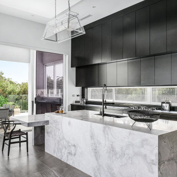
Carerra marble
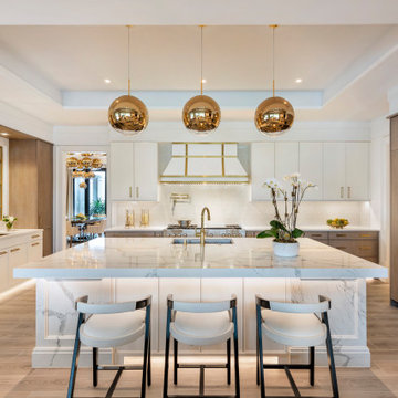
Waterfall Island
#buildboswell
The Sater Design Collection's Rosemary Bay (Plan #6781). www.saterdesign.com
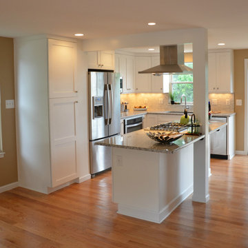
There are so many design elements to this kitchen, I almost don’t know where to start. Bright and airy with crisp clean white cabinets, the kitchen is open and welcoming. Still crisp but gently contrasting, the stainless steel appliance add depth amid the white. To keep this kitchen warm, natural oak covers the floors and a toasted wheat color washes the walls. And then there is the architectural elements. You know. That post and beam in the middle of the room. It’s the center of attention.When you walk into a room your eyes roam around, establishing the size and shape of the room as your feet take you forward. From the front door of this home straight ahead you encountered this wall. The dining area to the right gives you a glimpse of things to come. Where there is a dining room you will usually find a kitchen.
The architecture of years gone by consistently hides the kitchen, the heart of the home, behind walls. I sympathize with my Mom, and all the other Moms, who have had to spend so much time tucked into a tight kitchen, away from the family. This wall had to go, but it was structural. We needed its support but not its bulk.So we got rid of the bulk and only the bulk. Instead of a wall we have a post and beam, offering all of the structure we need. We could have installed a huge steel beam and reconfigure the joists to upset the beam, but why? The small beam and post add an incredible architectural element. It’s turning lemons into lemon, we simply made the most of what we had. It may be functional but it’s so fantastic. It looks like we created the effect just for the drama.
The original kitchen may have had a working triangle and some counter space, but it was fairly small, with each area only a step or two away. The dark cabinets made the space feel even smaller and the butcher block patterned laminate counter tops were very dated. The appliances were feeling their age as well, from a coil burner electric stove to a top freezer refrigerator. To keep this kitchen within its space, a half wall separated it from the dining area.
With the wall gone we borrowed some space from the living room and extended what was a U shaped kitchen into an L. At the living room window we start our new kitchen. We kept a small part of the wall to support the other end of our decorative beam. Sandwiched between a large pantry and our new French door refrigerator, the wall disappears. With our new open floor plan a sizable island was in order.
We split our cooking areas and installed a continuous grill gas cooktop into the island. A sleek island hood takes care of exhaust and adds an extra element to our architectural feature. Under the cooktop we added over-sized drawers for pots and pan storage. The frameless cabinets from New River Cabinetry are maple, painted white, with the Herndon door style. With the cooktop safely nestled into our island, we still had to add an oven.
We used the space where the old range sat for a large single oven of stainless steel and glass. If it worked for one, why not two? We created a home for a microwave in the wall cabinets. It’s perfect for heating leftovers so close to the refrigerator.An important consideration for hot spots in your kitchen is landing zones. Each of our cooking areas have generous landing zones, one on each side of the cooktop and an entire counter area above or below the ovens, depending on which one you’re using.We wanted to give the sink area more room so the half wall had to come out. We moved the trash and recycle cans into a cabinet, removed the heavy soffits and kept the sink under the window.With that little bit of extra space we were able to add a larger cabinet above the dishwasher and slide it all down. This used to be where the carpeting met the vinyl floor, but all of it is gone. Long oak planks eliminate that final divide between the kitchen and the dining area, while adding visual length to the area. White wall cabinets on each side of the window reflect the sunlight for a brighter view.
With all of the darker cabinetry the backsplash walls had been painted white. Even still, there was a darkness in the corners and it wasn’t very exciting. We wanted to add visual interest and reflect the new under-cabinet lighting, eliminating the shadows in this corner.With 1″x 2″ Arabescato Honed marble mosaics and those under-cabinet lights, we achieved the perfect balance. The marble has subtle swirls in gray and beige on a clean white background, but with the honed finish the light is softly reflected instead of glaring. For granite, we chose the soft gray tones of Luna Pearl. The speckles of gray and beige are a gentle contrast to the white cabinets and emulate the color of the stainless steel.Between the carpet, red half wall, dark railing and dated light fixture, the dining area felt tired. Since the kitchen lacked sufficient storage, a large utility cabinet crowded the table space without adding any decorate elements.Although it didn’t get any bigger, our dining area feels fresher and more open too. With the oak flooring joining the area to the rest of our space and the toasted wheat on the walls, the white table and chairs compliment the cabinetry while contrasting the warmer colors. We replaced the chandelier with recessed lighting and changed that railing too.With our new open floor plan, we ended up with a fairly open area in between our foyer closet and the living room window. Not one to miss an opportunity, we filled the space with a multi-functional work space.
With the sunlight streaming in this bright corner works for anything this family needs.
Photo Credit to RJK Construction, Inc.
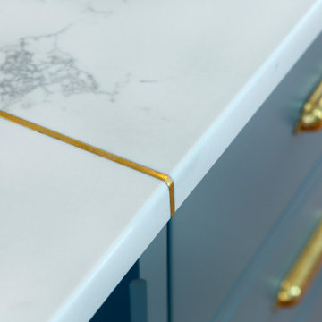
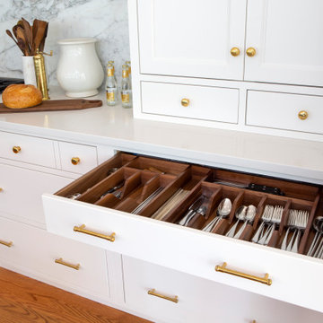
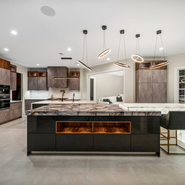
A beautiful kitchen transformation that went from formal to casual elegance with full framed inset custom cabinetry throughout. Appliance ready appliances, custom brass corners kicks, walnut interiors with customized paper towel holder. This island is one of our largest ones boasting at 13.5' long by 5.5' wide!
A beautiful kitchen transformation that went from formal to casual elegance with full framed inset custom cabinetry throughout. Appliance ready appliances, custom brass corners kicks, walnut interiors with customized paper towel holder. This island is one of our largest ones boasting at 13.5' long by 5.5' wide!
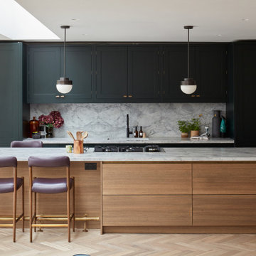
This detached home in West Dulwich was opened up & extended across the back to create a large open plan kitchen diner & seating area for the family to enjoy together. We added oak herringbone parquet in the main living area, a large dark green and wood kitchen and a generous dining & seating area. A cinema room was also tucked behind the kitchen
“With the open-concept floor plan, this kitchen needed to have a galley layout,” Ellison says. A large island helps delineate the kitchen from the other rooms around it. These include a dining area directly behind the kitchen and a living room to the right of the dining room. This main floor also includes a small TV lounge, a powder room and a mudroom. The house sits on a slope, so this main level enjoys treehouse-like canopy views out the back. The bedrooms are on the walk-out lower level.“These homeowners liked grays and neutrals, and their style leaned contemporary,” Ellison says. “They also had a very nice art collection.” The artwork is bright and colorful, and a neutral scheme provided the perfect backdrop for it.
They also liked the idea of using durable laminate finishes on the cabinetry. The laminates have the look of white oak with vertical graining. The galley cabinets are lighter and warmer, while the island has the look of white oak with a gray wash for contrast. The countertops and backsplash are polished quartzite. The quartzite adds beautiful natural veining patterns and warm tones to the room.
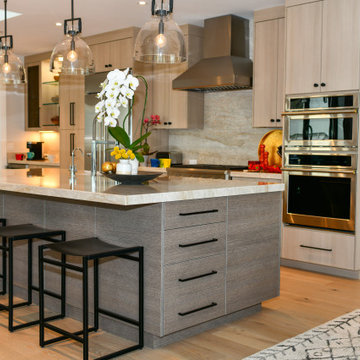
Beauty meets practicality in this Florida Contemporary on a Boca golf course. The indoor – outdoor connection is established by running easy care wood-look porcelain tiles from the patio to all the public rooms. The clean-lined slab door has a narrow-raised perimeter trim, while a combination of rift-cut white oak and “Super White” balances earthy with bright. Appliances are paneled for continuity. Dramatic LED lighting illuminates the toe kicks and the island overhang.
Instead of engineered quartz, these countertops are engineered marble: “Unique Statuario” by Compac. The same material is cleverly used for carved island panels that resemble cabinet doors. White marble chevron mosaics lend texture and depth to the backsplash.
The showstopper is the divider between the secondary sink and living room. Fashioned from brushed gold square metal stock, its grid-and-rectangle motif references the home’s entry door. Wavy glass obstructs kitchen mess, yet still admits light. Brushed gold straps on the white hood tie in with the divider. Gold hardware, faucets and globe pendants add glamour.
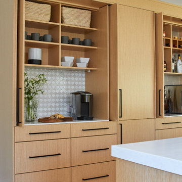
In the pantry, kitchen cabinetry is repeated, but here in all white with Caesarstone countertops. Flooring is laid diagonally. Matching panels front the wine refrigerator. Open cabinets display glassware and serving pieces.
This project was done in collaboration with JBD JGA Design & Architecture and NMB Home Management Services LLC. Bilotta Designer: Randy O’Kane. Photography by Nat Rea.
Description written by Paulette Gambacorta adapted for Houzz.
Built in the iconic neighborhood of Mount Curve, just blocks from the lakes, Walker Art Museum, and restaurants, this is city living at its best. Myrtle House is a design-build collaboration with Hage Homes and Regarding Design with expertise in Southern-inspired architecture and gracious interiors. With a charming Tudor exterior and modern interior layout, this house is perfect for all ages.
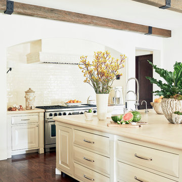
This beautiful Mediterranean - Santa Barbara home has stunning bones, but needed a refresh on some of the finishes. Although we wanted to keep a Spanish feel, we didn't want Mexican tile everywhere. The kitchen received new tile on the backsplash, counter tops, copper sinks and cabinet hardware. The wood floor that runs through out the home replaced the exiting Saltillo tile. The cooking alcove for the range top was dated and arched. We opened up the arch to a more modern square. This gave the space more room. We added new tile that still has a Spanish feel, but a bit more contemporary. The fireplace in the adjoining great room received a new façade with a teal colored aged tile. This updated the space and popped a bit of color in the room.
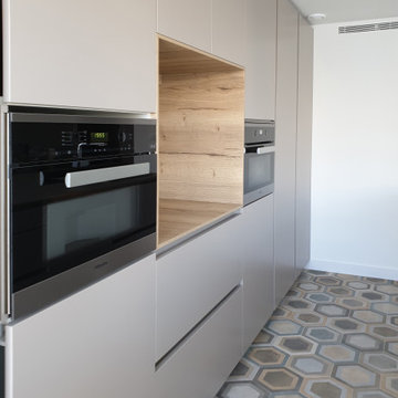
Para aligerar el peso de las columnas, puede resultar interesante el diseño de una hornacina en el espacio central. De esta forma también se aporta un pequeño espacio de almacenaje para pequeño electrodoméstico, por ejemplo.
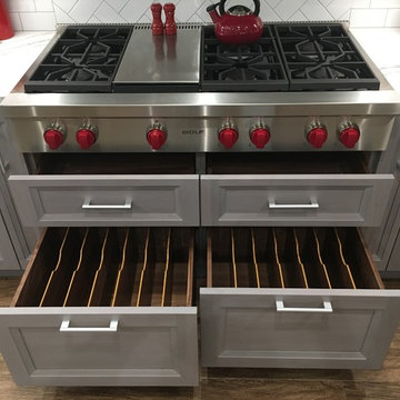
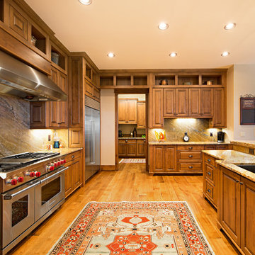
This gourmet Wolf rangetop features six large dual burners plus an infra-red flat-top griddle. Drawers provide ample and easily accessible storage for pots, pans, lids and trays.
Expansive Open Plan Kitchen Design Ideas
6