Galley Kitchen with Black Appliances Design Ideas
Refine by:
Budget
Sort by:Popular Today
121 - 140 of 16,355 photos
Item 1 of 3
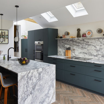
A modern flat panelled kitchen in a gorgeous rich super matt moonlight green colour with black handles and accessories and some striking glass fronted doors. The stone used throughout the kitchen for the work surfaces, peninsular island with waterfall leg to the floor and full height stone splash back and shelf is Sensa Sant Angelo by Cosentino and looks absolutely stunning and compliments the coloured doors perfectly.
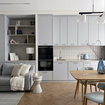
Основная задача: создать современный светлый интерьер для молодой семейной пары с двумя детьми.
В проекте большая часть материалов российского производства, вся мебель российского производства.
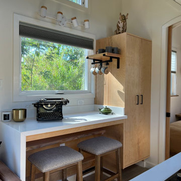
This Paradise Model ATU is extra tall and grand! As you would in you have a couch for lounging, a 6 drawer dresser for clothing, and a seating area and closet that mirrors the kitchen. Quartz countertops waterfall over the side of the cabinets encasing them in stone. The custom kitchen cabinetry is sealed in a clear coat keeping the wood tone light. Black hardware accents with contrast to the light wood. A main-floor bedroom- no crawling in and out of bed. The wallpaper was an owner request; what do you think of their choice?
The bathroom has natural edge Hawaiian mango wood slabs spanning the length of the bump-out: the vanity countertop and the shelf beneath. The entire bump-out-side wall is tiled floor to ceiling with a diamond print pattern. The shower follows the high contrast trend with one white wall and one black wall in matching square pearl finish. The warmth of the terra cotta floor adds earthy warmth that gives life to the wood. 3 wall lights hang down illuminating the vanity, though durning the day, you likely wont need it with the natural light shining in from two perfect angled long windows.
This Paradise model was way customized. The biggest alterations were to remove the loft altogether and have one consistent roofline throughout. We were able to make the kitchen windows a bit taller because there was no loft we had to stay below over the kitchen. This ATU was perfect for an extra tall person. After editing out a loft, we had these big interior walls to work with and although we always have the high-up octagon windows on the interior walls to keep thing light and the flow coming through, we took it a step (or should I say foot) further and made the french pocket doors extra tall. This also made the shower wall tile and shower head extra tall. We added another ceiling fan above the kitchen and when all of those awning windows are opened up, all the hot air goes right up and out.
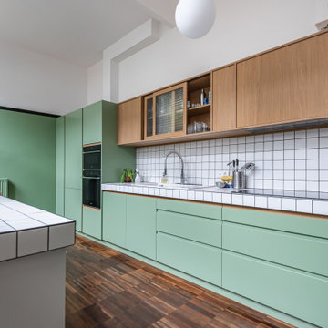
Bâtiment des années 30, cet ancien hôpital de jour transformé en habitation avait besoin d'être remis au goût de ses nouveaux propriétaires.
Les couleurs passent d'une pièce à une autre, et nous accompagnent dans la maison. L'artiste Resco à su mélanger ces différentes couleurs pour les rassembler dans ce grand escalier en chêne illuminé par une verrière.
Les sérigraphies, source d'inspiration dès le départ de la conception, se marient avec les couleurs choisies.
Des meubles sur-mesure structurent et renforcent l'originalité de chaque espace, en mélangeant couleur, bois clair et carrelage carré.
Avec les rendus 3D, le but du projet était de pouvoir visualiser les différentes solutions envisageable pour rendre plus chaleureux le salon, qui était tout blanc. De plus, il fallait ici réfléchir sur une restructuration de la bibliothèque / meuble TV.
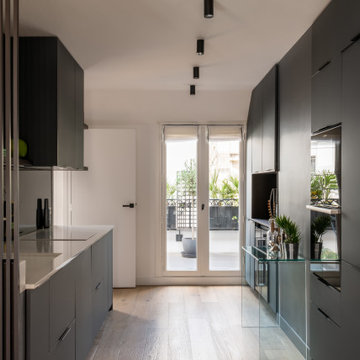
Cet appartement de 100m² acheté dans son jus avait besoin d’être rénové dans son intégralité pour repenser les volumes et lui apporter du cachet tout en le mettant au goût de notre client évidemment.
Tout en conservant les volumes existants, nous avons optimisé l’espace pour chaque fonction. Dans la pièce maîtresse, notre menuisier a réalisé un grand module aux panneaux coulissants avec des tasseaux en chêne fumé pour ajouter du relief. Multifonction, il intègre en plus une cheminée électrique et permet de dissimuler l’écran plasma ! En rappel, et pour apporter de la verticalité à cette grande pièce, les claustras délimitent chaque espace tout en laissant passer la lumière naturelle.
L’entrée et le séjour mènent au coin cuisine, séparé discrètement par un claustra. Le coloris gris canon de fusil des façades @bocklip laquées mat apporte de la profondeur à cet espace et offre un rendu chic et moderne. La crédence en miroir reflète la lumière provenant du grand balcon et le plan de travail en quartz contraste avec les autres éléments.
A l’étage, différents espaces de rangement ont été ajoutés : un premier aménagé sous les combles avec portes miroir pour apporter de la lumière à la pièce et dans la chambre principale, un dressing personnalisé.
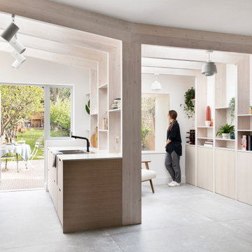
Amos Goldreich Architecture has completed an asymmetric brick extension that celebrates light and modern life for a young family in North London. The new layout gives the family distinct kitchen, dining and relaxation zones, and views to the large rear garden from numerous angles within the home.
The owners wanted to update the property in a way that would maximise the available space and reconnect different areas while leaving them clearly defined. Rather than building the common, open box extension, Amos Goldreich Architecture created distinctly separate yet connected spaces both externally and internally using an asymmetric form united by pale white bricks.
Previously the rear plan of the house was divided into a kitchen, dining room and conservatory. The kitchen and dining room were very dark; the kitchen was incredibly narrow and the late 90’s UPVC conservatory was thermally inefficient. Bringing in natural light and creating views into the garden where the clients’ children often spend time playing were both important elements of the brief. Amos Goldreich Architecture designed a large X by X metre box window in the centre of the sitting room that offers views from both the sitting area and dining table, meaning the clients can keep an eye on the children while working or relaxing.
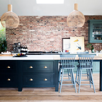
Amos Goldreich Architecture enlivened and lightened the home by working with materials that encourage the diffusion of light throughout the spaces. Exposed timber rafters create a clever shelving screen, functioning both as open storage and a permeable room divider to maintain the connection between the sitting area and kitchen. A deep blue kitchen with plywood handle detailing creates balance and contrast against the light tones of the pale timber and white walls.
The new extension is clad in white bricks which help to bounce light around the new interiors, emphasise the freshness and newness, and create a clear, distinct separation from the existing part of the late Victorian semi-detached London home. Brick continues to make an impact in the patio area where Amos Goldreich Architecture chose to use Stone Grey brick pavers for their muted tones and durability. A sedum roof spans the entire extension giving a beautiful view from the first floor bedrooms. The sedum roof also acts to encourage biodiversity and collect rainwater.
Continues
Amos Goldreich, Director of Amos Goldreich Architecture says:
“The Framework House was a fantastic project to work on with our clients. We thought carefully about the space planning to ensure we met the brief for distinct zones, while also keeping a connection to the outdoors and others in the space.
“The materials of the project also had to marry with the new plan. We chose to keep the interiors fresh, calm, and clean so our clients could adapt their future interior design choices easily without the need to renovate the space again.”
Clients, Tom and Jennifer Allen say:
“I couldn’t have envisioned having a space like this. It has completely changed the way we live as a family for the better. We are more connected, yet also have our own spaces to work, eat, play, learn and relax.”
“The extension has had an impact on the entire house. When our son looks out of his window on the first floor, he sees a beautiful planted roof that merges with the garden.”
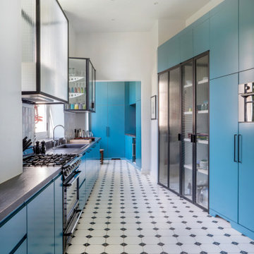
Rénovation d'une cuisine de château, monument classé à Apremont-sur-Allier dans le style contemporain.
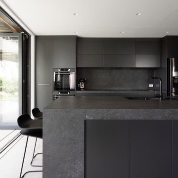
What was once a confused mixture of enclosed rooms, has been logically transformed into a series of well proportioned spaces, which seamlessly flow between formal, informal, living, private and outdoor activities.
Opening up and connecting these living spaces, and increasing access to natural light has permitted the use of a dark colour palette. The finishes combine natural Australian hardwoods with synthetic materials, such as Dekton porcelain and Italian vitrified floor tiles
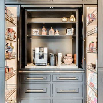
A close up view to the multi-function coffee bar and pantry which features:
-A custom slide out Stainless Steel top extension
-Lighted pull-out pantry storage
-waterproof engineered quartz top for the coffee station.
-Topped with lighted glass cabinets.
-Custom Non_Beaded Inset Cabinetry by Plain & Fancy.
cabinet finish: matte black
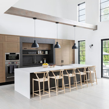
A playground by the beach. This light-hearted family of four takes a cool, easy-going approach to their Hamptons home.
Galley Kitchen with Black Appliances Design Ideas
7
