415 Home Design Photos

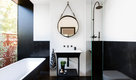


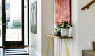
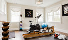

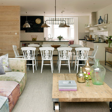
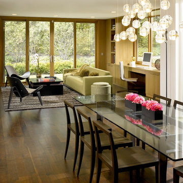
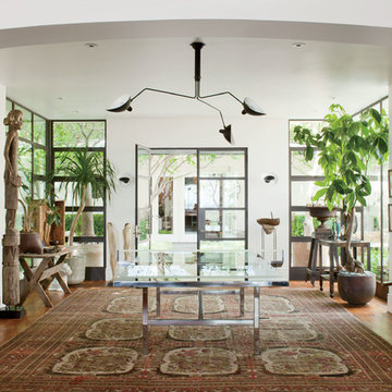
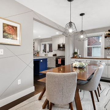
The lower ground floor of the house has witnessed the greatest transformation. A series of low-ceiling rooms were knocked-together, excavated by a couple of feet, and extensions constructed to the side and rear.
A large open-plan space has thus been created. The kitchen is located at one end, and overlooks an enlarged lightwell with a new stone stair accessing the front garden; the dining area is located in the centre of the space.
Photographer: Nick Smith
Restoring delight to a mid-century modern for avid art collectors.
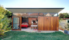
This home was once state-of-the-art, but had strayed from its original design aesthetic over the course of several updates and poorly planned additions. The owners wanted to restore a sense of spatial harmony as well as create a backdrop to showcase an extensive art collection.
Gutting the home allowed us to structure a flowing, open floor plan and add several extensions, including an expanded kitchen, complemented by an informal dining and play space for grandchildren. To create a visual and actual connection between indoor and outdoor living areas, we installed floor-to-ceiling picture windows and nearly invisible doors.
To complete the cohesive remodel, the house was updated with all new appliances, cabinetry, hardware and unique modern elements – including a family room with quartered, figured walnut wall panels and a front door that hinges to allow a 180–degree operating radius. And, finally, each magnificent art piece was given its own, perfect setting.
Aesthetic and functional cohesion was so successful that this sleek and stunning home was featured in a Trends article.
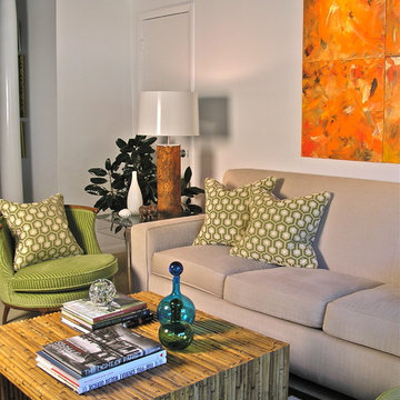
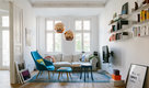
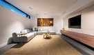
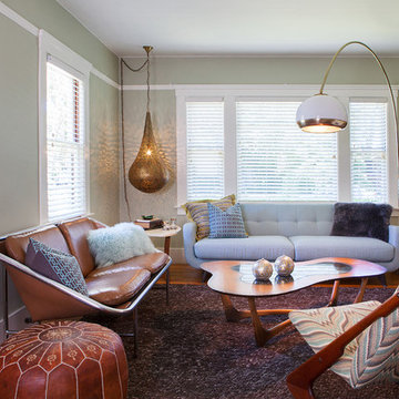
For this room we maximised the client's resources by updating the existing sofa and armchair with new cushions. We sourced a vintage armchair and Ercol coffee table, and repurposed a dresser from the guest bedroom, turning it in to a TV and media storage unit. The room was brought together with a new rug, plants, art and accessories,
This beautiful project features Coronado Stone Products Adobe Brick thin veneer. Adobe Brick thin veneer is not a structural brick, so it can be directly adhered to a properly prepared drywall or plywood substrate. This allows projects to be enhanced with the alluring look and feel of full bed-depth Adobe Brick, without the need for additional wall tie support that standard full sized Adobe Brick installations require. This Adobe Brick product is featured in the color Sienna. Images were supplied by Standard Pacific Homes, Phoenix. See more Architectural Thin Brick Veneer projects from Coronado Stone Products

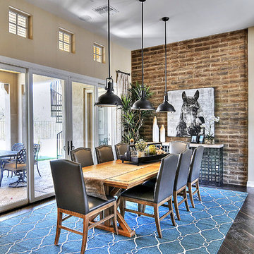
The residence received a full gut renovation to create a modern coastal retreat vacation home. This was achieved by using a neutral color pallet of sands and blues with organic accents juxtaposed with custom furniture’s clean lines and soft textures.
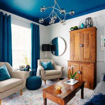
Heidi Pribell Interiors puts a fresh twist on classic design serving the major Boston metro area. By blending grandeur with bohemian flair, Heidi creates inviting interiors with an elegant and sophisticated appeal. Confident in mixing eras, style and color, she brings her expertise and love of antiques, art and objects to every project.
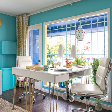
My husband added brass hairpin legs to inexpensive computer desks with laptop compartments, integrated power strips and cord cutouts. Mike Z Designs created a custom wooden box to hide the ugly in-wall AC unit. The front panel slides out to allow the unit to operate.
Photo © Bethany Nauert
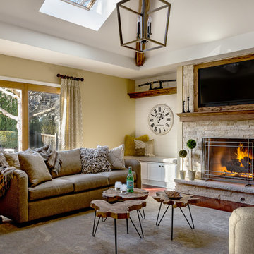
We replaced the brick with a Tuscan-colored stacked stone and added a wood mantel; the television was built-in to the stacked stone and framed out for a custom look. This created an updated design scheme for the room and a focal point. We also removed an entry wall on the east side of the home, and a wet bar near the back of the living area. This had an immediate impact on the brightness of the room and allowed for more natural light and a more open, airy feel, as well as increased square footage of the space. We followed up by updating the paint color to lighten the room, while also creating a natural flow into the remaining rooms of this first-floor, open floor plan.
After removing the brick underneath the shelving units, we added a bench storage unit and closed cabinetry for storage. The back walls were finalized with a white shiplap wall treatment to brighten the space and wood shelving for accessories. On the left side of the fireplace, we added a single floating wood shelf to highlight and display the sword.
The popcorn ceiling was scraped and replaced with a cleaner look, and the wood beams were stained to match the new mantle and floating shelves. The updated ceiling and beams created another dramatic focal point in the room, drawing the eye upward, and creating an open, spacious feel to the room. The room was finalized by removing the existing ceiling fan and replacing it with a rustic, two-toned, four-light chandelier in a distressed weathered oak finish on an iron metal frame.
Photo Credit: Nina Leone Photography
Mid Century Condo
Kansas City, MO
- Mid Century Modern Design
- Bentwood Chairs
- Geometric Lattice Wall Pattern
- New Mixed with Retro
Wesley Piercy, Haus of You Photography
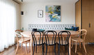
Vintage furniture from the 1950's and 1960's fill this Palo Alto bungalow with character and sentimental charm. Mixing furniture from the homeowner's childhood alongside mid-century modern treasures create an interior where every piece has a history.
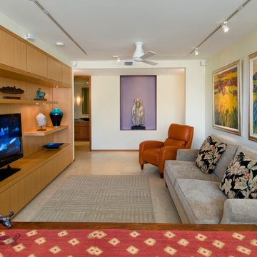
Custom cabinets are the focal point of the media room. To accent the art work, a plaster ceiling was installed over the concrete slab to allow for recess lighting tracks.
Hal Lum
415 Home Design Photos
2