Dulux Antique White USA - Yay or nay?
We are renovating our QLDer cottage and I am looking for an interior white for the walls. The builder has suggested Antique White USA, which I quite like, but there are reports that it throws yellow - which I DON'T like! Any feedback and/or your pics would be appreciated.
Comments (54)
 PRO
PRODan Kitchens Australia
9 years agoAntique White USA is very popular but we still warn our customers that it has a bit of yellow in it. Natural White is much safer.
Alisha E
9 years agoWe recently had the "white" dilemma and were suggested antique white also. We ended up going dulux whisper white - absolutely love it !! As I didn't want that yellow/warmth as we were renovating our kitchen and it was going to be white,white. The other white we really liked (but can be quite stark) is lexicon quarter strength white. Both have a grayish base and look amazing under daylight/cool white lights
suzwill
9 years agoVivid White is as white white as you can go. It doesn't throw blue or yellow. It's just white.bargainhunter
9 years agoI agree with NB Interiors.be different! I think all of Australia is painted in those whites mentioned!
Mandy
9 years agoDulux have a great app you can download. You can search for the shades of white you like capture the images and compare the different shades side by side.pallen100
9 years agoThe Dulux app is excellent! Thanks for sharing it.
I am repainting a small unit with whites. My unit is very small and I want to make it appear more spacious and light.
Should the ceilings and walls be the same white or would variations in whites be better?pallen100
9 years agoAfter much research it seems to paint the ceiling white and the walls a warm white will give the room more spaciousness. I am thinking Vivid White for the ceiling and maybe First Love Quarter for the walls.
Not so keen to go with yellow or grey whites.
Donna Todd
9 years agoPallenn100 good luck with your choice, I have a light grey carpet to contend with in a 1970 fibro place with low ceilings so vivid white with maybe lexicon 1/4 strength.
Jackie Pye
9 years agoI am a real estate agent as well so see many shades of everything!! Not always good!! I notice some whites stay white on walls but when it comes to timber they yellow because of the natural oils coming through. It hasn't happened with our paintwork because of the drop of black in the paint. Just sayen...
Josephine OLeary
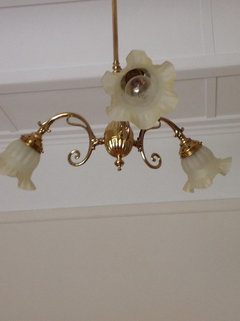
8 years agoHave recently painted our 1900's house USA Antique White but went with double strength for our formal lounge. It definitely has more warmth. This colour is get if you are putting up large scale artwork. We are very happy with the job our professional painter did. First time I haven't done it myself. BTW no yellow that I can tell. The hallway is single strength with white ceiling and second photo is formal room double strength.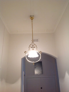
Vee
8 years agoI'm experiencing the white-on-white dilemma at the moment.
My previous house I painted Vivid White on ceilings and 1/4 Lexicon on walls (the exterior of the house was a darker grey and white trims).
My new house I am starting to renovate currently has Antique White walls and Vivid White ceiling and trims. I can definitely see a yellow warmth to it.
Dulux should be able to help. Check out their colour atlas on their website.Joanne Fosdike
8 years agoJust spent yesterday having this conversation with local paint store! The whites I was looking at - think antique and white on white - had yellow in the base which projected when put next to the Gray linen I am planning for the bed (I hate whites that throw yellow). We opted for full strength Lexicon as the blue/blacks in the base look white against the grey. Remember when white was just white?Vee
8 years agoI've chosen White on White for the ceilings on my new home - just have to find a warm white (without the yellow/red undertone).
Check out the pics: White on White on the ceiling (new) and the older Antique White on the walls. Also a pic of White on White on Ceiling, old Antique White behind + (L-R) Lexicon, Lexicon 1/2, Lexicon 1/4.
Lexicon will definitely not throw yellow - goes will with greys. :)
Mim Simpson
8 years agoI went with antique white USA using the Dulux brand base, if you use a different brand base paint the colour may not turn out the same. My wall and ceiling are in the Antique white USA absolutely no yellow in it. Also be sure it is "Antique white USA" not "antique white" as antique white is yellowish. If you are looking for a more cool white then Dulux lexicon or white duck are good choices.Mim Simpson
8 years agoVee the Antique white does look yellowish in your photo. Have a look at white duck half or quarter. I painted in a house about 2 years ago and looked good goes with grey, I see it is in the latest Dulux brochure.warestreet
8 years agoIt actually has red undertones. Usually is suitable for older houses but the light is different in every house so you can't be prescriptive. Dulux colour designer.
User
8 years agoWe painted our 1954 high set home's dining room in Antique White USA. I immediately saw both red and yellow and my husband saw yellow. I found the red'ish tones uncomfortable to live with. The tone varied throughout the day and night depending on lighting. We think it looks old fashioned and wouldn't use it again. PRO
PROWerribee Joinery
7 years agoWhat shade of white would you guys recommend with a light floor boards.
We were going with antique white Usa
But now not sure due to the house not having much natural light.
Advice much appreciated.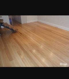

theamazingmisssharon
Original Author7 years ago@Werribee Joinery. After this post, and the great suggestions, ended up going with Natural White on the walls and 1/2 strength Natural White on the roof. It is such a great colour and just absorbs the colours around it so it goes with everything. We had light coloured tiles in our new living room, floorboards in the original part of the house (a QLDer), and carpet in the bedrooms and it was the perfect colour for all of it! I wouldn't hesitate to use it again. Good luck!Sharon
7 years agoAs to whether it throws yellow depends on many things: other colours in the room, whether it's a dark or light room, the size of the room and direction the windows are facing.
From my experience it looked pink in some rooms and more yellow in others. For example in a room with golden oak coloured gloss floorboards, it picked up yellow and in another room next to a mauve grey, it looked pink. Antique white USA is very 1990. Personally I like Dulux natural white. It still looks white but not as stark as the vivid white base.
Italian Girl
7 years agoI am thinking of doing my new home (modern style) in Natural White and the ceilings in Vivid White.
Definitely WON'T be doing Antique White - Too many reviews says it throws yellow. No thanks!!
Have not read any negative reviews on 'Natural White' anywhere :)
Ann B
7 years agoTribbletrouble, do dogs harm grape vines, even just ornamental vines? I am unaware of this. Pls advise. Thx!zaffa
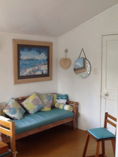
7 years agoI had this same dilemma. Natural
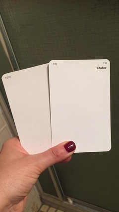
White threw pink and yellow tones in our house. We had a Dulux colour consultant come out and she recommended Snowy Mountains Quarter which, according to the A4 swatches she had, is perfect for our place. Apparently it is a relatively new colour and according to her is the 'new Natural White'. See pics. SMQ on left in first pic and on right in second pic. It is compared to Natural White. See what I mean?
Benny S
7 years agoYes there is a difference
I think we are locked in for cabinetry with natural white ... now for stone ...ahhh decisions.. like qq new diamond white.. we have a 1950s house with lots of timber floors ..excuse house love renos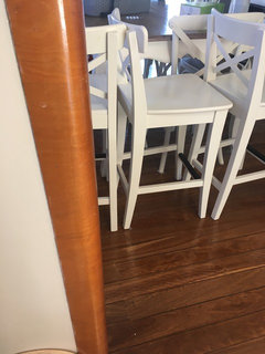
Italian Girl
7 years agoI'm having so many dilemmas with my house tile at the moment!! Please go to my latest post and help me out....I will check out Snowy mountain colour on the weekend now..Thanks 4 that :)
zaffa
7 years agoWill do. Make sure you check out Snowy Mountains Quarter (not Snowy Mountain). Who would've thought white was so difficult!!??Sharon
7 years agoI have used Antique White USA before. it throws yellows and pinks...depending on your room direction, whether you have Natural or artificial light and the other colours in the room and bouncing off it. Eg. warm golden timbers will make it seem more yellow. Personally I like Dulux Natural White.Ruth thompson
7 years agolast modified: 7 years agoI have coloured patches all over the house and thinking natural white might be best compromise although in one room it looks pinkish. But what colour for trim please.. in kitchen vivid white? But other rooms? Help gratefully received thank you....
darewing
7 years agolast modified: 7 years agoRuth, Natural White and Vivid White was shown by Houzzer @hagan_38 when I was asking the same question.
Natural White and Vivid White trims.. Heres a link to help you through it!
[https://www.houzz.com.au/discussions/wall-colour-and-kitchen-colour-dsvw-vd~4026962[(https://www.houzz.com.au/discussions/wall-colour-and-kitchen-colour-dsvw-vd~4026962)
nindhi
7 years agoOn this thread re whites has anyone had any experience with Casper white? For whatever reason this white appeals to me. Walnut timber tones in house. Thanks in advance.girlguides
7 years agoAntique white is more rose than yellow and in dark contemporary spaces can look grey natural white even more greygirlguides
7 years agoI liked look of Casper white a lot but it's a tad cool so went white polar quarterCreativelychallenged
7 years agoI have used Antique White USA 1.5 strength (never would do Antique White because it throws too much yellow/cream), have used Natural White and again was recommended Snowy Mountains Quarter by a Dulux Colour consultant. The Antique White USA does definitely throw a very slight "salmon" shade due to the amount of red in its base. It still looks good and is warm, and may be good in an old Queenslander style of house. It does still have a neutral look to it, but I wouldnt do it again. The Natural White I have in the bedrooms and hallway of my current house and it works well, but can look a little dirty again very white furniture (in my opinion). I have the Snowy Mountains Quarter in the living room and kitchen and I absolutely love it. I always wanted to have a house where the mixed hardwood floor and the walls were the base and then the pops of colour are added through artwork and accessories. Snowy Mountain Quarter achieves this perfectly. It is a warm colour (as compared to Lexicon quarter which is cool), but at same time, it seems to match with every colour I put with it. I have timber in the room that ranges from yellow tones, red tones, dark brown tones and this paint colour matches perfectly with them all. Also when I have had towels to be folded in the room, it seems to match with anything from mauves, citrus yellows and oranges, charcoals, beige, reds, etc etc. I only was put on to this paint colour after have the plasterboard base coat on the walls for a long period of time and liked its freshness and the amount of light that was kept in the room. I asked the colour consultant to recommend a top coat colour that was similar (also because the Natural white look a bit "dirty" and a little bit yellow against my neutral white kitchen cabinets)..........The only colour I will use on walls now when I am look for a "white" will be Snowy Mountains Quarter. Dulux should give us commission for all our recommendations of their paint colours!!!! :o)
Kel B
7 years agoI also liked Antique white USA but my color consultant said to use 'Natural White'. We went with her advice and absolutely love the colour.

susan
last yearI've had my place all painted natural white .. not happy as it's peachy colour .. I will doing a room at a time ..this snowy mountain quater ,what is the tints in this paint .so wanting the edge of vivid white for a coastel look
bigreader
last yearI’ve not seen Dulux Natural White described as peachy. What colour has it gone over? Are you sure you got the right tint? Having said that, it isn’t a crisp white. If you want something sharper try White on White. Or stark white, then as above Vivid white. Also as suggested Snowy Mountain 1/4 is very popular for a neutral white.
Sharon
last yearAs with any colour, you have to consider how other colours in the room with impact. This is particularly so with white. For example the hue in floorboards and floor coverings will reflect off the white and impact the final result as will, room direction and seasons.
For natural white to look peachy, there must be other factors at play, for example, golden tone flooring with a room facing daytime sun (north in southern hemisphere or south in northern hemisphere.)Marylee H
last yearAll these colours belong to the warm side of the Yellow Hue Family.
From top to bottom, we are moving from warmest to coolest.
The closer a colour sits to the Yellow-Red Hue Family, the more chance that a peachiness to its warmth will be discerned. This can be exacerbated by available light quality & context.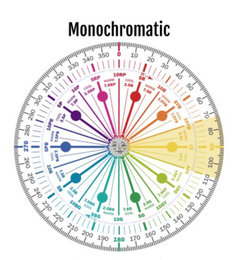


Vee
last yearAnd, if you have anything warm coloured in your surrounding areas it will reflect on to your walls e.g. light coloured floor boards (often varnish will turn yellow with age esp. visible on light timbers). So opt for cooler versions of any colour you decide on, to counteract this.

Ishaan Kamal
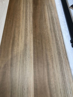
last yearAny suggestions please over Natural White, Snowy Mountain Quarter or Antique white for a warmer house and to go with this flooring.Thanks
Vee
last yearI'd try some sample tubs. It's the best way to know for sure how a colour will reflect the colours of your home surroundings. You can even paint each one on white board and hold up against each of your walls.
bigreader
last yearDulux make it easier these days. You can buy from their website, A4 samples that are like big post its. You can move them around the room and the house.


N.B. Interiors