

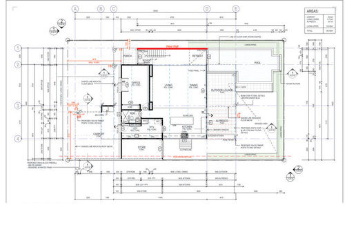
West Side Wall Issue
8 years ago
Featured Answer
Sort by:Oldest
Comments (16)
Related Discussions
1940's NZ kitchen - small, awkward-ish layout.
Comments (121)I would suggest you take out the cabinet that is to the right of the stove and use it elsewhere in the house -- perhaps in the bathroom or dining room with a hutch above it. Then, I would suggest you have someone install a lazy susan cabinet in the corner between the sink counter and the stove, meaning you would move the stove down a bit and have a small cabinet/counter top to the right of the stove. I would suggest you have the cabinets refinished in white and then paint the walls a pastel you like. If you would prefer white walls, then add white-painted crown molding and paint the ceiling a light neutral blue, such as Sherwin Williams Niagara Falls Blue. Then, I would suggest you choose a favorite accent color and use this sparingly in accessories like towels, pot holders, small vases or floral arrangements, and a valence above the triple windows. For a genuine 1940s look, you might have white ceramic square tiles with a rectangular red border installed as a back splash behind and above the stove. If you are replacing counter tops, I would suggest a light color such as white with a beige or light grey vein or striation for some sort of pattern. You might be able to find the same color and design in floor tile OR opt for a wood floor as another poster suggested....See MoreANY SUGGESTIONS PLEASE WITH MY LONG DARK HALLWAY
Comments (5)Hi eclipse 66 I'm sorry to hear about your break in. This is quite tricky to picture as I wasn't certain which walls related to which, but I will give this a go. I wonder if your ceilings are around the 2.4mtr mark, as your doors suggest. Although you have many windows that are probably floor to ceiling, each room is sectioned off by this central corridor, so no real natural light gets down there, is that right? The little natural light that might filter through would be absorbed by the walls, and the colour you have on these walls would not be easily seen. Without. Sounding too mainstream here, I would absolutely paint an offwhite wall the entire corridor and each adjoining living area off that, with exception to your kitchen. All ceilings purest ceiling white along with the window frames and all internal doors. The walls in a satin finish to help the light reflect a little, and move around the wall without being too shiny. You haven't mentioned your floor? Try to keep it consistent in all the living areas including your hallway, and only carpet the bedrooms as these doors would be closed often. With the door filled hallway being a white gloss finish, and a white ceiling in a flat white, the walls will feel a little warmer in comparison, although still a white, perhaps something like a hog bristle 1/4 strength by dulux. In your main living room, and kitchen, paint the hog bristle in full strength, so it feels warmer, as these spaces flow onto each other, feeling larger as a whole. With your doors being so tall, (or the ceiling being comparably low), hang your window rods if any right at ceiling level, use a sheer curtain that even when partly closed let's light filter through, they dress the window but won't block light, for that install roller blinds that will roll right up exposing as much daylight as possible, and if privacy is a factor, the sheer will provide a buffer and still seem light filled. Even if these are never used, framing the window will place an emphasis on the window frame, and more importantly the light they provide, swell as an illusion of vertical space even without it. Aother suggestion for that hall is to use this principle to heighten the ceiling, visually, is to use lining boards vertically, or a wallpaper with a strip or vertical print. Drawing you eye upward toward the end, with a wallpaper, I'm thinking of one I've seen many times over, it's a white or cream background, with an image of birch trunks, the base or top of the trees arent revealed in the picture so it doesn't make the space feel from a low or high perspective. This would provide a creative distraction to the corridor, evoke a feeling as you have walking through a beautiful place, and is graphic but still very neutral. You can even paper you doors so when they're closed, the hallway won't feel so busy. I would remove carpet in the hall if you have any, because a warm closed in space without proper airflow, or light feels stuffy, and carpet absorbs sound and lint, where floorboards or hard surface atleasts has a sound walking down it, which amplifies noise and feels bigger again by comparison. Against this neutral, cohesive space, your furniture andpersonality pieces can really stand out, particularly the red. I would also use this in the kitchen somewhere, maybe a gingham check fabric on the kitchen window or just your accessories. The less is more theory also extends to colour, particularly in smaller busy spaces, minimize these elements, like the repeat of doors and architraves on your walls, by tying them in with single colour, and keep your decorations either in a theme or single colour hue. Scatter your colour around so visually you have somewhere your eye is drawn to around the space. If you get pictures I will know if I'm way off track, but if any of them resonate with you, then great. Good luck. Ml design...See MorePlease critique our house plan
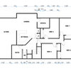
Comments (17)Thanks Mel. We'll see what we can do to make the rumpus enclosed - it's probably more of a "man cave" at the moment :) Grandad had a dining table in his current place (which is bigger) and got rid of it because he never used it. He also wants more bench space than he currently has. So, this was a deliberate choice rather than a compromise due to lack of space. You've reminded me now that someone did warn us earlier in the design process about the back and forth between wardrobe and bathroom becoming annoying over time. We don't currently have an en suite so it feels wonderfully convenient for us by comparison. However, that feeling will change if we realise it could have been even better. We did have the en suite off the wardrobe in some designs but have been warned this can lead to dampness in your clothes no matter how well ventilated the bathroom is (especially in Auckland's humidity). Would love to hear people's experiences of this configuration - good and bad. On top of that, there are lovely private bush views to the south so we've tried to make the most of those....See MoreHelp with 1960s kitchen design
Comments (4)Possible suggestions if sticking to same floor plan and hands firmly glued to the budget Leave the stove where it is. Down the side of the stove securely attach slimline fireproof panelling to the height of the oven's back control panel and the depth of the oven. Floor to ceiling if you prefer then if you wanted to you could change out the door itself, that is put the door handle to the right of the door so it swings back flush with the fireproof panelling. Put the dishwasher under the stainless steel bench top left of the sink. Take all the cabinetry out where the dishwasher is currently housed place the fridge in the centre of that wall building functional cabinetry around it. Get rid of the cupboard at the end of the stainless steel bench replace it with a wheeled butchers block the same width and depth of bench also have hinged sides so you can get extra useable bench top surfacing. You could then wheel it around include brakes on it of course so little hands don't go racing around with it....See More PRO8 years ago
 PRO8 years agolast modified: 8 years agoGravityC thanked Paul Di Stefano Design




ddarroch