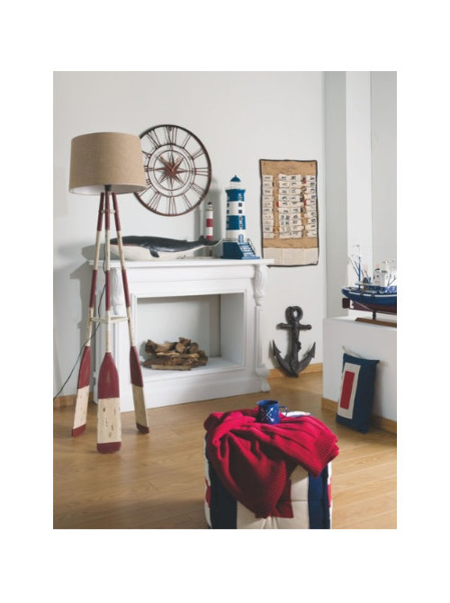
Describe coastal interior style ... in just one word
HouzzUK
5 years ago
last modified: 5 years ago
Featured Answer
Sort by:Oldest
Comments (56)

chicdub
5 years ago
E D
5 years agoRelated Discussions
Is my beach house too blue
Comments (56)It's refreshing to see nautical, navy BLUE. Everyone is saying the same thing for the most part - just introduce another color, definitely bright (yellow or orange IMO) and it will make it more current. What I really like is how your style will withstand the test of time - and with minor updates now and then it will always look fresh and "current"....See MoreHelp to make front porch more welcoming
Comments (47)Thank you so much for your comment after all this time. The colour you have suggested brightens the front door area beautifully and if the two red pots were painted in a tone to match, we think it would look great. Not sure if you can get Crestview doors in New Zealand but there must be something similar. We like the idea of going away from another cedar door - mainly because it would stand out too much while it was weathering. I don't know whether we would have been that brave but the tangerine works so well with the jade green of the joinery. I have re-laid all the stones and put a new wider front step in. The timber colour will soften down in time. I put a big pot in the garden to draw visitors to the front door and have added some colourful bromeliads to the garden alongside the house to make the area a bit more cheerful. We can't make a decision about what to do with a larger 'overhang' to protect the front porch yet - it is a project in progress. Thanks again for your post....See MoreThe influence of light both natural and artificial light..how to use
Comments (8)Hello Lisa..thanks for your comments - so kind of you. The pictures are not good (sorry) and to be honest whilst I'm renovating I don't have the courage the post much at all ..well at least until it's finished but here are a few enclosed. My real idea is to get a discussion going that we might all enjoy. and yes how light strikes (as in angle?) can impact on even the paint colour etc. I see so many questions from readers about wallpaper paint colour etc and yet experts and skilled people such as yourself will know that it's the cohesion that has to work and light can play such a huge part. A wallpaper can be purchased and then prove disappointing if used in different a light as can paint - which is why we use your good services where possible! I've a pile of boards each with different colours (I use linen style artists boards as I can shift them around - I leave a white border on them to allow a suitable contrast) The small bedroom picture with the striped curtains was more to show that curtain colour - it's now blended with duck egg blue paint (sorry it's a New Zealand company called Resene's so it won't be known of there but called Robin's Egg Blue), ivory carpets which I had edged in a green/blue wool. Before these drapes (Laura Ashley) were in a different room and just didn't work. The bedroom hasn't been finished (See? I'm still a tad embarrassed) but I mentioned these as with incandescent lights this curtain colour did not work at all. Taking my courage in both hands and uploading a picture of the main living area which is to be painted next to do away with the strong saturated green..very dark and gloomy as the natural light is very limited. Hoping you can't see the paint splotches on the wall. Another lesson I learned is to paint a surface white and THEN paint the choices. If we don't do this the original surface colour 'bleeds'. So I really hope to have others including myself recognise that we have to have one eye to the climate and outdoor colours all the time as well as the same paint colour possibly being different from room to room. Regards...and thank you once again for taking the time to reply....See MoreDescribe Scandinavian style in one word
Comments (5)I really like the white chairs with the metal cross over and wooden legs. You put some on a post together with bar stools to match just recently. Would luv some of these. Luv the whole look of wood and white or soft blue, calming, uncluttered, and simple beauty. I wouldn't mind some ideas on helping open airy and large spaces look a little more cosy tho', without moving away from the general feel, just adding a little bit of cosy. I'll be working on this one over the next few years for sure....See More
rachelmidlands
5 years ago
Daisy England
5 years ago
Bianka W
5 years agominipie
5 years ago
Chris Goodchild
5 years ago
Juliet Docherty
5 years ago
Ana Martin Fiestas
5 years ago
Nathalie L
5 years ago PRO
PROOrigin - Doors and Windows
5 years ago PRO
PROLima Kitchens
5 years ago PRO
PROamordesigns
5 years ago
Resh
5 years agoResh
5 years agoResh
5 years agoT Gray
5 years agochapss89
5 years ago
Ian Pierce
5 years ago PRO
PROWoodka Interiors
5 years ago
Ribena Drinker
5 years ago
Karen Deakin
5 years ago
Sue K
5 years ago
Rebecca O'Regan
5 years ago PRO
PROBurgess Kitchens Ltd
5 years ago PRO
PROBathroom + Kitchen Eleven
5 years ago- PRO
Burgess Kitchens Ltd
5 years ago  PRO
PRO'Fencasa' Net Curtains Direct Ltd
5 years ago PRO
PROModelight
5 years ago PRO
PRORCD DESIGN
5 years ago PRO
PROEdward Pett Design
5 years ago PRO
PROPfeiffer Design
5 years ago- PRO
Burgess Kitchens Ltd
5 years ago - PRO
User
5 years ago E D
5 years ago- PRO
Burgess Kitchens Ltd
5 years ago E D
5 years agoKittihawke
5 years agoRuth Galloway
5 years agowendy Anderson
5 years ago
KC
5 years ago PRO
PROAnglian Home Improvements
5 years ago PRO
PROdecHouse Designers
5 years ago PRO
PROAgence KP-Architecte d'intérieur
5 years agoEmily O'Byrne
5 years ago
suze1992
5 years ago
Sam Potter
5 years agodonut99
5 years ago
MMD
28 days ago


E D