houzzaupolls

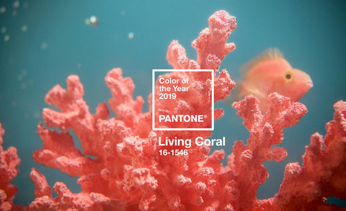
POLL: What do you think of Pantone's 2019 Colour of the Year?

HouzzAU Polls
5 years ago
last modified: 5 years ago

Pantone has just announced its colour of the year, Living Coral. Read what the experts have to say here.

Vote and tell us your thoughts in the comments below.


COY2019 · More Info


I love it!!
Ok, but not great.
I don't like it.

Comments (19)

  • PRO
    MB Design & Drafting
    5 years ago

    Last years colour was good but I preferred the 2017 green.

  • Luke Buckle
    5 years ago

    It's very early 1990s

  • bigreader
    5 years ago
    Pretty but not really for me.
  • cloudpants
    5 years ago
    I don't usually like the Pantone Colour of the Year and this one is no exception.
  • littlethommo2 .
    5 years ago

    I have only just seen it and already Im sick of it!

  • glenda moran
    5 years ago

    i wear this colour pink/apricot all the time! finally i will be "in"

  • Maree Wallish
    5 years ago

    I have coral in curtain headings, two side chairs & scatter cusions. When mixed well with other colours, it is very warming.

  • PRO
    Paul Di Stefano Design
    5 years ago

    roll eyes

  • Carol Gunn
    5 years ago

    It reminds me of my grandmother corsets from 40's & '50's - remember them with the bones and laces - they always seemed to be this colour.

  • mjbevilacqua
    5 years ago
    Love this! I think of ruby grapefruit, pink sapphires and rosè!
    And as the photo suggests, easy to team up with other citrus colours, teals and turquoise pinks etc.
    Zingy and fresh and fun. But like all trends, if you don’t like, simply avoid!
  • Swa Neee
    5 years ago

    Everything Old is New again...if only that worked in human ageing :(

  • PRO
    signarture
    5 years ago
    last modified: 5 years ago

    Wow, what an even split across the votes to date!

    For those of you that love it and like to incorporate the latest on-trend colours into your décor, accessories such as scatter cushions and artworks are an ideal medium. We created a selection of abstract artworks that hero coral


    As mjbevilacquasays, it is complemented well by pinks and turquoises.


    signarture 'lhotse' abstract perspex / plexiglas artwork in coral and pink · More Info


  • minerva000
    5 years ago

    Sadly, it reminds me of the 80's when bathroom fixtures were a sort of "peach/apricot" colour, along with "avocado"...You can always tell a bathroom that needs an update from the "colour" of its fittings!

  • macyjean
    5 years ago

    I like it. I would wear it but I have difficulty picturing it in home decor. It says beach house to me and could be lovely for something like that, vibrant and cheerful and relaxed.

  • Kim Westwood
    5 years ago

    Sorry but I am not impressed it reminds me of my first house in early 80's. Then I used it again in early 90's throughout, why, I dont know. Now I am much happier with antique white.

  • Double D
    5 years ago
    Makes me hot just looking at it. Not for me, I prefer a more calming colour.
  • PRO
    Helenscolour
    5 years ago
    ‘Living Coral’ looks amazing with red brick tones which are becoming popular again. It’s a very rich combination giving the bricks new life!
  • PRO
    Helenscolour
    5 years ago
    ‘Living Coral’ looks amazing with red brick tones which are becoming popular again. It’s a very rich combination giving the bricks new life!