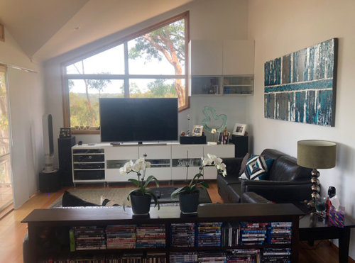
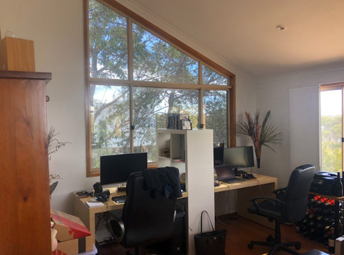
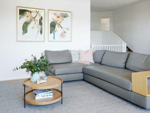
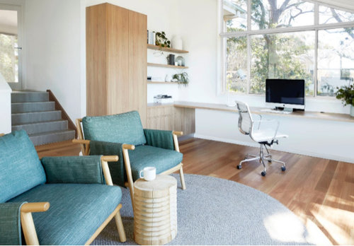
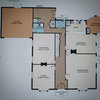
Before & after: A multi-purpose living room
McMillan Design
4 years ago
last modified: 4 years ago
Featured Answer
Sort by:Oldest
Comments (16)
 PRO
PROJamie
4 years agoRelated Discussions
How do I design my living room around this chandelier?
Comments (22)As chookchook said in her recommendation about painting, put a drop cloth on the floor. Get a very safe ladder. remove the lightbulbs, and cover the outlets. Turn off the electricity to the chandelier. Then spray it with a mild cleaner (I use one I found at Target that's basically water with vinegar, until it's dripping wet. Start at the bottom and work your way up, so you don't have dirty spray dripping on the bottom of the chandelier.Work your way up and down until the dripping spray is clean. The chandelier may be gorgeous and expensive, but it seems totally out of place in the architecture of the room--more at home in a chalet than a sunny room with a window wall. I would probably try to find a way to get it removed, and sell it to someone who appreciated it better than I....See Moreideas for lights for family room/play room in bungalow
Comments (8)Despite previous opinions I have to say this - DON'T GET DOWN LIGHTS!!!! We had them in our previous home. They were constantly blowing no matter what kind of bulb used. The casings kept breaking. This meant we couldn't just change the bulb ourselves. It drove me mental. They spotlight certain parts of a room instead of lighting the whole room so when one of our main "culprits" kept blowing in the kitchen, I had no lighting above that bench until we could get an electrician in. More than one electrician told us they are a serious fire hazard. I will never have them again!...See MoreBoring powder room!
Comments (18)I would look at this room from 2 angles, in this order: convenience (as you have young kids and need everyone to be able to fully use it) and aesthetics. Equipment and accessories: #1 - first look at what is necessary to have in this bathroom: a place where to keep soap, toothbrushes, toothpaste -- all within easy reach for all users (including not-tall-enough kids) #2 - a cosmetic mirror ? #3 - a towel rail #4 - a small cabinet for storage Ideally, #1 should be stored directly on the sink, as it's lower, within easy reach for the kids (see below photo from one of our baths): You can do this also witha smaller sink, like the one we use in the half-bath: If you'd like to keep the one you have (which is really nice), you'll have then to use a shelf (as also suggested by someone else above), and I'd propose one of white porcelain and not one of glass, as it's a lot less reliable with children around. Below, an example of what I mean. The shelf should be installed as low as possible to be reachable by the kids, but also the mirror should be much lower, so that they can use it (much more interesting for them) without having it too low so the adults can't see themselves anymore. For #2 look on the left of the mirror in this photo (if you need it): A towel rail (#3) is absolutely necessary and make sure it's one where you can stretch the towel for faster drying (like the one in the 2nd photo). The cabinet storage (#4) could be placed on the wall from the right of the mirror, as you can see we have in our half-bath (also 2nd photo): Aesthetics: I agree that blinds on the window make no sense, light should be let to flow in as it's much needed in a bathroom. If you don't have time or disposition to paint the walls (and maybe they should remain white anyway, or a light color, because this is a small space), you might use decorations from your DYI center and stick them on the walls (see an example below from my daughter's bedroom, but there are other smaller ones for any kind of space): This way, the room becomes more attractive, more welcoming and more colorful (with very low cost). I hope this helps :-)...See MoreEclectic Elegance Villa Renovation
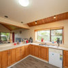
Comments (0)Brief: The client had purchased a 4 bedroom villa with large proportions. With white walls throughout, and very little existing furniture that the client wanted to keep, it was a blank canvas for design work in all areas of the house. A new kitchen was required to allow the client to enjoy cooking and house contemporary storage solutions. The client wanted to retain the integrity of some of the villa features, yet create a contemporary elegance which was different from a traditional take on design, and incorporated a quirky eclectic feel that could include reference to other eras. They wanted a sense of luxury and surprise incorporated into the design but didn’t want the traditional busy-ness of the Victorian era in which the villa was built but a more uncluttered simplicity. Newly purchased villa Solutions: With the entire house being white, and the existing black painted floorboards and grey carpet, a black and white base to the colour scheme was layered with accents of red and aqua, mixed with metallic silvers and charcoals. The starting point for this colour scheme was a painting the client had for the living area, which had a touch a soft aqua in it. (as pictured below) and we wanted to connect it into the room. A variety of depth of aqua tones were brought into the colour scheme to give it more depth but keep it restful. Existing art work The existing kitchen was dark and heavy and required a complete redesign, but had to fit with the existing large scullery area in behind it and incorporate all the modern storage within. The new design bought together pattern, texture and light. The cabinets above the hobs were printed with graphics on glass which incorporated a large scale traditional pattern and a touch of the soft aqua blue. This pattern on the glass uses a traditional emblem element and plays with scale to contemporise it. The main bench-top and cabinetry were kept light and white, to connect with the rest of the house, and an asymmetrical feature bench-top in Petra Grigio marble was added to balance the asymmetry of thehigh wall cabinetry on the back wall. The feature marble added interest and depth to the island. The high wall cabinetry was kept open on the right, to visually connect with the scullery rather than close it off. The splash back tiles on the back wall and tiles on the back of the island were heavily textured and played with the light to create a sense of interest and movement. The kitchen is situated in a south facing part of the house so it was important to consider reflectance, sheen, and the use of materials that added to the perception of light. The kitchen and scullery floor was also replaced with quirky tiles that played with light. To complete the area, high gloss black glass lights were hung over the island.These light fittings had a large base plate so the framing of the fretwork on the ceiling had to be enlarged to install them. The previous kitchen was flued through the roof on the kitchen side, we took it through the back wall and up through the scullery shelving in order to take it out of sight. The design off the kitchen allows connection to other areas so that while the kitchen is being used by the client, he can entertain at the same time. Before After The dining family area was open plan to the kitchen. A large American ash dining table with a charcoal stain was added with fully upholstered dining chairs, sitting on a custom designed rug. Contemporary cabinets in Resene Black-white sat on either side of the fireplace which had the hearth replaced in a black Basalt and a new gas fire retro-fitted into it. Contemporary chairs and small black leather and chrome side tables gathered around the fireplace sitting on a custom designed rug to provide a comfortable conversation space with out cluttering it with heavy furniture. All the fabrics and rugs pulled together the aqua, black and white colour scheme. Each chair around the fireplace was upholstered in a different luxurious velvet fabric, pulling together the traditional and retro elegance. Before After The formal lounge connected to the kitchen area and the back patio area of the house. The furniture was custom built for comfort and luxury. The fabrics incorporated velvets and texture, and the custom made rug added a high silky sheen to the room. Red was introduced into this area along with the aquas and the black -white base to bring warmth into a south facing room. A black basalt hearth was overlaid on the existing hearth, and the clients existing entertainment cabinet was recoloured to work with the scheme. A large traditional decorative silver framed mirror reflects back to the kitchen connecting the areas. This area provided the client with a spatial sanctuary, but also allowed for entertainment with the connection through to the kitchen and living areas. Before After The entrance hallway had large proportions. New hall lights were added that were made from a contemporary medium of black acrylic, yet were a modern take on a traditional chandelier. The pattern of these lights was reflected in the design of a custom designed hall runner. The scale of pattern oversized to enhance the proportions of the hallway and emphasis the contemporary feel. A touch of red was added in to bring interest into the colour scheme, you can see the formal lounge at the end of the hallway and the red leads you in. There is a real sense of an eclectic mix of scale and over the top luxury in this space. The rug allowed the client to have a warmth and softness on the flooring. To furnish the hall, we had to custom size a hall table so that the proportions worked. Before After The final result is a seemless transition from Victorian through to contemporary, connecting through a variety of design elements and creating the eclectic elegance the client was after. Check out entire project here!...See More PRO
PROMcMillan Design
4 years ago- PRO
McMillan Design
4 years ago - PRO
McMillan Design
4 years ago - PRO
McMillan Design
4 years ago


Kate