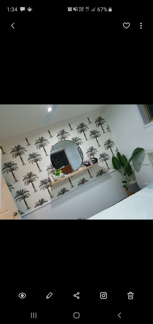
wallpaper dilemma
4 years ago
Featured Answer
Sort by:Oldest
Comments (8)
 4 years ago
 PRO4 years ago
Related Discussions
Need help with my lounge
Comments (2)Hi Tammy first time user had trouble loading photos have since posted a couple...See MoreNeed help with my lounge
Comments (1)Your space is quite roomy at almost 23 feet by 16 feet 5 inches. It would help us to see all four walls. Is this going to be an area where you will eat as well as watch TV? I would put in some recessed lighting: (I like the idea of painting the ceiling a light blue or yellow.) You need to have table lamps and or floor lamps as well. If those are light fixtures on the beam, I would remove them and repair the beam. Would you husband be open to staining the beams darker? Something like this: A fireplace mantel like the one in the Crisp photo would finish off the fireplace. With yellow and cream, you could go with warm colors, browns reds and oranges or blues and green....See MoreIdeas needed to finish the living room?
Comments (8)Mona you have seen exactly the dilemmas I'm facing with this room so I really appreciate your comments. I was focusing on no1, but really 2 and 3 are on my mind too. In terms of getting some continuity between the rooms I was planning on recovering the dining chairs in a fabric to tone with cushions/throws on the white couch, ottomans in a matching tone, and pulling this colour scheme through into cushions in the formal lounge. I love the spring colours at the moment (greens, blues etc) which you can see i'm playing with at the moment but you might be able to see the painting in the formal room which is orange, red and yellow with a blue/purple base. So I'm very keen on colour and so tired of the brown carpet and neutral walls. I was also going to restain the dining table and chairs to a dark mahogany colour, and change the bar stools to something more modern. re: rug closer to sofa, I've done this and it looks off-balance with nothing else in the space. It seems to work better in the middle of the carpet area at the moment. Perhaps thats because I haven't ordered the ottomans yet. I don't want to add a coffee table to this room as prefer Ottoman to put feet up on. I've attached a pic of a rug, do you think something like this would work better? re the wall: yes this is the major for me at the moment. It is a TV room so tv and speakers stay and I wont be adding any custom cabinetry. The idea was to increase the space in this room by removing all of the cabinets and they are now in the adjoining room. The speaker covers have not been painted as I needed to work out what wall covering to apply, and colour etc. so once they are painted the wall colour they will blend in better. The idea of shelving has merit, I'll have to have a think more about that... Any other thoughts you have are appreciated....See MoreThe influence of light both natural and artificial light..how to use
Comments (8)Hello Lisa..thanks for your comments - so kind of you. The pictures are not good (sorry) and to be honest whilst I'm renovating I don't have the courage the post much at all ..well at least until it's finished but here are a few enclosed. My real idea is to get a discussion going that we might all enjoy. and yes how light strikes (as in angle?) can impact on even the paint colour etc. I see so many questions from readers about wallpaper paint colour etc and yet experts and skilled people such as yourself will know that it's the cohesion that has to work and light can play such a huge part. A wallpaper can be purchased and then prove disappointing if used in different a light as can paint - which is why we use your good services where possible! I've a pile of boards each with different colours (I use linen style artists boards as I can shift them around - I leave a white border on them to allow a suitable contrast) The small bedroom picture with the striped curtains was more to show that curtain colour - it's now blended with duck egg blue paint (sorry it's a New Zealand company called Resene's so it won't be known of there but called Robin's Egg Blue), ivory carpets which I had edged in a green/blue wool. Before these drapes (Laura Ashley) were in a different room and just didn't work. The bedroom hasn't been finished (See? I'm still a tad embarrassed) but I mentioned these as with incandescent lights this curtain colour did not work at all. Taking my courage in both hands and uploading a picture of the main living area which is to be painted next to do away with the strong saturated green..very dark and gloomy as the natural light is very limited. Hoping you can't see the paint splotches on the wall. Another lesson I learned is to paint a surface white and THEN paint the choices. If we don't do this the original surface colour 'bleeds'. So I really hope to have others including myself recognise that we have to have one eye to the climate and outdoor colours all the time as well as the same paint colour possibly being different from room to room. Regards...and thank you once again for taking the time to reply....See More- 4 years ago
 PRO4 years ago
- 4 years ago
- 4 years ago
 PRO4 years ago


Ali BorgOriginal Author