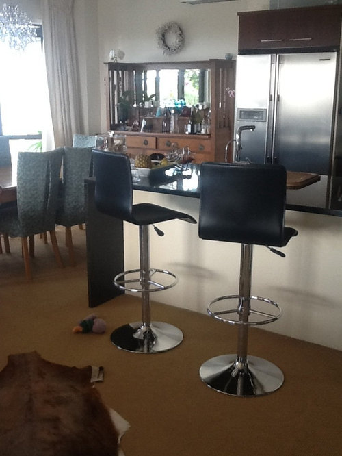
Replace bar stools - your ideas most appreciated.
jacquipru
10 years ago


Featured Answer
Sort by:Oldest
Comments (15)

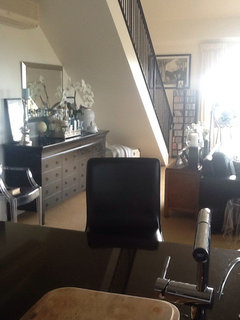
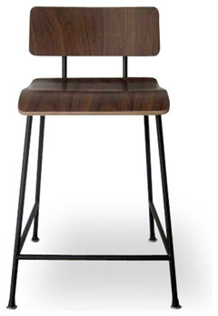
jacquipru
10 years agowlkgbrz
10 years agoRelated Discussions
Boring house looking for ideas on how to update
Comments (32)Hi definitely remove the x bars on the deck balustrade. Landscape close to the house so it grounds the house. Trees will make it look less bare. Chose some that work for your area, that are evergreen, and are not going to grow really big. With a really plain house - dark colors will make it look better. Dark Grey, or black with a warm tone so it doesn't have a blue undertone in it. Make sure it is a warm grey or black. Use green foliage around it. Paint out the pergola in the dark grey too or white if you want a different look. Fill in the balustrade where the x is removed with plants in front of those areas. Grow a vine up the pergola that is nice....See MoreKitchen layout - need your opinion
Comments (12)You have a good nice project planned here, with your kitchen now a part of large living space. Here, though, are some cautions and suggestions. Your extra-large peninisula counter and full window wall over the sink seem to be features that you like and want - but they also cause some problems with this plan. If two people are ever in the kitchen, one will be trapped there. And even for one, the peninsula forces an irritating hike around it to the table for serving and clean-up. Table and array of counter stools are uncomfortably close together, creating congestion especially when occupied. And while your back wall may well contain a fridge, wall ovens, pantry and cook-top, it would just barely do so - and leave no other space at all for counter. This, together with your nice bank of windows on the outside wall leave no space at all for upper cabinet dish storage. I agree with Laurie that an island here would be much preferable. I would put the sink and dishwasher on an island, with fewer stools, and some mid-height dish storage - letting gatherings of more than two or three enjoy the table in a conversational arrangement instead of facing away from the room in a row. I would also minimize the window array a bit, and extend the kitchen toward the dining table window a foot or so - and put the wall ovens at this end of the "L" - with no side wall at the left. This would distribute your countertop space more happily among your work stations, allow for some upper cabinet storage, and make the kitchen feel more part of the nice big room, instead of separated from it by the peninsula. Perhaps a careful in-person visit with a kitchen designer would be wise before you build this fun new addition. Good luck! Mark...See MoreKitchen/Laundry renovation design ideas needed
Comments (9)Yes, measurements would help. Thank you aldrea1 for other explanation, though. That helps too. It sounds like you are going into a total gut-job! I love this! Great opportunity for your creativity. Also, it looks like you have a petite sized stove. With total remodel you can upgrade to a standard size range. Is this part of your plan? Are you going to replace any appliances? It would be good for you to keep sink and stove in original locations. It is complicated to move the stove's exhaust fan and the sink's plumbing. Not impossible, but probably $$$$$$$ and a lot of hassle…. So, I would start planning with those items--stove and sink on current walls. Wherever you put your refrigerator, it would be best to be sure side view is hidden. If refrigerator stays in current position, you could make peninsula a little smaller, so wall on the right of kitchen entrance could extend further and hide refrigerator edge----Or, move refrigerator to another location… Not too far from sink and counters, though. That would cause you inconvenience. You want a work triangle with not that many steps in-between. Do you currently have a dishwasher? Or are you planning to add one? Not much creativity in placement of a dishwasher---needs to be near water source and drain.. Are you doing the work yourselves or hiring a contractor?...See MoreANY SUGGESTIONS PLEASE WITH MY LONG DARK HALLWAY
Comments (5)Hi eclipse 66 I'm sorry to hear about your break in. This is quite tricky to picture as I wasn't certain which walls related to which, but I will give this a go. I wonder if your ceilings are around the 2.4mtr mark, as your doors suggest. Although you have many windows that are probably floor to ceiling, each room is sectioned off by this central corridor, so no real natural light gets down there, is that right? The little natural light that might filter through would be absorbed by the walls, and the colour you have on these walls would not be easily seen. Without. Sounding too mainstream here, I would absolutely paint an offwhite wall the entire corridor and each adjoining living area off that, with exception to your kitchen. All ceilings purest ceiling white along with the window frames and all internal doors. The walls in a satin finish to help the light reflect a little, and move around the wall without being too shiny. You haven't mentioned your floor? Try to keep it consistent in all the living areas including your hallway, and only carpet the bedrooms as these doors would be closed often. With the door filled hallway being a white gloss finish, and a white ceiling in a flat white, the walls will feel a little warmer in comparison, although still a white, perhaps something like a hog bristle 1/4 strength by dulux. In your main living room, and kitchen, paint the hog bristle in full strength, so it feels warmer, as these spaces flow onto each other, feeling larger as a whole. With your doors being so tall, (or the ceiling being comparably low), hang your window rods if any right at ceiling level, use a sheer curtain that even when partly closed let's light filter through, they dress the window but won't block light, for that install roller blinds that will roll right up exposing as much daylight as possible, and if privacy is a factor, the sheer will provide a buffer and still seem light filled. Even if these are never used, framing the window will place an emphasis on the window frame, and more importantly the light they provide, swell as an illusion of vertical space even without it. Aother suggestion for that hall is to use this principle to heighten the ceiling, visually, is to use lining boards vertically, or a wallpaper with a strip or vertical print. Drawing you eye upward toward the end, with a wallpaper, I'm thinking of one I've seen many times over, it's a white or cream background, with an image of birch trunks, the base or top of the trees arent revealed in the picture so it doesn't make the space feel from a low or high perspective. This would provide a creative distraction to the corridor, evoke a feeling as you have walking through a beautiful place, and is graphic but still very neutral. You can even paper you doors so when they're closed, the hallway won't feel so busy. I would remove carpet in the hall if you have any, because a warm closed in space without proper airflow, or light feels stuffy, and carpet absorbs sound and lint, where floorboards or hard surface atleasts has a sound walking down it, which amplifies noise and feels bigger again by comparison. Against this neutral, cohesive space, your furniture andpersonality pieces can really stand out, particularly the red. I would also use this in the kitchen somewhere, maybe a gingham check fabric on the kitchen window or just your accessories. The less is more theory also extends to colour, particularly in smaller busy spaces, minimize these elements, like the repeat of doors and architraves on your walls, by tying them in with single colour, and keep your decorations either in a theme or single colour hue. Scatter your colour around so visually you have somewhere your eye is drawn to around the space. If you get pictures I will know if I'm way off track, but if any of them resonate with you, then great. Good luck. Ml design...See More
Darzy
10 years agojacquipru
10 years agojacquipru
10 years agojacquipru
10 years agosuzanne_m
10 years ago
januarisun
10 years agojacquipru
10 years ago
Nancy Travisinteriors
10 years agojacquipru
10 years ago
indianpatti
10 years agolast modified: 10 years agopremiumlot
10 years agojacquipru
10 years ago


suzanne_m