Project Of The Week
A Space-Savvy Renovation for a Tiny Worker's Cottage
Making every bit of space in this three-bed, one-bath cottage work harder gave the owners all the extra room they needed

In this Q&A series, we turn the spotlight on one thought-provoking renovation or extension each week. Here, Jess Ryall, designer at Architecture Republic, reveals how meticulous space planning allowed her to extend the usable living space in this three-bed, one-bath worker’s cottage in Canberra without altering the footprint – all while creating enviable indoor-outdoor flow for the busy family living here.
Shown here, the original front door and paving
What was the cottage like originally?
A single-storey, three-bedroom, one-bathroom 1950s worker’s cottage. It had a concrete porch at the front door and some paving (shown above and below). The front door was the only connection to the outdoor space.
These cottages were typical in Canberra in the 1950s. This one was a British kit home in near-original condition. It was clad with timber boards on the outside and fibre cement sheets inside. It had some structural issues – no structural bracing or tie-downs – which meant that it was leaning.
Shown here, another angle of the original front door and porch
Shown here, the original living room and kitchen
Room of the Week: The Non-Conformist Family Kitchen (That Rocks!)
Room of the Week: The Non-Conformist Family Kitchen (That Rocks!)
What was your brief?
To completely refurbish the home, adding height, storage and a connection to the outdoors. The clients wanted their home to feel light and airy.
They also wanted a new kitchen and bathroom, but without adding any additional space, preferring the simple, minimalist lifestyle that living in a smaller home would bring.
What were the clients’ must haves?
- A pitched ceiling in the living area.
- New kitchen, laundry and bathroom.
- A better connection to the garden.
- A light and airy feel.
- More storage.
- Increased thermal efficiency.
What exactly did you do?
Read more renovation stories
- Reworked the existing layout to improve liveability.
- Created an open-plan kitchen-living-dining room with a pitched ceiling.
- Refurbished the existing bathroom and three bedrooms.
- Added new storage.
- Installed new, larger tilt-and-turn windows.
- Added new french doors to the open-plan living room and bedroom that open to a new 56-square-metre wraparound deck.
- Put in a new carport/storage shed.
Read more renovation stories
What constraints did this project address?
The existing home was tired and inefficient. The layout didn’t work; it had too many small rooms connected by circulation spaces that took away from the home’s useable floor area. The house didn’t have enough storage and no dedicated laundry. It was also thermally inefficient; too cold in winter and stuffy in summer.
The existing home was tired and inefficient. The layout didn’t work; it had too many small rooms connected by circulation spaces that took away from the home’s useable floor area. The house didn’t have enough storage and no dedicated laundry. It was also thermally inefficient; too cold in winter and stuffy in summer.
How does the new work address these constraints?
Major alterations to the structure completely changed the way the existing spaces feel and function.
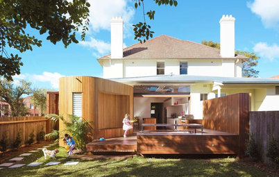
We worked closely with the engineers to affordably remove the existing flat ceiling in the living room and replace it with a high, pitched ceiling. We also removed and replaced the existing windows opening onto the backyard: where tall, narrow windows once existed, the entire wall now seems to slide away and opens directly onto an expansive new deck. In fair weather, this doubles the size of the living area.
New insulation to ceilings, walls and under the floors, European uPVC windows and energy-efficient blinds hugely increase the sustainability of the house. A cold, draughty house has become warm, inviting and cheaper to heat and cool.
Major alterations to the structure completely changed the way the existing spaces feel and function.
We worked closely with the engineers to affordably remove the existing flat ceiling in the living room and replace it with a high, pitched ceiling. We also removed and replaced the existing windows opening onto the backyard: where tall, narrow windows once existed, the entire wall now seems to slide away and opens directly onto an expansive new deck. In fair weather, this doubles the size of the living area.
New insulation to ceilings, walls and under the floors, European uPVC windows and energy-efficient blinds hugely increase the sustainability of the house. A cold, draughty house has become warm, inviting and cheaper to heat and cool.
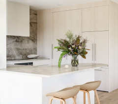
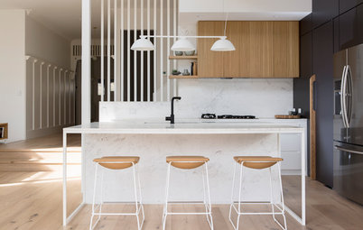
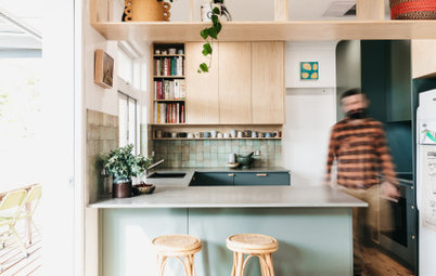
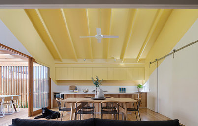
The kitchen performs double-duty as a laundry with appliances hidden under the breakfast bar alongside kitchen storage. Broom and pantry storage is concealed behind cabinetry.
Our goal was to maximise storage and bench space while maintaining an open and airy feel. We chose white cabinetry to reduce the visual bulk of so much storage in a relatively small space.
The outside of the building received a facelift with a new deck, uPVC window and door frames, paintwork, exterior lighting, downpipes and gutters. Keeping the existing timber floors, exterior roof cladding and wall cladding made this a cost-effective, but radical transformation.
The design enhances everything that was good about the original home, while addressing all the things that weren’t.
What challenges did you work around?
Structural problems; once the old walls had been removed, it became clear the home had no structural bracing or tie-down. As a result, the whole structure was leaning. This was remedied by the builder and extra timber was added to square up the walls that weren’t straight.
See more white kitchens
Structural problems; once the old walls had been removed, it became clear the home had no structural bracing or tie-down. As a result, the whole structure was leaning. This was remedied by the builder and extra timber was added to square up the walls that weren’t straight.
See more white kitchens
Where did most of the $350,000 budget go?
The pitched ceiling, new deck, and kitchen and bathroom fit-outs.
The pitched ceiling, new deck, and kitchen and bathroom fit-outs.
What does the new pitched ceiling add to the home?
It adds a sense of height to the space. Open-plan spaces can feel a little flat and low-ceilinged (even when they aren’t that low) because they are so much longer and wider than they are high. We wanted to avoid this lacklustre result. The pitched ceiling is all about light and space – the new room feels brighter and more open now.
Tell us about the floor
We debated replacing the original baltic-pine floor because due to previous low-quality renovations and the need for walls to be moved, segments would need to be patched. But together with the clients, we decided this patchwork effect of new and old was actually quite beautiful and reflected the history of the house.
Tell us about the new deck
We wanted to maximise the liveable area of the home without extending the interior space. This meant going outside!
The deck functions as an ‘outdoor room’, extending the living area into a beautiful Canberra garden. As a result, the house feels larger despite no extension being made to the actual footprint.
We designed the deck around existing deciduous trees (we believe they were crepe myrtles and a maple), maintaining the canopy and protecting the windows and deck from the hot summer sun.
Is there any underlying philosophy you want to highlight?
When it comes to homes, our philosophy is to keep them small and smart. While it is sometimes worth extending, many people resort to this option without thinking about what else they can do to make the existing space work better.
Especially on small blocks, filling the available gardens with house (both front and back) rarely results in a better lifestyle for the occupants.
Why do you think the reno works so well?
Though not a ‘tiny house’, this Canberra cottage is quite small, managing three bedrooms in just under 94 square metres. In a small home, it’s crucial that every square metre functions as hard as it can.
Instead of spending the clients’ budget gaining extra floor space, we sought to make their existing home work to its full potential. The design process was meticulous; we went through the entire structure square metre by square metre to maximise utility, practicality and liveability.
Key features
- Open-plan kitchen-living room-diner with a high, pitched ceiling.
- New kitchen with generous storage, prep space and hidden laundry functions.
- Plenty of natural light.
- Minimalist finishings.
- A generous wrap-around deck.
- A seamless connection to the ‘outdoor room’ (the new deck).
Materials palette
- Baltic-pine floor.
- Caesarstone kitchen benchtops in Sleek Concrete.
- Deceuninck uPVC windows and doors from Windows For Life.
- Full-height french doors.
- Boral Timber spotted gum decking.
Paint palette
Dulux paints used throughout:
Dulux paints used throughout:
- Red Stop on front door.
- Signature on exterior.
- Monument on gutters and steel details.
- Vivid White on underside of soffits.
Tell us
Are you as impressed by this clever renovation as we are? Tell us in the Comments below. And remember to like this story, save your favourite images and join the conversation.
More
Enjoyed this story? Don’t miss last week’s Project of the Week: A Classic Federation-Style Cottage Gets a Lofty Addition

Answers by Jess Ryall, designer at Architecture Republic
Who lives here: A couple with two young boys
Location: Ainslie, ACT
Original size: 93.8 square metres internally
Size after extension: 93.8 square metres internally (the interior layout was re-worked for better circulation and functionality, but no internal floor space was added). Externally, a new 56-square-metre deck was added as well as a 4.2-square-metre porch and a 25.2 square metre carport/storage shed
Budget: $350,000
Gained: A new open-plan kitchen, living area and dining room with a pitched ceiling and stacking-slider doors that open to a new deck; a refurbished bathroom and bedrooms; and additional storage. Plus, a new wraparound deck and carport/storage shed
Architect and interior designer: Architecture Republic
Builder: CJC Constructions