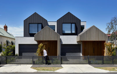
Architects' Secrets: 4 Genius Design Solutions for Narrow Homes
Your skinny home challenges solved! Learn tricks of the trade from the architects behind these four narrow abodes

Don’t let a narrow home defeat you – here are four skinny homes that successfully marry style and function. Read on to find out exactly how the architects did it and pick up tips for your own slender abode.
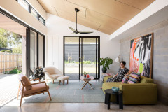
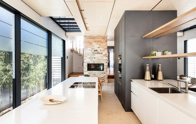
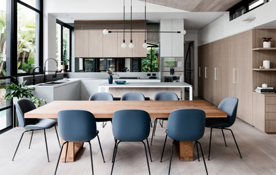
One of the tricks we used to minimise the feeling of narrowness here was not taking joinery right to the floor in order to lighten the bulk of the pieces – it makes them appear to ‘float’.
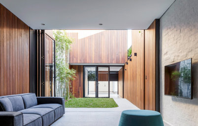
A generous ceiling height enhances the perception of the home’s size, while a strategically placed clerestory window and skylight draw light and ventilation to what would otherwise have been a dark centre of the home.
The distinctive, irregularly shaped roofline profile adds architectural interest and complements the neighbouring dwellings. It also allowed us to specify an irregularly shaped clerestory window that brings sunlight to some really interesting spaces and nooks in this home.
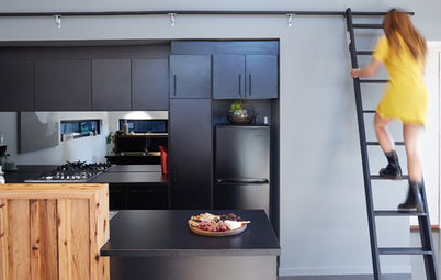
Customised built-ins gave us more control over the size and proportions of the components, and allowed us to maximise storage in this narrow home.
The joinery was carried through from the kitchen to the dining room to allow for a seamless transition between the spaces. This helps optimise the feeling of openness.
One perhaps seemingly trivial, but effective, component of the kitchen was to place the bin at the end of the island so the owners can chop and slide scraps off into it, which they love for the convenience. It’s these practical details that you never want to dismiss due to site constraints.
Need help tackling the challenges of your small or narrow home? Find a local architect on Houzz
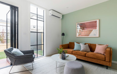
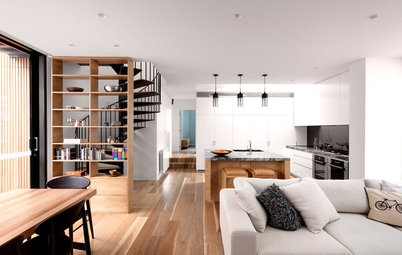
Open screening to the mezzanine and stairs create a more open feel, allow light to flood the mezzanine and enable views. Also, looking up to the mezzanine level instead of a solid wall makes the space feel endless.
2. Commentator: Ellie Taylor, director at Lande Architects
Location: Abbotsford, Victoria
Approximate width: 4.9 metres
Who lives here: A young couple
Describe the house: A semi-detached single-storey Victorian terrace
Beds and baths: Two bedrooms and a bathroom downstairs and a master bedroom and ensuite upstairs
Location: Abbotsford, Victoria
Approximate width: 4.9 metres
Who lives here: A young couple
Describe the house: A semi-detached single-storey Victorian terrace
Beds and baths: Two bedrooms and a bathroom downstairs and a master bedroom and ensuite upstairs
A view from the ground-floor living area
The double-height angled window has a double-storey void above it, which draws your eye up to the first floor and prevents the ground-floor living room from feeling narrow, while bringing in natural light.
Maximising storage was essential in this project: a built-in window seat provides a little seating nook and allows for discreet storage underneath.
The internal spaces are clean and minimal, which lets the external green pockets around the house become the focal points.
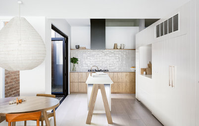
We specified dark timber-veneer joinery to the kitchen to conceal the built-in oven so the space didn’t look like a conventional kitchen, but rather an extension of the dining room.
In order to intertwine the interior and exterior areas (which serves to enhance the sense of space), we specified flooring in a similar colour – a lightly ground, polished concrete inside and limestone pavers outside.
Rather than having two separate seating areas – one in the kitchen and one in a dining area – we combined them into one, with dining seating at the island bench. This also saves on circulation space as it’s only required on three sides rather than the four sides you’d normally have around a dining table.
Storage for cleaning items, toys, shoes and more is concealed within a panelled joinery unit that runs from floor to ceiling in the living room. The indents around the panels act as finger pulls, providing a clean, minimalist aesthetic.
The joinery runs on an angle, which helps direct users into the living spaces and creates a flow-on effect, rather than the feeling of walking towards a solid wall or piece of joinery. The angled joinery also reflects light down the hallway.
Large sliding glass doors disappear in front of the external brick wall, which opens the house to the courtyard. When the sliding doors are open to the side and the rear they disappear from view, so the inside and outside areas become one.
Having no door between the ensuite and walk-in wardrobe in the master suite allowed us to borrow space from both areas, maximising spaciousness.
We placed all services along one wall to save on circulation space.
We also ran mirrors the full length of the room to enhance the sense of space and bounce light around.
We laid black and white tiles on the floor and extended them up the shelf to differentiate between the shelf and the walls. If the bold tiles were on the walls, it would feel as though the room was closing in, so we kept the walls white and minimal.
A space-saving spiral staircase (which leads to the master suite) is a smart choice for a narrow home. The open treads allow light to flow through and the shape of the staircase creates open, useable space beneath it.
We chose black to make the staircase a standout feature in the living room and for the practical reason that black doesn’t show footprints. We also wanted to be able to see the landscaping in the internal courtyard beyond the staircase, which black allows for more successfully than any other colour.
We chose black to make the staircase a standout feature in the living room and for the practical reason that black doesn’t show footprints. We also wanted to be able to see the landscaping in the internal courtyard beyond the staircase, which black allows for more successfully than any other colour.
Images: Luc Remond
3. Commentator: Angus Mackenzie, principal at Angus Mackenzie Architect
Location: Newtown, NSW
Approximate width: Four metres
Who lives here: A couple with a young daughter
Describe the house: A two-storey worker’s cottage in a heritage conservation area
Number of beds and baths: Two bedrooms (the rumpus room can be converted into a third bedroom) and two bathrooms
Builder: Studio Constructions
View of the kitchen/diner looking through to the rear courtyard
Painting the brick wall white reflects light into the living areas and helps visually open up this narrow space.
Browse more small and stylish Australian homes
Painting the brick wall white reflects light into the living areas and helps visually open up this narrow space.
Browse more small and stylish Australian homes
Wide timber beams are another space-stretching tool – they make the space instantly feel wider. Plus, they exude a feeling of warmth and cosiness and frame the ‘one-point perspective’ of the open-plan living space, which leads to the rear courtyard.
This bathroom is very small and we needed to pack in a lot. The family wanted a separate bath and shower, so in order to fit it all in, we opted for a Japanese bath from The Japanese Bath Company that is deep but not very long. The arrangement allowed us to put in a separate shower. A frameless glass shower screen adds to the feeling of openness.
A steep raked ceiling makes the room appear larger and the high, north-facing louvres flood the room with natural light and provide perfect ventilation.
A mirrored vanity is opposite the high louvred windows and helps bounce natural light around the light-coloured tiles.
A steep raked ceiling makes the room appear larger and the high, north-facing louvres flood the room with natural light and provide perfect ventilation.
A mirrored vanity is opposite the high louvred windows and helps bounce natural light around the light-coloured tiles.
Flexible thinking around the use of space is essential in a small or narrow home. Here, sliding-stacking doors create a flexible space on the ground floor. They slide into the wall cavity and the room opens up as a play room, or you can close the doors and the space converts to a private third bedroom.
Bi-fold doors to the ground floor fully open the interiors to the deck and garden, creating one interconnected indoor-outdoor space.
We specified blackbutt timber to both the deck and to the interior floors in order to boost the sense of connection between the two areas.
We specified blackbutt timber to both the deck and to the interior floors in order to boost the sense of connection between the two areas.
4. Commentator: Rebecca Naughtin, director of Rebecca Naughtin Architect
Location: Fitzroy North, Victoria
Width: Overall width is 6.05 metres and the kitchen width is 2.5 metres
Who lives here: A couple
Describe the house: A single-storey Victorian terrace
Beds and baths: Two bedrooms and one bathroom
The use of white paint, white brick, full-height glazing, stainless steel and marble lighten the space and make it feel larger.
We specified a mix of open shelves for display and closed storage to keep the space clutter-free and low-maintenance. The exposed shelves, cantilevered on brass rods, accentuate the horizontality of the space and allow the light to travel deeper into the room. European oak lightens and warms the space and speaks to the kitchen joinery opposite.
Our client enjoys cooking and provided us with a detailed and extensive brief. The design opted for a galley-style kitchen, using the maximum length of the site and increasing the capacity for storage.
The storage along the wall adds an extra layer of sound insulation from the laneway beyond.
The foldaway doors help to increase the kitchen’s useable surface area, while also hiding appliances away and keeping the space clutter-free when the adjacent living room is in use.
Having the kitchen and living room programs overlap visually increases the width of the room.
The 4.5-metre-high steel-framed windows flood the kitchen and living areas with natural light, improving the sense of space and volume within the building.
The doors and windows can be opened to access the courtyard, allowing our client to host events and enjoy the sun throughout the day.
A strong connection to external views and the outdoor courtyard allows the building to occupy the external space, increasing the overall living area.
The doors and windows can be opened to access the courtyard, allowing our client to host events and enjoy the sun throughout the day.
A strong connection to external views and the outdoor courtyard allows the building to occupy the external space, increasing the overall living area.
Your turn
Which of these ideas did you find the most useful? Tell us in the Comments below, like this story, save the images, and join the conversation.
More
Want more on skinny homes? Check out this Picture Perfect: 25 Ideas for Narrow Spaces in Your Home
Which of these ideas did you find the most useful? Tell us in the Comments below, like this story, save the images, and join the conversation.
More
Want more on skinny homes? Check out this Picture Perfect: 25 Ideas for Narrow Spaces in Your Home
Location: Glebe, NSW
Approximate width: 3.8 metres (at its widest)
Who lives here: A couple
Describe the house: A two-storey infill house with a modest detached garage and a first-floor studio
Beds and baths: Two bedrooms, three bathrooms and a studio bedsit