
Decorating

Neutral Shades and How to Work With Them
Get to know your neutral shades and the no-colour areas of your home will be anything but bland

When you check any New Zealander paint chart, it fast becomes clear that we love our neutrals. Every colour chart is dominated by variations on beige, greige, cream and pale tea shades. Blame it on our understated, don’t-like-to-make-a-fuss, national characteristic – or the overwhelming colours of our land, sea and sky that make interior colours seem redundant.
But don’t let neutrals be a by-word for boring, don’t-look-at-me decorating. Here are some great ways to shift your neutrals up a gear to look fresh, sparkling and very, very modern.
But don’t let neutrals be a by-word for boring, don’t-look-at-me decorating. Here are some great ways to shift your neutrals up a gear to look fresh, sparkling and very, very modern.

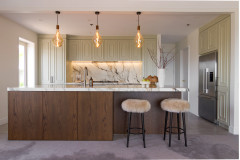
Warm up with yellow
If you have always tended towards pure white or barely-there creams, push yourself into a new part of the paint chart. Every neutral has an underlying tone of brown, black/white, green, yellow or red. If you can’t find the colour descriptions on the paint charts, paint store staff will be happy to show you the difference.
Don’t dismiss a buttery yellow-based neutral because it reminds you of ‘nana cream. It works well with colours such as reds and blues, and it looks modern paired with crisp white, picking out architectural details such as beams, architraves and skirting boards.

Test the waters with green
Pure white might be fashionable, but for some rooms it feels too sterile. A neutral in the greened-off shades is on-trend, and more comforting.
As in nature, greens pair with wood tones, light and dark. You can happily keep taking your colour cues from nature, adding in plenty of indoor greenery with flowers and plants. Again, use a crisp white to stop everything dulling down, and to keep it modern.

Make it a grey area
Grey is the new beige, with so many shades of grey, and so many ways to amp up your neutral palette without getting scary. Push yourself out of the safe white kitchen comfort zone with grey: same ease of mixing in accent colours, same great background for your accessories, but a whole lot more pizzazz.
Naturally, brushed stainless steel appliances and handles work comfortably with grey, but if you’re feeling braver, take your sinks and taps to the next level with pure black. Don’t worry, it won’t scream 2016 in years to come, as black and grey are timeless, crisp and smart.
If you’re loving the look of warm metals – copper, bronze, gilt – grey is the perfect foil. And nothing says industrial like a swatch of grey.
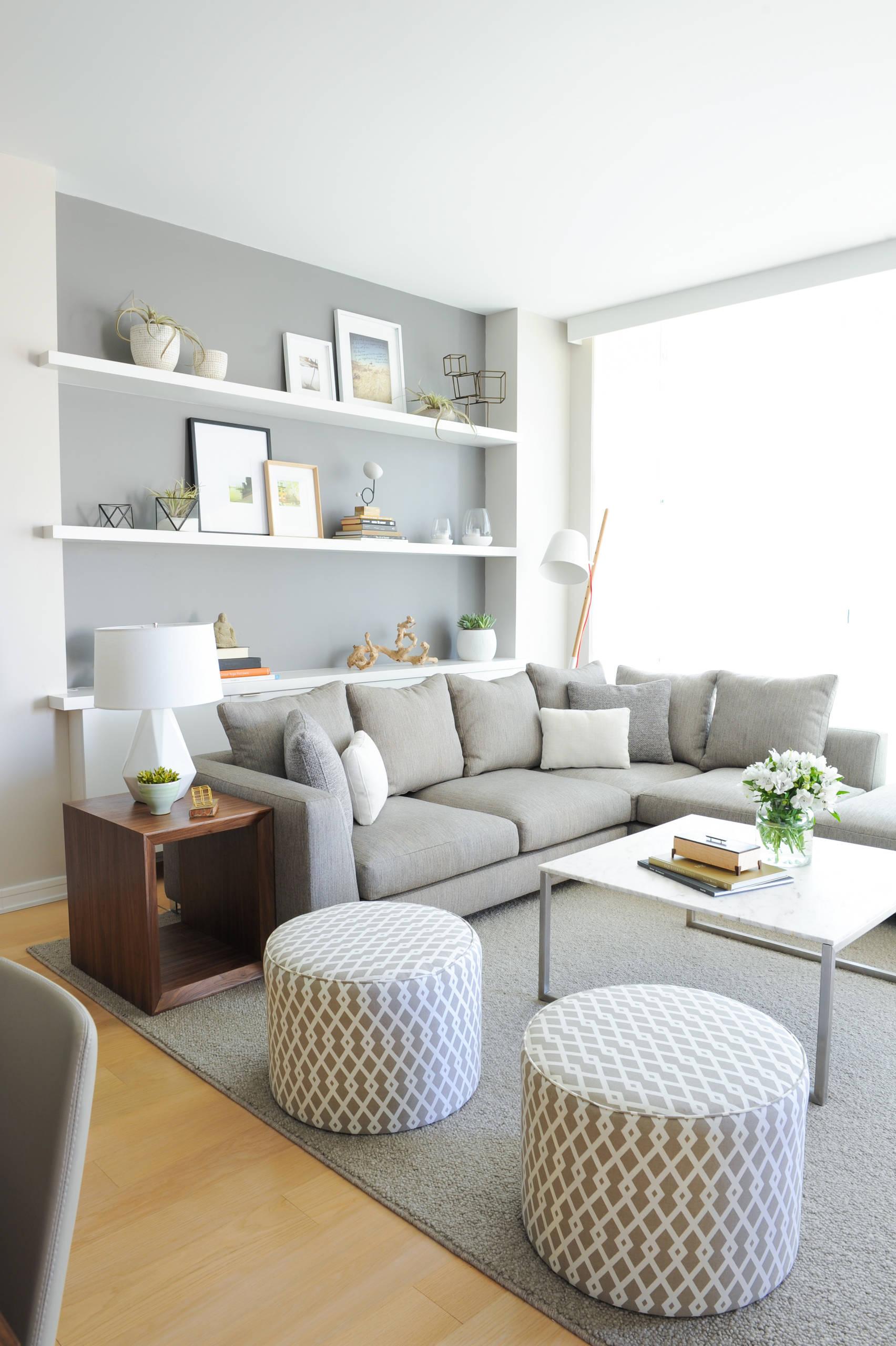
But it can also get a good boost with white for a softer, more casual, daytime take on mixing it up. Surprisingly, grey can feel warm: Scandinavians use a lot of soft, washed greys to counter their dark, dreary winters.
To stop your grey scheme fading away, make judicious use of tone on tone. Here a deeper shade on shelves makes the precious accessories stand out more than they would against white, a mid-toned rug anchors the scheme against a warm wood floor. Subtle prints in a mix of neutrals are an easy way to add visual interest if you are really colour averse. (Again, block out the patterned ottomans and you’ll see how dull the room becomes).
To stop your grey scheme fading away, make judicious use of tone on tone. Here a deeper shade on shelves makes the precious accessories stand out more than they would against white, a mid-toned rug anchors the scheme against a warm wood floor. Subtle prints in a mix of neutrals are an easy way to add visual interest if you are really colour averse. (Again, block out the patterned ottomans and you’ll see how dull the room becomes).

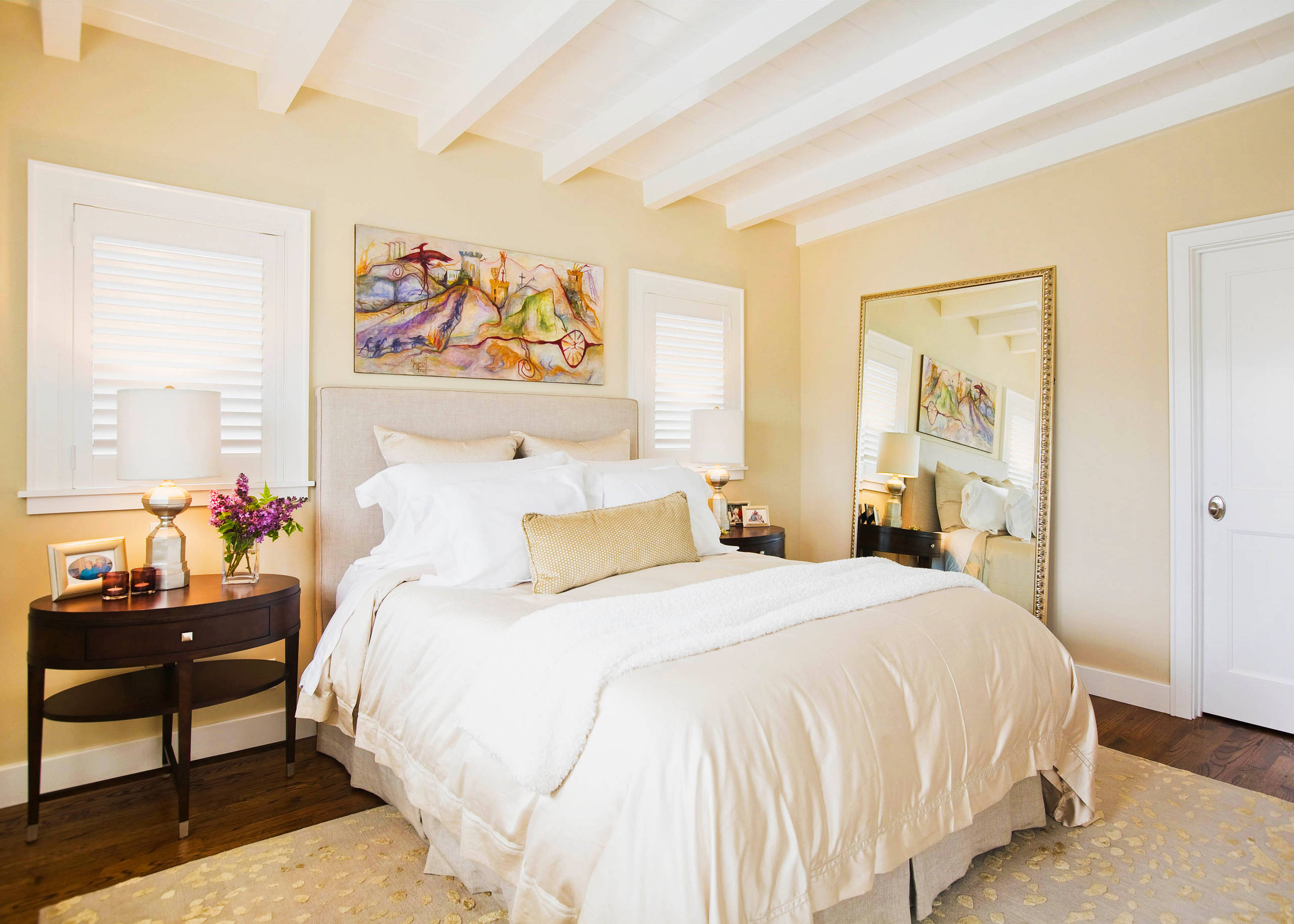
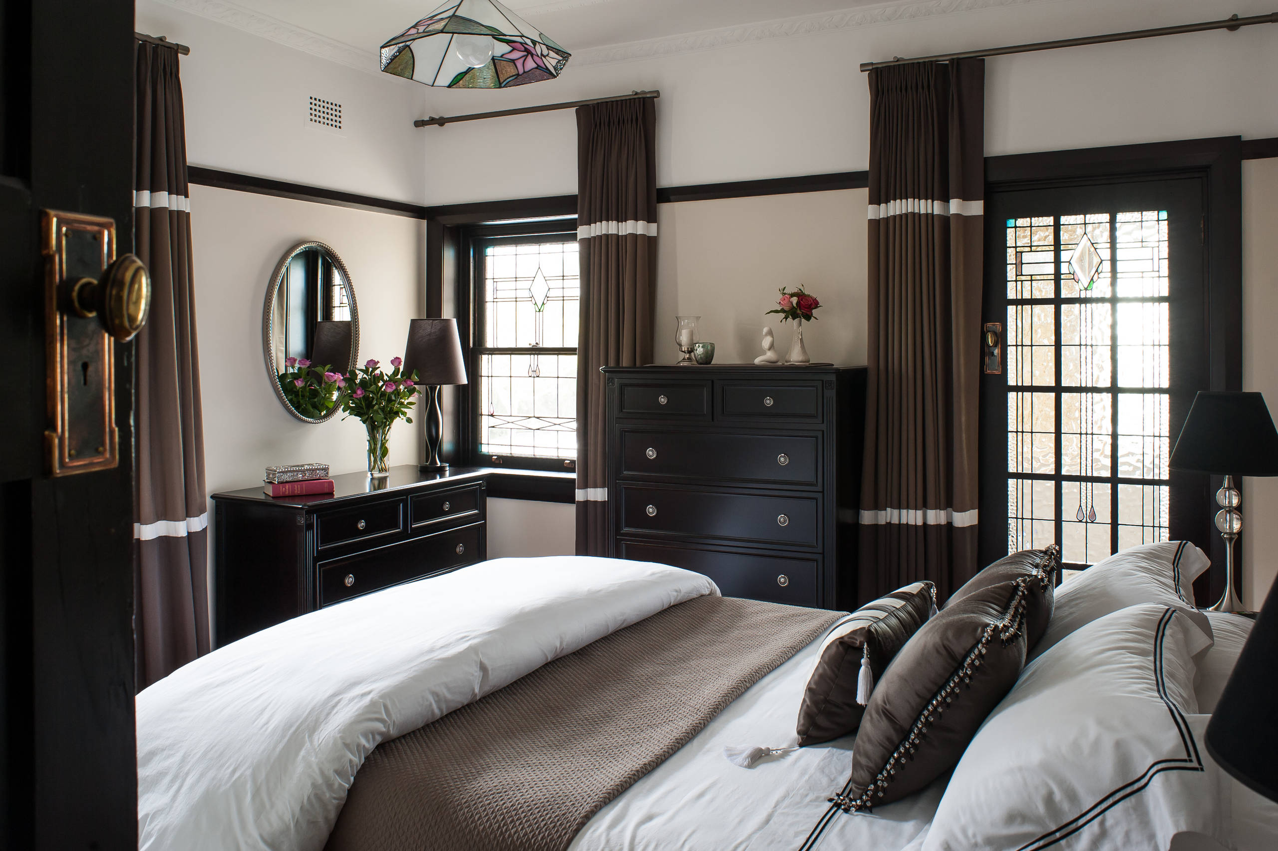
Brown is not boring
A neutral bedroom is soothing and relaxing, but you don’t want to be yawning in boredom from brown-based beige tones. To avoid your bedroom becoming too feminine boudoir – or man-about-town bachelor pad – a layered, sophisticated neutral palette is a happy medium.
Plenty of texture does the trick. By all means, start with beige walls and crisp white linen bedding. But invigorate it with textured accessories – subtle wool (or cashmere, bliss!) blankets, a shimmer of silk or crushed velvet, or one or two fabrics with an accent of sophisticated black or even a dull gold will really punch up neutrals.

Show us your pearly whites
Delicious as it may look on the pages of a magazine or idea-book, an entirely white-on-white scheme can get bland surprisingly quickly. All it takes is a mix of whites (yes, there are dozens to choose from), a mix of finishes (try super high gloss for accents, along with various satins and sheens for different walls) and then pump it up with mid and dark tones to lift a white room to exciting. And no scary colours to send you running.
TIP: Have your flooring pro make up several swatches from dark chocolates through to blacks and charcoals and check the colours at different parts of the room and different times of the day.
Work some dark magic with black
Yes, black is a neutral too. If you’ve been bold enough to get this far with upping your neutral palette, then creating a whole scheme around black will be an easy next step. The trick here is not to turn your house into a bat cave, but to judiciously add plenty of light sparkling accents – mirrors, sparkly hardware and light fittings, crisp white linen, even shiny ribbon accents on pillows and curtains.
TIP: When you’re ready to go bolder with an all black scheme, check out what works best with black.

Creamy textures
There is only so much a pop of colour can do to a room if all the textures are so much the same that they are merging blandly into each other. Introduce interesting materials such as wood beams or textured tiles, but softened with neutral cream tones. Play with mixing your eras – here a sleekly modern cocktail cabinet plays off curvy-legged accent tables and a quirky light fixture.
There is only so much a pop of colour can do to a room if all the textures are so much the same that they are merging blandly into each other. Introduce interesting materials such as wood beams or textured tiles, but softened with neutral cream tones. Play with mixing your eras – here a sleekly modern cocktail cabinet plays off curvy-legged accent tables and a quirky light fixture.
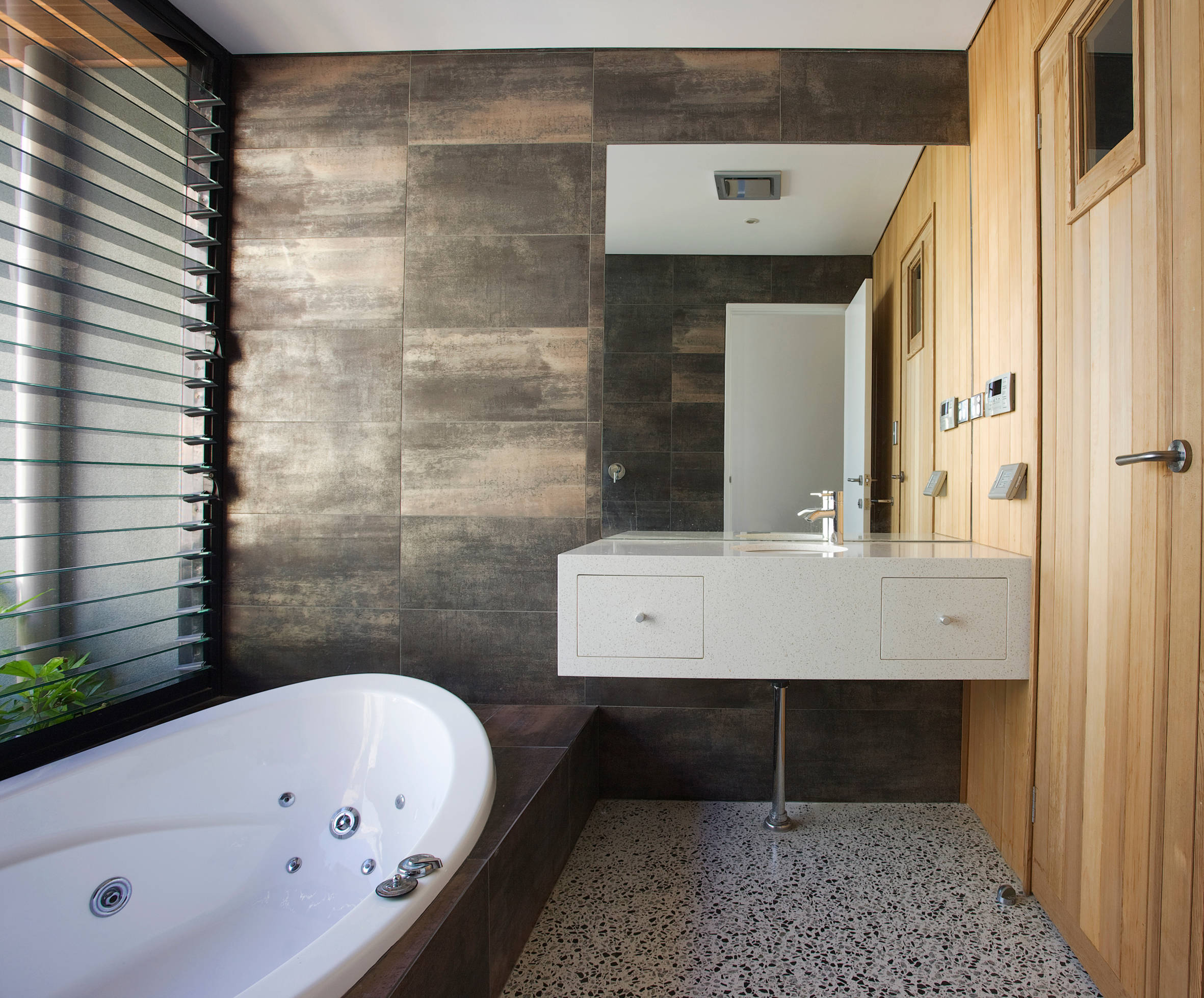
Use nature’s neutrals
Even in a bathroom, where your materials are restricted to those that are water- and steam-proof, you can amp up the neutral palette with different textures. You don’t need to have shiny floor tiles that match the shiny wall tiles that match the shiny vanity.
Play with the size of tiles – here the colours of the large stone-textured wall tiles are picked out in the polished stones in the terrazzo floor (or tiny mosaic tiles would work as a contrast here). Wood walls are neutral in tone, but warm the entire room.

Add it up
In neutral math, 1 + 1 equals way more than 2. Add a brown-based neutral to a white-cream neutral and you have an interesting layered look that won’t get boring. It takes only paint, masking tape, a level and a steady hand to create drama out of two pots of paints. Wide stripes are great for visually manipulating the proportions of a room.
Or add ‘architecture’ with two shades of grey paint, taking a line drawn at chair-rail or picture-rail level to mimic panelling.

Layer tones with accent neutrals
Now that feature walls have had their day, a deeper colour as a background to display shelves or cabinets is a low-risk place to start playing with stronger tones. Add some natural wood tones that won’t force too much colour on you, but will stop everything looking too matchy-matchy. And, of course, lashings of white to keep neutrals crisp and fresh.
TELL US
What are your favourite neutral shades and how have you used them around your home? Tell us in the Comments below.
MORE
How to Colour Block Neutrals
6 Kitchen Colour Schemes That Will Stand the Test of Time
How to Design a Neutral Room that Kicks Boring to the Kerb
If you find yourself reaching for the same safe paint swatches, and then wondering why your room looks the same as everyone else’s (dull, dull, dull), take a tip from the professionals and pull together a mood board.
Start with the materials that you’re using for the largest areas, as they will dominate the room. Use the biggest swatches of paint, wall-tile or wallpaper available. Add a big chunk of your flooring – postage stamp-sized swatches will not help you envisage the effect properly. Then add pictures of your major furniture pieces with swatches of window and upholstery fabrics.
Squint at it – and start critiquing. This is the time to test adding an accent colour to wake up the scheme – try covering up the yellow on this all-neutrals mood board and see how flat it becomes.