Room Of The Week
Popular Houzz Series
Popular Houzz Series
Appears in
See also
Fun HouzzFrom The ProsHouzz Around The WorldProject Of The WeekStickybeak Of The WeekQuizzesCreatives At HomeAt Home With...Best Of The WeekRoom Of The WeekDesigner Profiles3 Things I Wish My Clients KnewHow Do I...Buyer's GuidesExpert EyeInnovation AlertSo Your Style Is...Spotted!Picture PerfectBefore & AfterBudget BreakdownHome TimeMade Local
Interior Design

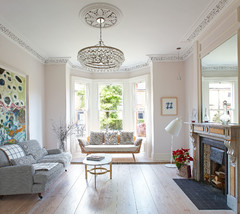
Room of the Week: A Sophisticated, Richly Coloured Living Room
This homeowner wanted a vibrant, unfussy area that incorporated modern and retro. Drink in the incredibly plush result

In a Q&A format, we talk to the designers – and examine the creative thinking – behind some of Houzz’s most loveable rooms.
Brief
Situated on busy, connected St Kilda Road, this apartment overlooks the lush Fawkner Park. Initially a blank canvas, the brief was to make this Melbourne pied-a-terre feel like a home away from home using blues, dusky pinks, deep purples and white as the palette, and incorporating modern and natural elements, and retro furniture. The vibrant result was achieved with wallpaper, textured fabrics and solid colour interspersed with pattern and bold features.
Artwork: Kerry Armstrong
Starting point
I started with the colour palette, which naturally fell to choosing the fabrics and furniture. The art came afterwards. The clients wanted easy, comfortable living. Unfussy.
I started with the colour palette, which naturally fell to choosing the fabrics and furniture. The art came afterwards. The clients wanted easy, comfortable living. Unfussy.
Key design aspects
Colour palette: Blue/white and touches of green. I added in the wine/purple tones as a contrast.
Materials palette: Linen, velvet, wool, timber, wallpaper on the wall behind the sofa.
Key pieces of furniture/fittings: The sofa, comfortable for lounging on and watching TV, came from Fanuli. The two armchairs are Cassina’s Utrecht chairs, available at Space. The rug is from Cadrys. The coffee tables and low console are from Fanuli and the drinks unit with slatted timber doors is from Spence and Lyda.
Thinking behind the arrangement of furniture
The clients wanted a room/space with orientation to the outdoors, which overlooks Fawkner Park and towards the plasma TV on the wall, (wall opposite sofa) as well as being able to seat a few guests.
The clients wanted a room/space with orientation to the outdoors, which overlooks Fawkner Park and towards the plasma TV on the wall, (wall opposite sofa) as well as being able to seat a few guests.
Challenges you worked around
The wall behind the sofa starts off straight and then curves around to the bedroom. I was also required to work with the existing carpet, which was a mushroom brown – not my choice at all.
The wall behind the sofa starts off straight and then curves around to the bedroom. I was also required to work with the existing carpet, which was a mushroom brown – not my choice at all.
Why do you think this room works?
The colours, textures, proportions and orientation all work together in a cohesive and easy manner. They complement each other very well and are very soothing to the eye. At the same time there is a subtle sense of luxury playing out. It’s warm and cosy.
Tell us
What do you love about this room? Tell us in the Comments below. And don’t forget to save your favourite images, like the story, and join in the conversation.
More
Love creative design? Check out last week’s Room of the Week: A Groovy Transformation for a ‘70s Kitchen
Styling by Bree Leach
Answers by Marylou Sobel, principal designer at Marylou Sobel Interior Design
Who lives here: A professional woman, whose parents stay here when they are in Melbourne.
Location: Melbourne, Victoria
Room purpose: Living room