
Stickybeak: An Award-Winning Modernist Home for a Private Couple
A light-filled interior and a private sanctuary formed the brief for this raw yet refined concrete house

After living in their single-storey 1960s brick house for two years, the owners – a young professional couple – decided it was time for an update. What started in 2014 as a renovation finished in 2016 as a brand new build at the creative hands of Albert Mo, director of Architects EAT. The result – named Moving House – is an homage to modernist architecture, a building that makes a statement and a home that gives its owners the privacy they craved.
As well as referencing modernist architecture, Mo was careful to shield the interior from sight to ensure the utmost privacy for his clients.
“They are absolutely private people, hence the design of the house reflects part of that,” he says.
Mo responded to the couple’s brief for privacy and “showing nothing” by designing a series of white aluminium slats that lend the house a strong linearity and shield it like a skin. From the inside, the aluminium screen lets natural light permeate the interior and offers diffused views back to the street. From the outside, it sets a rhythm to which the rest of the site plays.
You enter this home through a recession in the eastern side where the exterior aluminium screen gives way to cantilevered raw concrete beams – a clue of what’s to come inside.
“There are a few subtle hints of Le Corbusier,” Mo says of the entrance, again paying homage to the groundbreaking modernist architect.
“The green entry door is a reference to [Le Corbusier’s] Chandigarh High Court and how it juxtaposes against the raw concrete, while the blue gate at the street is more of Corbusier’s earlier works in France, such as Poissy and Marseille.”
Because the home’s northern aspect faces the street, this begged the question of how Mo could draw light into the interior without opening up the facade and sacrificing the owners’ privacy. The answer lay in a series of vaulted skylights that echo a cadenced beat.
These soaring geometric forms illuminate the home’s cloistered rooms over the course of the day and rear up in succession, punctuating the volume of the interior.
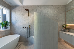
The vaults were constructed from shotcrete on timber framework and finished with a Butynol waterproof membrane. Glass louvres at the height of the clerestory windows provide cross-ventilation and the in-situ concrete accents give the interior a raw edginess.
These soaring geometric forms illuminate the home’s cloistered rooms over the course of the day and rear up in succession, punctuating the volume of the interior.
The vaults were constructed from shotcrete on timber framework and finished with a Butynol waterproof membrane. Glass louvres at the height of the clerestory windows provide cross-ventilation and the in-situ concrete accents give the interior a raw edginess.
Seen here in section and eastern elevation, these clerestory windows set the roof aglow at night when the house is lit from within.
Once you’ve crossed the front threshold, this home takes on an entirely different attitude: the interior is as open as the exterior is closed. Step inside and the design immediately goes from concealing itself to revealing its mass in a cavernous, open-plan layout.
The kitchen, dining and living areas dominate the ground floor as seen here in plan. To reconnect the interior to the garden, Mo added bi-fold doors and slide-up windows on the eastern periphery, meaning the main living space can be fully opened up to let the outdoors in.
Again, Mo subtly referenced another 20th century architectural master – Louis Kahn, who is remembered for his monumental buildings and concrete forms – through his choice of materials, form and texture.
“The reason we chose shotcrete was to create a rough and raw surface texture,” says Mo. “We want the building to be remembered.”
“The reason we chose shotcrete was to create a rough and raw surface texture,” says Mo. “We want the building to be remembered.”
In the end, the design phase spanned four months, documentation was finished in six months and construction took 16 months. “The site didn’t require us to apply for a planning permit, therefore it was a much ‘quicker’ process to lead to construction,” says Mo.
Since its completion, Moving House has been shortlisted and nominated as a finalist in numerous awards – both in Australia and internationally – and has captured people’s attention for its blend of rawness and refinement.
Since its completion, Moving House has been shortlisted and nominated as a finalist in numerous awards – both in Australia and internationally – and has captured people’s attention for its blend of rawness and refinement.
“The clients have found the house’s rawness somehow transports them to a tranquil place, as if the house is part of nature,” says Mo.
Tell us
What do you love about this house? Tell us your thoughts in the Comments, save your favourite images and like or save the story.
More
Want more? Take a look at last week’s Room of the Week: A Luxurious Low-Maintenance Seaward Kitchen
Tell us
What do you love about this house? Tell us your thoughts in the Comments, save your favourite images and like or save the story.
More
Want more? Take a look at last week’s Room of the Week: A Luxurious Low-Maintenance Seaward Kitchen
Who lives here: A young professional couple
Location: Kew, Victoria
Size: Site, 600 square metres; house, 300 square metres; 4 bedrooms, 3 bathrooms
Architect: Architects EAT
Before you even enter the front gate, it is quickly made clear that this is a design heavily informed by the modernist architectural movement. Architect Albert Mo cast the home’s street number into the concrete front wall using the same ‘stencil’ font that Le Corbusier – one of the great pioneers of modernist architecture – used in his drawings’ title blocks.