Before & After

USA Bathroom Renovation Brings Back Mid-Century Modern
This renovated family bathroom is sturdy enough for two teenage boys and stylish enough for their parents

A busy couple and their two teenage boys share this family bathroom in their 1950s USA ranch house in Portland, Oregon. Due to its cramped and awkward layout and lack of storage, the family struggled with the 1.5 x 2.4-metre space and decided to fully renovate it.
After having her clients fill out an extensive questionnaire, interior designer Casey Keasler of Casework had a clear sense of their style and needs for the space. They wanted the bathroom to be in a modern, minimalist style; it had to stand up to heavy use; and it needed to be easy to clean. As Keasler says, when the parents “come home from work, they want things to be simple, easy and not too precious for the boys”.
After having her clients fill out an extensive questionnaire, interior designer Casey Keasler of Casework had a clear sense of their style and needs for the space. They wanted the bathroom to be in a modern, minimalist style; it had to stand up to heavy use; and it needed to be easy to clean. As Keasler says, when the parents “come home from work, they want things to be simple, easy and not too precious for the boys”.
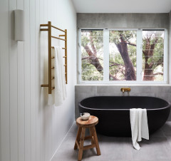
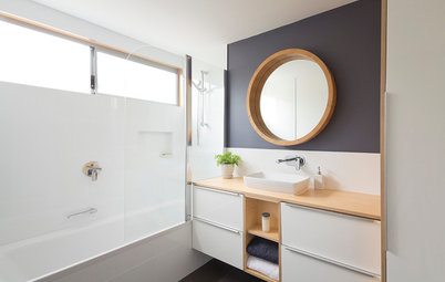
After: The layout changes included bumping out the wall to the left by approximately 30 centimetres to make room to move the bathtub under the window. This increased the space from 1.5 x 2.4 metres to 1.8 x 2.4 metres – a small change that made all the difference by increasing the room’s size from 3.6 square metres to 4.3 square metres.
A new window was also centred over the bath tub, which emphasises the horizontality in the narrow space.
Keasler chose an Icera toilet with perfectly smooth sides as one of many low-maintenance features. “A skirted toilet is way easier to clean – it doesn’t have any of the bolts or pipe shapes that make cleaning other toilets difficult,” she says.
With the bathroom layout in place, Keasler set about finding the right style. She needed an updated look that would suit her client’s minimalist tastes and the home’s mid-century modern vintage. And she needed to find durable and easy-to-clean materials.
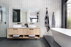
Keasler added just the right dose of interest to the floor by buying one sheet of black 2.5 x 2.5-centimetre Ann Sacks tiles and having the tile installer add small plus-sign shapes. It’s a graphic look reminiscent of patterns that were popular during the mid-century modern period.
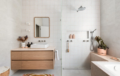
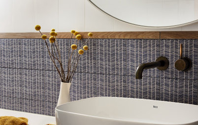
The shower tile (made locally in Portland, USA) lends a handcrafted feel to the room, and its square shape nods to mid-century modern design.
The tile “helps warm the room, has a sparkle to its glaze and has beautiful variation that feels mid-century. And mid-range colours are much better at hiding dirt and dust than bright white or black,” says Keasler. She also used a grey grout, which is easier to keep looking clean than white.
Keasler added just the right dose of interest to the floor by buying one sheet of black 2.5 x 2.5-centimetre Ann Sacks tiles and having the tile installer add small plus-sign shapes. It’s a graphic look reminiscent of patterns that were popular during the mid-century modern period.
The shower tile (made locally in Portland, USA) lends a handcrafted feel to the room, and its square shape nods to mid-century modern design.
The tile “helps warm the room, has a sparkle to its glaze and has beautiful variation that feels mid-century. And mid-range colours are much better at hiding dirt and dust than bright white or black,” says Keasler. She also used a grey grout, which is easier to keep looking clean than white.
Also warming the room are the mirrors, white-oak vanity and built-ins, all custom-crafted by Maple Key. The improved storage is more than ample for these homeowners.
“My clients truly are minimalists. They don’t like clutter, and they really don’t have a lot of products or things like different hair appliances to put in here,” says Keasler.
Minimalistic detailing suits the couple’s tastes and nods to their preferred design era. The tapware have streamlined silhouettes, and rather than adorning the vanity’s drawers with hardware, Keasler gave them simple finger pulls.
The glass shower divider is another minimalist element that helps the room feel open and larger than it is. The vanity’s legs make the floor feel more expansive too, because the tiles can be seen extending underneath it.
The client loves timber yachts and the work of iconic Finnish architect and designer Aino Aalto. So the complex joinery and the simple, sail-like polythene shades of these wall sconces by Brendan Ravenhill were a terrific fit. There is additional recessed lighting in the ceiling.
For the vanity top, Keasler led her clients towards simple, clean-looking white Caesarstone quartz, which is strong enough to stand up to a lot of wear and tear. She continued it up the wall as a 10-centimetre splashback rather than using a different tile, for an uninterrupted minimalist look.
For the vanity top, Keasler led her clients towards simple, clean-looking white Caesarstone quartz, which is strong enough to stand up to a lot of wear and tear. She continued it up the wall as a 10-centimetre splashback rather than using a different tile, for an uninterrupted minimalist look.
Built-in cabinetry – which is 45-centimetres deep and includes shelves for towels, baskets and toiletries – occupies the space where the over-bath shower used to be. Below the shelves are laundry hampers, because a tight space like this cannot handle dirty clothes left on the floor. The white oak of the built-ins matches that of the vanity and mirror frames.
Design tips
Your turn
What’s your favourite element in this space? Tell us in the Comments below, like this story, save the images, and join the conversation.
More
Need more practical tips and measurements to renovate your small bathroom? See 4 Great Small Bathrooms… and How They Did It
Design tips
- Use easy-to-clean elements such as a smooth-edged toilet, mid-tone tiles and durable quartz vanity tops, and opt for darker grout, which is easier to keep looking clean.
- When updating a home but also respecting its history, reference silhouettes, materials and dimensions from the original era – in this case, mid-century modern.
- A glass shower screen and a vanity on legs will make a bathroom feel more open and expansive.
- A bathroom is a great place for laundry hampers, particularly when the entire family shares the space.
Your turn
What’s your favourite element in this space? Tell us in the Comments below, like this story, save the images, and join the conversation.
More
Need more practical tips and measurements to renovate your small bathroom? See 4 Great Small Bathrooms… and How They Did It
Bathroom at a Glance
Who lives here: A couple and their two teenage boys
Location: Portland, USA
Room purpose and size: A family bathroom measuring 4.3 square metres
Designers: Casey Keasler of Casework (interior design) and Studio Coop Architecture
Builder: Raven Builders
Before: An over-bath shower hides behind the door on the left. The bathroom had undergone several renovations over the years that had wiped away its mid-century modern character.
In the last renovation, the previous designer awkwardly tucked a vanity-like cabinet with bench space on the far side of the toilet. This left the family with a small pedestal sink to balance their toiletries upon while using the sink and mirror.