Beige Kitchen with Solid Surface Benchtops Design Ideas
Refine by:
Budget
Sort by:Popular Today
61 - 80 of 6,212 photos
Item 1 of 3
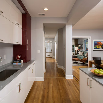
As in many New York City buildings, the extent of this kitchen was limited to the original prewar footprint. Custom cabinets with glass doors, and integrated appliances help keep the space feeling open and airy.
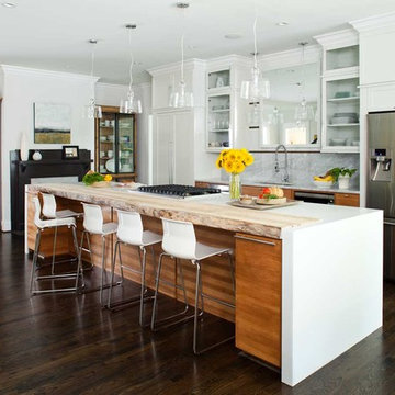
This photo is taken from the newly-added family room. The column in the kitchen island is where the old house ended. The dining room is to the right, and the family room is behind the photographer.
Featured Project on Houzz
http://www.houzz.com/ideabooks/19481561/list/One-Big-Happy-Expansion-for-Michigan-Grandparents
Interior Design: Lauren King Interior Design
Contractor: Beechwood Building and Design
Photo: Steve Kuzma Photography
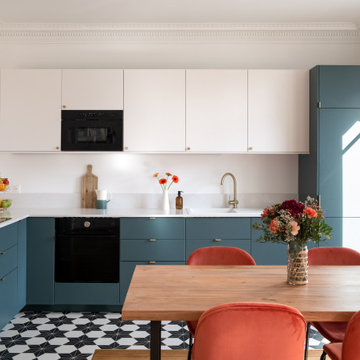
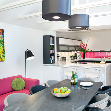
Rénovation complète d'un appartement haussmmannien de 70m2 dans le 14ème arr. de Paris. Les espaces ont été repensés pour créer une grande pièce de vie regroupant la cuisine, la salle à manger et le salon. Les espaces sont sobres et colorés. Pour optimiser les rangements et mettre en valeur les volumes, le mobilier est sur mesure, il s'intègre parfaitement au style de l'appartement haussmannien.
Custom kitchen with dark wood cabinetry, Limestrong plaster backsplash, and Caesarstone countertops.
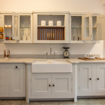
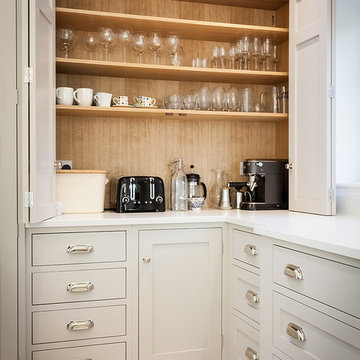
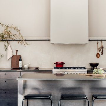
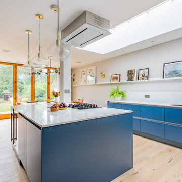
This bright and airy kitchen extension features a large island with bar stools, an induction range, two larder cupboards and a butler's pantry to hide the toaster and coffee machine. The hand painted kitchen by The White Kitchen Company. The worktop is BQS Almond White quartz.
Clients' first home and there forever home with a family of four and in laws close, this home needed to be able to grow with the family. This most recent growth included a few home additions including the kids bathrooms (on suite) added on to the East end, the two original bathrooms were converted into one larger hall bath, the kitchen wall was blown out, entrying into a complete 22'x22' great room addition with a mudroom and half bath leading to the garage and the final addition a third car garage. This space is transitional and classic to last the test of time.
Amos Goldreich Architecture has completed an asymmetric brick extension that celebrates light and modern life for a young family in North London. The new layout gives the family distinct kitchen, dining and relaxation zones, and views to the large rear garden from numerous angles within the home.
The owners wanted to update the property in a way that would maximise the available space and reconnect different areas while leaving them clearly defined. Rather than building the common, open box extension, Amos Goldreich Architecture created distinctly separate yet connected spaces both externally and internally using an asymmetric form united by pale white bricks.
Previously the rear plan of the house was divided into a kitchen, dining room and conservatory. The kitchen and dining room were very dark; the kitchen was incredibly narrow and the late 90’s UPVC conservatory was thermally inefficient. Bringing in natural light and creating views into the garden where the clients’ children often spend time playing were both important elements of the brief. Amos Goldreich Architecture designed a large X by X metre box window in the centre of the sitting room that offers views from both the sitting area and dining table, meaning the clients can keep an eye on the children while working or relaxing.
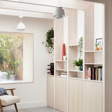
Amos Goldreich Architecture enlivened and lightened the home by working with materials that encourage the diffusion of light throughout the spaces. Exposed timber rafters create a clever shelving screen, functioning both as open storage and a permeable room divider to maintain the connection between the sitting area and kitchen. A deep blue kitchen with plywood handle detailing creates balance and contrast against the light tones of the pale timber and white walls.
The new extension is clad in white bricks which help to bounce light around the new interiors, emphasise the freshness and newness, and create a clear, distinct separation from the existing part of the late Victorian semi-detached London home. Brick continues to make an impact in the patio area where Amos Goldreich Architecture chose to use Stone Grey brick pavers for their muted tones and durability. A sedum roof spans the entire extension giving a beautiful view from the first floor bedrooms. The sedum roof also acts to encourage biodiversity and collect rainwater.
Continues
Amos Goldreich, Director of Amos Goldreich Architecture says:
“The Framework House was a fantastic project to work on with our clients. We thought carefully about the space planning to ensure we met the brief for distinct zones, while also keeping a connection to the outdoors and others in the space.
“The materials of the project also had to marry with the new plan. We chose to keep the interiors fresh, calm, and clean so our clients could adapt their future interior design choices easily without the need to renovate the space again.”
Clients, Tom and Jennifer Allen say:
“I couldn’t have envisioned having a space like this. It has completely changed the way we live as a family for the better. We are more connected, yet also have our own spaces to work, eat, play, learn and relax.”
“The extension has had an impact on the entire house. When our son looks out of his window on the first floor, he sees a beautiful planted roof that merges with the garden.”
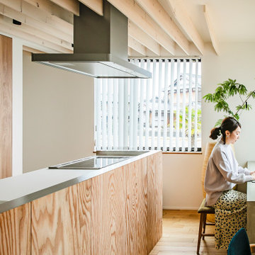
郊外にある新しい分譲地に建つ家。
分譲地内でのプライバシー確保のためファサードには開口部があまりなく、
どのあたりに何の部屋があるか想像できないようにしています。
外壁には経年変化を楽しめるレッドシダーを採用。
年月でシルバーグレーに変化してくれます。
リビングには3.8mの長さのソファを作り付けで設置。
ソファマットを外すと下部は収納になっており、ブランケットや子供のおもちゃ収納に。
そのソファの天井はあえて低くすることによりソファに座った時の落ち着きが出るようにしています。
天井材料は、通常下地材として使用するラワンべニアを使用。
前々からラワンの木目がデザインの一部になると考えていました。
玄関の壁はフレキシブルボード。これも通常化粧には使わない材料です。
下地材や仕上げ材など用途にこだわることなく、素材のいろいろな可能性デザインのポイントとしました。
Beige Kitchen with Solid Surface Benchtops Design Ideas
4