Kitchen with Solid Surface Benchtops Design Ideas
Refine by:
Budget
Sort by:Popular Today
41 - 60 of 3,844 photos
Item 1 of 3
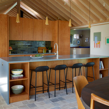
Modern farmhouse kitchen with a warm wood ceiling, built-in pantry storage, and terracotta tile flooring
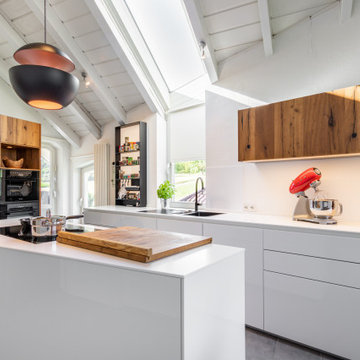
Die Kunst bei der Gestaltung dieser Küche war die Trapezform bei der Gestaltung der neuen Küche mit großem Sitzplatz Sinnvoll zu nutzen. Alle Unterschränke wurden in weißem Mattlack ausgeführt und die lange Zeile beginnt links mit einer Tiefe von 70cm und endet rechts mit 40cm. Die Kochinsel hat ebenfalls eine Trapezform. Oberschränke und Hochschränke wurden in Altholz ausgeführt.
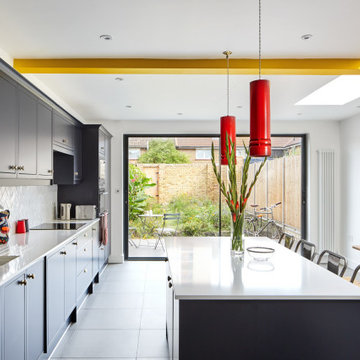
Amos Goldreich Architecture has completed an asymmetric brick extension that celebrates light and modern life for a young family in North London. The new layout gives the family distinct kitchen, dining and relaxation zones, and views to the large rear garden from numerous angles within the home.
The owners wanted to update the property in a way that would maximise the available space and reconnect different areas while leaving them clearly defined. Rather than building the common, open box extension, Amos Goldreich Architecture created distinctly separate yet connected spaces both externally and internally using an asymmetric form united by pale white bricks.
Previously the rear plan of the house was divided into a kitchen, dining room and conservatory. The kitchen and dining room were very dark; the kitchen was incredibly narrow and the late 90’s UPVC conservatory was thermally inefficient. Bringing in natural light and creating views into the garden where the clients’ children often spend time playing were both important elements of the brief. Amos Goldreich Architecture designed a large X by X metre box window in the centre of the sitting room that offers views from both the sitting area and dining table, meaning the clients can keep an eye on the children while working or relaxing.
Amos Goldreich Architecture enlivened and lightened the home by working with materials that encourage the diffusion of light throughout the spaces. Exposed timber rafters create a clever shelving screen, functioning both as open storage and a permeable room divider to maintain the connection between the sitting area and kitchen. A deep blue kitchen with plywood handle detailing creates balance and contrast against the light tones of the pale timber and white walls.
The new extension is clad in white bricks which help to bounce light around the new interiors, emphasise the freshness and newness, and create a clear, distinct separation from the existing part of the late Victorian semi-detached London home. Brick continues to make an impact in the patio area where Amos Goldreich Architecture chose to use Stone Grey brick pavers for their muted tones and durability. A sedum roof spans the entire extension giving a beautiful view from the first floor bedrooms. The sedum roof also acts to encourage biodiversity and collect rainwater.
Continues
Amos Goldreich, Director of Amos Goldreich Architecture says:
“The Framework House was a fantastic project to work on with our clients. We thought carefully about the space planning to ensure we met the brief for distinct zones, while also keeping a connection to the outdoors and others in the space.
“The materials of the project also had to marry with the new plan. We chose to keep the interiors fresh, calm, and clean so our clients could adapt their future interior design choices easily without the need to renovate the space again.”
Clients, Tom and Jennifer Allen say:
“I couldn’t have envisioned having a space like this. It has completely changed the way we live as a family for the better. We are more connected, yet also have our own spaces to work, eat, play, learn and relax.”
“The extension has had an impact on the entire house. When our son looks out of his window on the first floor, he sees a beautiful planted roof that merges with the garden.”
郊外にある新しい分譲地に建つ家。
分譲地内でのプライバシー確保のためファサードには開口部があまりなく、
どのあたりに何の部屋があるか想像できないようにしています。
外壁には経年変化を楽しめるレッドシダーを採用。
年月でシルバーグレーに変化してくれます。
リビングには3.8mの長さのソファを作り付けで設置。
ソファマットを外すと下部は収納になっており、ブランケットや子供のおもちゃ収納に。
そのソファの天井はあえて低くすることによりソファに座った時の落ち着きが出るようにしています。
天井材料は、通常下地材として使用するラワンべニアを使用。
前々からラワンの木目がデザインの一部になると考えていました。
玄関の壁はフレキシブルボード。これも通常化粧には使わない材料です。
下地材や仕上げ材など用途にこだわることなく、素材のいろいろな可能性デザインのポイントとしました。
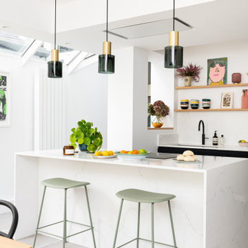
A new side extension allows for a generous new kitchen with direct link to the garden. Big generous sliding doors allow for fluid movement between the interior and the exterior. A big roof light was designed to flood the space with natural light. An exposed beam crossed the roof light and ceiling and gave us the opportunity to express it with a nice vivid colour which gives personality to the space.
SieMatic similaque gloss white and gloss graphite grey cabinets, Solid surface gloss white countertop with waterfall ends and integrated white sink, hidden breakfast bar inside tall cabinets, paneled hidden appliances, SieMatic internal wood and metal accessories, interior custom shelving
Una cucina semplice, dal carattere deciso e moderno. Una zona colonne di colore bianco ed un isola grigio scuro. Di grande effetto la cappa Sophie di Falmec che personalizza l'ambiente. Cesar Cucine.
Foto di Simone Marulli
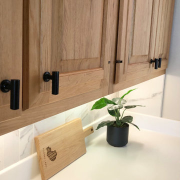
Detail of refinished oak upper cabinets, black hardware, and new backsplash.
Old orangey oak cabinets were refinished to a light natural with satin finish on the upper cabinets. The transformation was subtle but impactful. The lower cabinets were painted a rich black. This tied in the black appliances and modernized the whole space! The same hardware was used on both uppers and lowers, but black on the top and gold on the lowers. Very chic! The old glazed ceramic tiles were demo'ed and new porcelain tiles were installed. The vertical orientation created visual height and is more modern than the traditional subway installation. Tiles were matched to the existing Corian countertops to give a seamless look to the counter to backsplash transition. The veined tiles up-date the look dramatically!
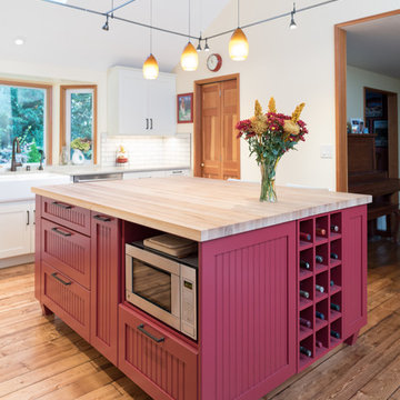
The kitchen island is comprised of pull-out trash & recycling, cookbook shelves, wine storage, seating and a microwave oven niche.
Bunn feet give the island a furniture look.
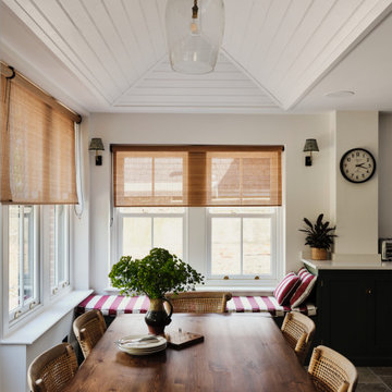
We added tongue and groove cladding to the ceiling, a built in window seat, chik blinds and wall lights to the kitchen diner extension of the Isle of Wight project
Kitchen with Solid Surface Benchtops Design Ideas
3