
Living Room Design Photos with Orange Walls and Brown Floor
Refine by:
Budget
Sort by:Popular Today
41 - 60 of 94 photos
Item 1 of 3
 Chiara Bevegni Design
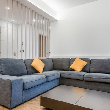
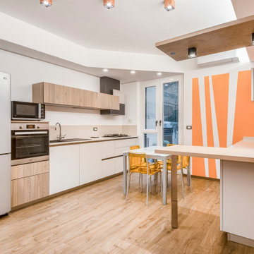
La cucina si apre direttamente sulla zona del soggiorno.
Il colore scelto come principale è il bianco, a cui viene accostato un tono di arancione molto acceso. La particolarità consiste nell'allogazione del colore stesso; con il colore arancione, infatti, vengono messe in evidenza alcune parti cruciali della stanza.
Le linee diagonali attirano il nostro sguardo e creano dinamicità.
Il legno e il tortora di pavimento e arredo contribuiscono a riscaldare l'ambiente, creando un'atmosfera chic, ma al tempo stesso molto famigliare.
La zona living è separata dalla cucina da una penisola in legno massello; La penisola ha la stessa finitura delle ante dei pensili e del top del mobile TV

 Louise Mackay Interior Design
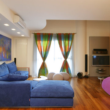
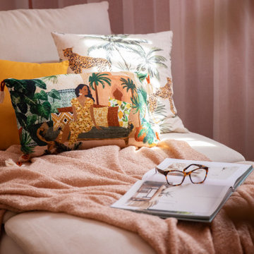
Mi Casa is a sophisticated blend of warm hues, cozy textures and fanciful décor that elegantly enunciates the story of who resides in this restored miner’s cottage. Through a renewed colour palette you are inspired to escape to the Mediterranean seaside inspired by sunsets in Spain.
 TME Interiors
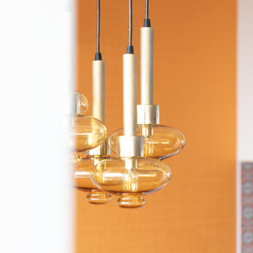
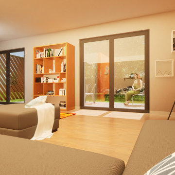
we completely revised this space. everything was ripped out from tiles to windows to floor to heating. we helped the client by setting up and overseeing this process, and by adding ideas to his vision to really complete the spaces for him. the results were pretty perfect.

 Andrea Vertua Architetto
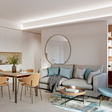
Piccolo soggiorno in appartamento a Milano.
Cucina lineare con basi color canapa e pensili finitura essenza di rovere. Spazio TV in continuità sulla parete.
Controsoffitto decorativo con illuminazione integrata a delimitare la zona ingresso e piccolo angolo studio.
Divano confortevole e tavolo allungabile.
Pavimento in gres porcellanato formato 75x75.
 LEIVARS
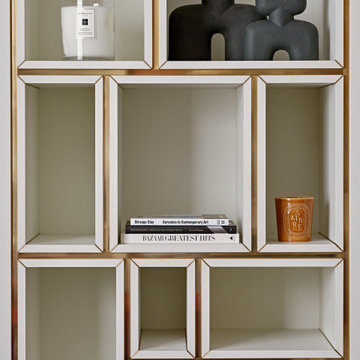
We are delighted to reveal our recent ‘House of Colour’ Barnes project.
We had such fun designing a space that’s not just aesthetically playful and vibrant, but also functional and comfortable for a young family. We loved incorporating lively hues, bold patterns and luxurious textures. What a pleasure to have creative freedom designing interiors that reflect our client’s personality.


 Chiara Bevegni Design
La cucina si apre direttamente sulla zona del soggiorno.
Il colore scelto come principale è il bianco, a cui viene accostato un tono di arancione molto acceso. La particolarità consiste nell'allogazione del colore stesso; con il colore arancione, infatti, vengono messe in evidenza alcune parti cruciali della stanza.
Le linee diagonali attirano il nostro sguardo e creano dinamicità.
Il legno e il tortora di pavimento e arredo contribuiscono a riscaldare l'ambiente, creando un'atmosfera chic, ma al tempo stesso molto famigliare.
La zona living è separata dalla cucina da una penisola in legno massello; La penisola ha la stessa finitura delle ante dei pensili e del top del mobile TV


 Casa Flair Interiors
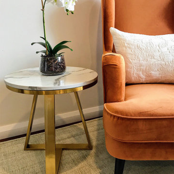
This unused space was repurposed for my client's need to create a warm inviting space for a new Coaching business. The space allows a professional and welcoming setting for clients to comfortably discuss thier pursuits, as well as a bright & invigorationg office space for the owner. "This is amazing!" were the words continually uttered from my client! She was very excited and keen to commence utilizing the space and envisaging its potential.
 TME Interiors
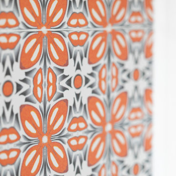
we completely revised this space. everything was ripped out from tiles to windows to floor to heating. we helped the client by setting up and overseeing this process, and by adding ideas to his vision to really complete the spaces for him. the results were pretty perfect.
 Art of Flooring
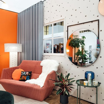
Moduleo Impress Shades 62220 installed in a Living Room designed by Sara Slade Interiors for Grand Designs Live.
Sara Slade Interiors won a competition to design a room-set for Grand Designs Live at the NEC in Birmingham. Sara Slade Interiors designed this room to create a space that moved completely away from neutral palettes and inject a sense of fun by using colour and pattern. Using a mixture of design products and more affordable high-street items, Sara Slade Interiors created a space that can easily be re-created in your own home.
Design by Sara Slade Interiors
Photography by Maciek Platek
 ExpéDesign - Laurine GOBLED
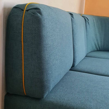
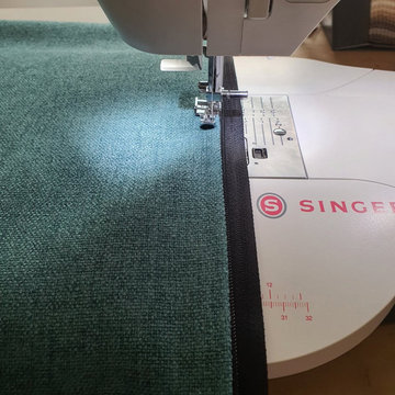
Montage d'une fermeture éclaire pour une housse de banquette de mobile-home.

 LEIVARS
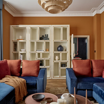
We are delighted to reveal our recent ‘House of Colour’ Barnes project.
We had such fun designing a space that’s not just aesthetically playful and vibrant, but also functional and comfortable for a young family. We loved incorporating lively hues, bold patterns and luxurious textures. What a pleasure to have creative freedom designing interiors that reflect our client’s personality.
3