Midcentury Kitchen with Granite Benchtops Design Ideas
Refine by:
Budget
Sort by:Popular Today
121 - 140 of 2,145 photos
Item 1 of 3
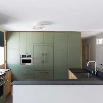
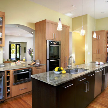
In a home with just about 1000 sf our design needed to thoughtful, unlike the recent contractor-grade flip it had recently undergone. For clients who love to cook and entertain we came up with several floor plans and this open layout worked best. We used every inch available to add storage, work surfaces, and even squeezed in a 3/4 bath! Colorful but still soothing, the greens in the kitchen and blues in the bathroom remind us of Big Sur, and the nod to mid-century perfectly suits the home and it's new owners.
Where do we even start. We renovated just about this whole home. So much so that we decided to split the video into two parts so you can see each area in a bit more detail. Starting with the Kitchen and living areas, because let’s face it, that is the heart of the home. Taking three very separated spaces, removing, and opening the existing dividing walls, then adding back in the supports for them, created a unified living space that flows so openly it is hard to imagine it any other way. Walking in the front door there was a small entry from the formal living room to the family room, with a protruding wall, we removed the peninsula wall, and widened he entry so you can see right into the family room as soon as you stem into the home. On the far left of that same wall we opened up a large space so that you can access each room easily without walking around an ominous divider. Both openings lead to what once was a small closed off kitchen. Removing the peninsula wall off the kitchen space, and closing off a doorway in the far end of the kitchen allowed for one expansive, beautiful space. Now entertaining the whole family is a very welcoming time for all.
The island is an entirely new design for all of us. We designed an L shaped island that offered seating to place the dining table next to. This is such a creative way to offer an island and a formal dinette space for the family. Stacked with drawers and cabinets for storage abound.
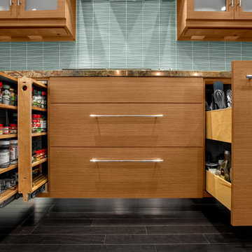
Both the cabinets and drawers lining the kitchen walls, and inside the island are all shaker style. A simple design with a lot of impact on the space. Doubling up on the drawer pulls when needed gives the area an old world feel inside a now modern space. White painted cabinets and drawers on the outer walls, and espresso stained ones in the island create a dramatic distinction for the accent island. Topping them all with a honed granite in Fantasy Brown, bringing all of the colors and style together. If you are not familiar with honed granite, it has a softer, more matte finish, rather than the glossy finish of polished granite. Yet another way of creating an old world charm to this space. Inside the cabinets we were able to provide so many wonderful storage options. Lower and upper Super Susan’s in the corner cabinets, slide outs in the pantry, a spice roll out next to the cooktop, and a utensil roll out on the other side of the cook top. Accessibility and functionality all in one kitchen. An added bonus was the area we created for upper and lower roll outs next to the oven. A place to neatly store all of the taller bottles and such for your cooking needs. A wonderful, yet small addition to the kitchen.
A double, unequal bowl sink in grey with a finish complimenting the honed granite, and color to match the boisterous backsplash. Using the simple colors in the space allowed for a beautiful backsplash full of pattern and intrigue. A true eye catcher in this beautiful home.
Moving from the kitchen to the formal living room, and throughout the home, we used a beautiful waterproof laminate that offers the look and feel of real wood, but the functionality of a newer, more durable material. In the formal living room was a fireplace box in place. It blended into the space, but we wanted to create more of the wow factor you have come to expect from us. Building out the shroud around it so that we could wrap the tile around gave a once flat wall, the three dimensional look of a large slab of marble. Now the fireplace, instead of the small, insignificant accent on a large, room blocking wall, sits high and proud in the center of the whole home.
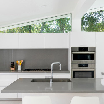
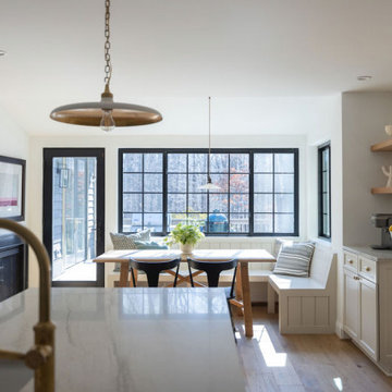
This 1950s Fairfax home underwent a dramatic transformation with updated midcentury modern touches. The floor plan was opened up to create an open plan kitchen and dining room that flows to the back patio.
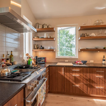
This Denver ranch house was a traditional, 8’ ceiling ranch home when I first met my clients. With the help of an architect and a builder with an eye for detail, we completely transformed it into a Mid-Century Modern fantasy.
Photos by sara yoder
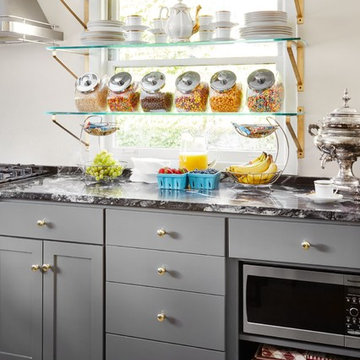
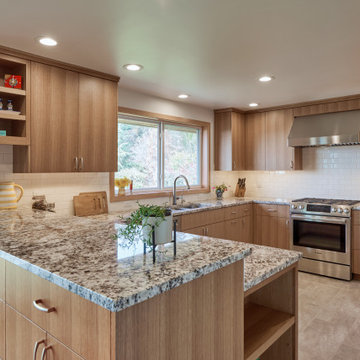
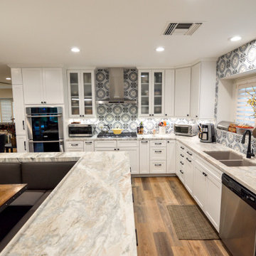
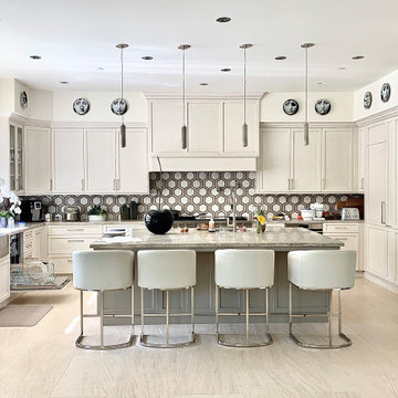
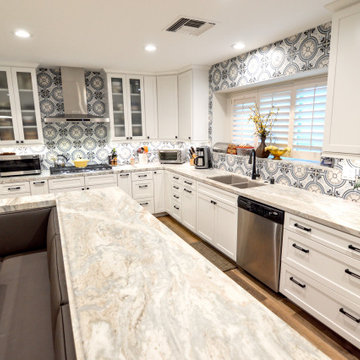
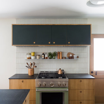
Enlarged kitchen by removing a wall, back door & window, creating a U-shaped kitchen. Stainless steel appliance. Useable comer cabinets; cloud like trays. Ample cookbook storage
Where do we even start. We renovated just about this whole home. So much so that we decided to split the video into two parts so you can see each area in a bit more detail. Starting with the Kitchen and living areas, because let’s face it, that is the heart of the home. Taking three very separated spaces, removing, and opening the existing dividing walls, then adding back in the supports for them, created a unified living space that flows so openly it is hard to imagine it any other way. Walking in the front door there was a small entry from the formal living room to the family room, with a protruding wall, we removed the peninsula wall, and widened he entry so you can see right into the family room as soon as you stem into the home. On the far left of that same wall we opened up a large space so that you can access each room easily without walking around an ominous divider. Both openings lead to what once was a small closed off kitchen. Removing the peninsula wall off the kitchen space, and closing off a doorway in the far end of the kitchen allowed for one expansive, beautiful space. Now entertaining the whole family is a very welcoming time for all.
The island is an entirely new design for all of us. We designed an L shaped island that offered seating to place the dining table next to. This is such a creative way to offer an island and a formal dinette space for the family. Stacked with drawers and cabinets for storage abound.
Both the cabinets and drawers lining the kitchen walls, and inside the island are all shaker style. A simple design with a lot of impact on the space. Doubling up on the drawer pulls when needed gives the area an old world feel inside a now modern space. White painted cabinets and drawers on the outer walls, and espresso stained ones in the island create a dramatic distinction for the accent island. Topping them all with a honed granite in Fantasy Brown, bringing all of the colors and style together. If you are not familiar with honed granite, it has a softer, more matte finish, rather than the glossy finish of polished granite. Yet another way of creating an old world charm to this space. Inside the cabinets we were able to provide so many wonderful storage options. Lower and upper Super Susan’s in the corner cabinets, slide outs in the pantry, a spice roll out next to the cooktop, and a utensil roll out on the other side of the cook top. Accessibility and functionality all in one kitchen. An added bonus was the area we created for upper and lower roll outs next to the oven. A place to neatly store all of the taller bottles and such for your cooking needs. A wonderful, yet small addition to the kitchen.
A double, unequal bowl sink in grey with a finish complimenting the honed granite, and color to match the boisterous backsplash. Using the simple colors in the space allowed for a beautiful backsplash full of pattern and intrigue. A true eye catcher in this beautiful home.
Moving from the kitchen to the formal living room, and throughout the home, we used a beautiful waterproof laminate that offers the look and feel of real wood, but the functionality of a newer, more durable material. In the formal living room was a fireplace box in place. It blended into the space, but we wanted to create more of the wow factor you have come to expect from us. Building out the shroud around it so that we could wrap the tile around gave a once flat wall, the three dimensional look of a large slab of marble. Now the fireplace, instead of the small, insignificant accent on a large, room blocking wall, sits high and proud in the center of the whole home.
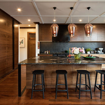
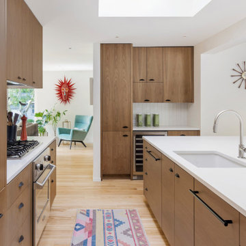
This thoughtfully renovated 1920’s character home by Rogan Nash Architects in Auckland’s Westmere makes the most of its site. The homeowners are very social and many of their events centre around cooking and entertaining. The new spaces were created to be where friends and family could meet to chat while pasta was being cooked or to sit and have a glass of wine while dinner is prepared. The adjacent outdoor kitchen furthers this entertainers delight allowing more opportunity for social events. The space and the aesthetic directly reflect the clients love for family and cooking.
In a home with just about 1000 sf our design needed to thoughtful, unlike the recent contractor-grade flip it had recently undergone. For clients who love to cook and entertain we came up with several floor plans and this open layout worked best. We used every inch available to add storage, work surfaces, and even squeezed in a 3/4 bath! Colorful but still soothing, the greens in the kitchen and blues in the bathroom remind us of Big Sur, and the nod to mid-century perfectly suits the home and it's new owners.
Midcentury Kitchen with Granite Benchtops Design Ideas
7