Modern Entryway Design Ideas with Recessed
Refine by:
Budget
Sort by:Popular Today
1 - 20 of 158 photos
Item 1 of 3
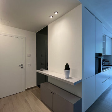
All'ingresso dell'abitazione troviamo una madia di Lago con specchi e mobili cappottiera di Caccaro. Due porte a vetro scorrevoli separano l'ambiente cucina.
Foto di Simone Marulli
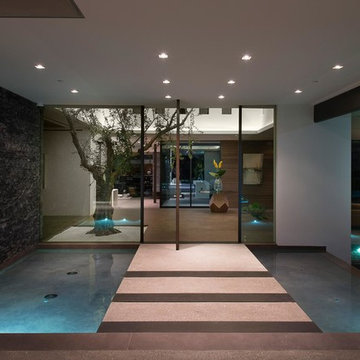
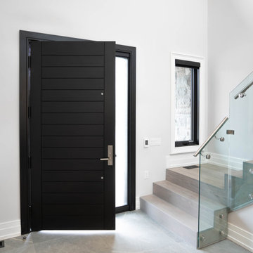
Benedict Canyon Beverly Hills luxury mansion modern front door entrance ponds. Photo by William MacCollum.
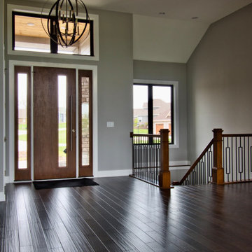
The Entryway's eight foot tall door, sidelights, and transom allow plenty of natural light to filter in. An open railing staircase to the finished Lower Level is adjacent to the entry.
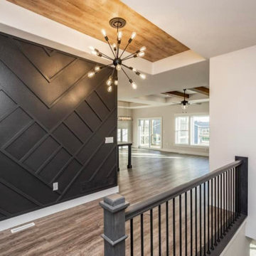
Make a Stunning First Impression with Your Modern Entryway! At Henry's Painting & Contracting, we specialize in redefining the welcome you offer to your home. Our expert design services infuse contemporary style with functional features, creating a modern entryway that captivates from the moment you step inside. The introduction of an accent wall adds a touch of drama and personality to your space. From sleek furniture to innovative lighting and decor, we transform your entryway into a harmonious blend of form and function. Experience the art of modern living with our entryway design, where the perfect entry is just the beginning of an elegant journey through your home.
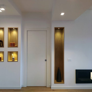
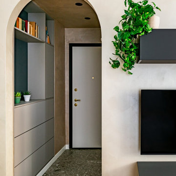
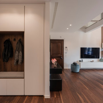
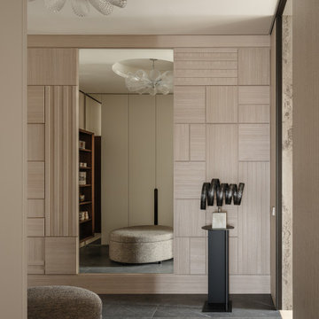
L’ingresso: sulla parte destra dell’ingresso la nicchia è stata ingrandita con l’inserimento di un mobile su misura che funge da svuota-tasche e scarpiera. Qui il soffitto si abbassa e crea una zona di “compressione” in modo da allargare lo spazio della zona Living una volta superato l’arco ed il gradino!
Il punto focale che ha ispirato la realizzazione di questi ambienti tramite ristrutturazione completa è stata L’importanza di crearvi all’interno dei veri e propri “mix d’effetto".
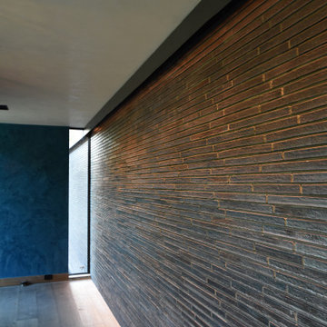
I colori scuri e l'abbianmento di metalo nero con rivestimento in mattoncini sbiancati vogliono cercare di trasportaci all'intermo dello stile industriale, senza però appesantire gli ambienti, infatti come si può vedere ci sono solo dei piccoli accenni.
Il tutto arricchitto da dettagli come la carta da parati, led ad incasso tramite controsoffitti e velette, illuminazione in vetro a sospensione sulla zona tavolo nella sala da pranzo formale ed la zona divano con a lato il termocamino che rendono la zona accogliente e calorosa.
Download our free ebook, Creating the Ideal Kitchen. DOWNLOAD NOW
The homeowners built their traditional Colonial style home 17 years’ ago. It was in great shape but needed some updating. Over the years, their taste had drifted into a more contemporary realm, and they wanted our help to bridge the gap between traditional and modern.
We decided the layout of the kitchen worked well in the space and the cabinets were in good shape, so we opted to do a refresh with the kitchen. The original kitchen had blond maple cabinets and granite countertops. This was also a great opportunity to make some updates to the functionality that they were hoping to accomplish.
After re-finishing all the first floor wood floors with a gray stain, which helped to remove some of the red tones from the red oak, we painted the cabinetry Benjamin Moore “Repose Gray” a very soft light gray. The new countertops are hardworking quartz, and the waterfall countertop to the left of the sink gives a bit of the contemporary flavor.
We reworked the refrigerator wall to create more pantry storage and eliminated the double oven in favor of a single oven and a steam oven. The existing cooktop was replaced with a new range paired with a Venetian plaster hood above. The glossy finish from the hood is echoed in the pendant lights. A touch of gold in the lighting and hardware adds some contrast to the gray and white. A theme we repeated down to the smallest detail illustrated by the Jason Wu faucet by Brizo with its similar touches of white and gold (the arrival of which we eagerly awaited for months due to ripples in the supply chain – but worth it!).
The original breakfast room was pleasant enough with its windows looking into the backyard. Now with its colorful window treatments, new blue chairs and sculptural light fixture, this space flows seamlessly into the kitchen and gives more of a punch to the space.
The original butler’s pantry was functional but was also starting to show its age. The new space was inspired by a wallpaper selection that our client had set aside as a possibility for a future project. It worked perfectly with our pallet and gave a fun eclectic vibe to this functional space. We eliminated some upper cabinets in favor of open shelving and painted the cabinetry in a high gloss finish, added a beautiful quartzite countertop and some statement lighting. The new room is anything but cookie cutter.
Next the mudroom. You can see a peek of the mudroom across the way from the butler’s pantry which got a facelift with new paint, tile floor, lighting and hardware. Simple updates but a dramatic change! The first floor powder room got the glam treatment with its own update of wainscoting, wallpaper, console sink, fixtures and artwork. A great little introduction to what’s to come in the rest of the home.
The whole first floor now flows together in a cohesive pallet of green and blue, reflects the homeowner’s desire for a more modern aesthetic, and feels like a thoughtful and intentional evolution. Our clients were wonderful to work with! Their style meshed perfectly with our brand aesthetic which created the opportunity for wonderful things to happen. We know they will enjoy their remodel for many years to come!
Photography by Margaret Rajic Photography
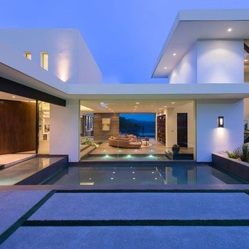
Benedict Canyon Beverly Hills luxury modern mansion exterior & entrance. Photo by William MacCollum.
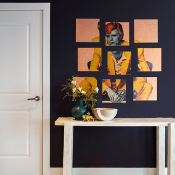
When walking in the front door you see straight through to the expansive views- we wanted to lean into this feature with our design and create a space that draws you in and ushers you to the light filled heart of the home. We introduced deep shades on the walls and a whitewashed flooring to set the tone for the contrast utilized throughout.
A personal favorite- The client’s owned a fantastic piece of art featuring David Bowie that we used as inspiration for the color palette throughout the entire home, so hanging it at the entry and introducing you to the vibes of this home from your first foot in the door was a no brainer.
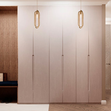
un mobile perfettamente inglobato con il muro, nasconde un guardaroba ed un ripostiglio, sulla destra del muro, grigio, un pannello apribile dello stesso colore, cela alla vista una serie di piccoli quadri elettrici.
Modern Entryway Design Ideas with Recessed
1