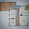
Bag Washed Blocks
Bree Stirling
4 years ago
Featured Answer
Sort by:Oldest
Comments (6)
 PRO
PROMB Design & Drafting
4 years agoBree Stirling
4 years agoRelated Discussions
1940's NZ kitchen - small, awkward-ish layout.
Comments (121)I would suggest you take out the cabinet that is to the right of the stove and use it elsewhere in the house -- perhaps in the bathroom or dining room with a hutch above it. Then, I would suggest you have someone install a lazy susan cabinet in the corner between the sink counter and the stove, meaning you would move the stove down a bit and have a small cabinet/counter top to the right of the stove. I would suggest you have the cabinets refinished in white and then paint the walls a pastel you like. If you would prefer white walls, then add white-painted crown molding and paint the ceiling a light neutral blue, such as Sherwin Williams Niagara Falls Blue. Then, I would suggest you choose a favorite accent color and use this sparingly in accessories like towels, pot holders, small vases or floral arrangements, and a valence above the triple windows. For a genuine 1940s look, you might have white ceramic square tiles with a rectangular red border installed as a back splash behind and above the stove. If you are replacing counter tops, I would suggest a light color such as white with a beige or light grey vein or striation for some sort of pattern. You might be able to find the same color and design in floor tile OR opt for a wood floor as another poster suggested....See MoreCounter height?
Comments (3)This is a kitchen going into a dog kennel building so I'm not too worried about resale. My dogs are raw fed and so I spend quite a bit of time prepping food, washing bowls, etc. I'm only 5'6" but I've been doing these tasks in our house... in our current kitchen which has counters at 35 1/2"... and my back is constantly killing me after I get done. I've purchased a long stainless steel counter top for the kennel (with built in sinks) but plan on the cabinets underneath being custom built. Just can't figure out what height. I was wondering... if I'm sitting at a table (which is comfortable for me to work at for hours on end) and I measure where the table top "hits" on my body and then stand and measure the distance to the floor, it's about 41". I'm wondering if that is an indication as to where my counters in the kennel should be! Seems awfully high! I may need to take the counter top I've bought and put it on some saw horses and varying heights and work on it to see what is best before I make the call!...See MoreNeed help to remodel house into two flats
Comments (4)I think your layout is generally good. With a one bedroom it's nice for guests to have access to the ensuite without having to walk through the bedroom. One thing I do notice though is that there is a lot of hallway/storage/circulation space in the center of the building (in the two bedroom portion) that might be better used as living space. You could pretty easily make the ensuite in the one bedroom larger for example. The wash house space seems unnecessarily large to me as well. You could push the wall dividing kitchen from wash house almost all the way back to where the toilet door is in this plan (you'd then have the toilet door open into the wash room to the right from this viewpoint rather than straight ahead). This would leave much more kitchen to porch access, which would be nice....See MoreKitchen Makeover - Before and After
Comments (0)Miramar Kitchen Makeover Getting from a Then to a Now takes commitment and we could not be happier for our delightful clients. They tell us they pinch themselves every morning and what an utter privilege it has been to contribute to a space filled with joy. Before: After: As with any meaningful transformation, this one started with thoughtful consideration of space planning. This previously busy space now feels relaxing and spacious whilst also adding a laundry, having more kitchen storage AND accommodating uncluttered display features. It's a great example of the power of a good layout and bringing in the light :-) Before: After: One 21sqm room contains three zones that are cohesive but also occupy a distinct space practical for their function. The new kitchen layout is a galley (meaning no corners), the dining table that was against a wall is now centralised giving access from all sides, and a laundry occupies a corner formally filled with unused fireplace. Before: After: The new layout is a galley style kitchen with the main benchtop extending the full length of the outer wall. It comfortably accommodates space for a long working bench, storage cabinetry, main kitchen appliances, as well as the contained laundry unit. No corner goes wasted with this particular layout. Tall elements such and fridge freezer and pantry are located on the opposite wall so they don’t block light or views. Adjusting the existing windows allowed for maximum bench space and a clear wall for cabinetry, hob and extractor as well as a succinct shape for a feature tile. Before: After: The former kitchen and dining room didn’t utilise the space as efficiently as it could. We removed the fireplace, reconfigured the room layout, added a laundry, tweaked existing windows to allow for a more open and accessible kitchen design and brought more natural light into the space through skylights. Before: After: NEW LAUNDRY The ‘Laundry in a Cupboard’ is in an accessible area with plenty of room around it when in use but able to be shut away and appear as one with the kitchen. SPECIFIC FEATURES • Enclosed cupboard space to fit washing machine and ventless dryer. • Space to accommodate a dirty laundry basket and a laundry basket for clean washing. • Tall and narrow cupboard for ironing board, floor mop and Dyson vacuum cleaner. • Higher additional shelving for infrequently used storage e.g. Christmas decorations. Before: After: SKYLIGHTS The wall was able to be used by deleting an ineffectual window and raising the height of another so a bench to run underneath. The natural light was generously supplemented with the inclusion of three fabulous skylights that bathe the whole space in light. Before: After: For this kitchen, the transformation was quite remarkable. The room went from a worn, dim and makeshift set up to a well functioning, modern and attractive space. Before: After: DISPLAY SHELVES The display shelves on the cabinetry corners facing the table create a comfortable feeling for dining, enhanced by the low feature pendant over the inviting round table. Before: After: AESTHETICS The overall palette aimed to be refreshing and a balance of pretty and smart. Some of the key features: ‘Contemporary character’ achieved through matte surfaces and clean lines. Precise, elegant and simple cabinetry. Colours and materials that balance fresh light walls bathed in natural light with cool and warm in balance. Cool tones from the subtle sage green/grey coloured cabinetry and detail in the marble splashback tiles Light, warm timber tones used on floor, furniture and joinery details. Before: After: PENDANT having low over dining table helps to create an intimate gathering space in an open plan area Before: After: OPEN STORAGE The custom timber joinery designed for the tall open shelving unit and above the sink visually create a sense of the space appearing larger. Purposefully placed on the corner of a block of cabinetry, the tall open shelving doesn’t completely block off the view from the dining area. At the same time the open shelving is useful for placing items and small appliances that are frequently used, adding to the range of storage possibilities within the space....See More- PRO
MB Design & Drafting
4 years ago 
siriuskey
4 years agoBree Stirling
4 years ago

siriuskey