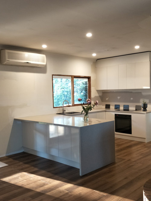
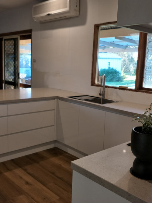
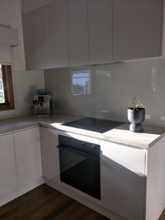
Help needed please to choose glass splash back colour
manask222
3 years ago
Featured Answer
Sort by:Oldest
Comments (25)

manask222
3 years agoRelated Discussions
Help me choose a wallpaper!!
Comments (25)There are tons of papers available that would go with your midcentury home. Many people tire of a paper quicker than they are ready to redecorate and they can also look dated in a couple of years. Metallic papers were big im midcentury...perhaps a metallic silver paper? Are you also considering paint? You can get it in so many textures and a blue wall to match the blue in your loveseat would be lovely with some midcentury art and sculpture, or photographs on it. A mirrored wall with or without art or sculpture would also work with midcentury. These treatments are easier to adapt should you wish to change the look slightly from time to time. I would suggest replacing your stairrail with chrome or acrylic if that is in the budget...see how well the loveseat frame looks with the fabric? I hope you will post the "after" photos for us to see. Above all, enjoy the process!...See MoreHelp for bedroom please
Comments (1)Especially with the amber-colored glass at the top of the window, orange and pink would be nice for this room....See MoreI need help choosing an exterior colour scheme
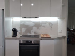
Comments (8)Hi, I know there are so many things to take into account and it's hard to get perspective from a photo. The white you can see is an extension with building paper, and the red is the existing building which is two story. The exterior is wide weatherboard planking, the windows are silver aluminium with very little trim. The doors in the front of the picture are French doors from bedrooms that will open to an enclosed courtyard ( yet to be built of course) The roof will be a light grey/brown but you won't see it much because of the flat roof style. There will be decking and ballustrades covering half of the new extension....See MoreHelp! I think i made a mistake with my splash back colour!
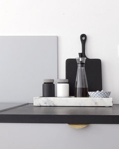
Comments (46)The blue is awesome (grey is too trendy)! The reason it stands out to you is perhaps because it's the only real colour there. Bring in the blue in a window treatment, a small appliance that sits on the counter, a pretty tray or area rug. Also, it is more appealing often if there are more than 2 colours - so right now you have a white and blue colour scheme - bring in red or orange or fushia - something from the other side of the spectrum (like you did with the yellow flowers but in a more permanent way)!...See Moremanask222
3 years agomanask222
3 years agorobandlyn
3 years ago PRO
PRODr Retro House Calls
3 years ago
C P
3 years agoESB
3 years ago
differentways
3 years agolast modified: 3 years agobigreader
3 years agomanask222
2 years agomanask222
2 years agolast modified: 2 years agomanask222
2 years agomanask222
2 years agomanask222
2 years ago


manask222Original Author