Before & After
Architecture
Renovating
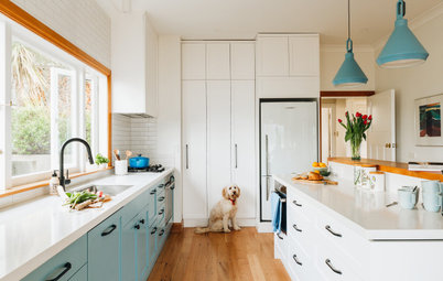
Before & After: Moody Blues & Luxe Touches Transform a Drab Home
A serious kitchen upgrade, a splash of petrol blue and some stunning furnishings make a dull dwelling unrecognisable

In this Q&A series, we turn the spotlight on one thought-provoking renovation or makeover each week. Here, Bo Chu, creative director at Pitch Architecture + Design, takes us through the sensitive reimagining of a dated and dysfunctional brick-veneer home for a pair of retirees.
The kitchen before works.
What is the house like?
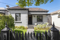
A single-storey brick veneer house built in early 2000.
Ready to get cracking on your own renovation? Find an architect near you on Houzz
What is the house like?
A single-storey brick veneer house built in early 2000.
Ready to get cracking on your own renovation? Find an architect near you on Houzz
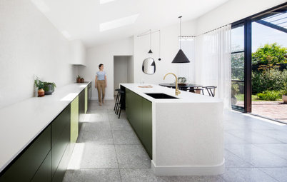
The kitchen after works.
What condition was the house in?
Fair, but dated and worn out.
What wasn’t working for the client?
The original enclosed kitchen was too small, poorly laid out and dysfunctional.
The overall interior of the house felt tired and needed a refresh.
What condition was the house in?
Fair, but dated and worn out.
What wasn’t working for the client?
The original enclosed kitchen was too small, poorly laid out and dysfunctional.
The overall interior of the house felt tired and needed a refresh.
The floor plan before works.
How would you describe this project?
An internal renovation.
What was your scope of works?
We were initially engaged to provide concept, construction documentation and contract administration work. Later on, the client also engaged us to provide furnishing and styling services, which included choosing the colours and finishes.
The floor plan after works.
What was the client’s brief?
To refresh the overall interior of the house and specifically create an open-plan kitchen. A new door from the garage to the interior spaces was to be added as well.
What were their must-haves for the new design?
What was the client’s brief?
To refresh the overall interior of the house and specifically create an open-plan kitchen. A new door from the garage to the interior spaces was to be added as well.
What were their must-haves for the new design?
- A new kitchen.
- New bathrooms.
- New joinery.
What did you identify as the main problems or challenges?
The main problem was the enclosed original kitchen and the corridor adjacent to it, which created two parallel corridors that increased unnecessary circulation.
There also wasn’t direct access from the garage to the interior.
The main problem was the enclosed original kitchen and the corridor adjacent to it, which created two parallel corridors that increased unnecessary circulation.
There also wasn’t direct access from the garage to the interior.
What was gained with the renovation?
- A new open-plan layout.
- A more open and practical kitchen.
- The interior design of the home, including the wet areas, was refreshed and brought up-to-date.
- New joinery.
What exactly did you do?
- We removed the wall next to the kitchen to open up the space.
- We demolished the original kitchen (retaining the services connections) and reconfigured it with an open-plan layout, which opened up the interior spaces significantly.
- We added a new door in the living room that provides direct access from the garage.
What was the budget?
Around AU$250,000.
Where did most of it go?
On the joinery and wet areas.
Browse more images of delightful Australian dining rooms on Houzz
Around AU$250,000.
Where did most of it go?
On the joinery and wet areas.
Browse more images of delightful Australian dining rooms on Houzz
The view into the original kitchen.
Tell us about the kitchen
The original kitchen had a galley layout, with the kitchen bench sandwiched by a wall and a full-height pantry. We worked very closely with the client and tried to understand their cooking habits and preferences with the new design. We decided to demolish the entire original kitchen and adjacent walls, but keep all the service connection points where they were in order to reduce costs.
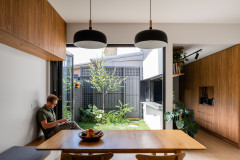
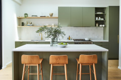
For the new kitchen, we created an L-shape layout with a large central island bench that opens onto the living area. The central island contains a microwave, sink with a Zip tap and dish drawers that face the ‘cooking’ side, with storage and seating on either side of it.
The food-preparation area now faces the window, which overlooks a cosy and leafy backyard. The pantry and cooktop are positioned on either side of it.
Tell us about the kitchen
The original kitchen had a galley layout, with the kitchen bench sandwiched by a wall and a full-height pantry. We worked very closely with the client and tried to understand their cooking habits and preferences with the new design. We decided to demolish the entire original kitchen and adjacent walls, but keep all the service connection points where they were in order to reduce costs.
For the new kitchen, we created an L-shape layout with a large central island bench that opens onto the living area. The central island contains a microwave, sink with a Zip tap and dish drawers that face the ‘cooking’ side, with storage and seating on either side of it.
The food-preparation area now faces the window, which overlooks a cosy and leafy backyard. The pantry and cooktop are positioned on either side of it.
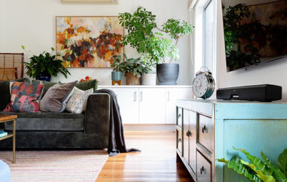
What did you do in the living area?
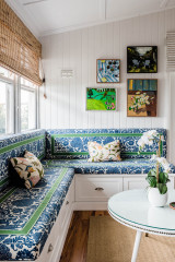
Minimal changes were made to the living and dining areas, apart from a new floor and fresh paint.
A chandelier was added to the dining area to create a little drama.
Minimal changes were made to the living and dining areas, apart from a new floor and fresh paint.
A chandelier was added to the dining area to create a little drama.
What was your thinking behind the colour and materials palette?
The client wanted a rich and moody interior palette. We chose a warm dark walnut colour for the floor finish, with a brighter and more playful blue finish to all the joinery throughout the house. We kept the walls and ceiling white to contrast with the floor and joinery.
The client wanted a rich and moody interior palette. We chose a warm dark walnut colour for the floor finish, with a brighter and more playful blue finish to all the joinery throughout the house. We kept the walls and ceiling white to contrast with the floor and joinery.
What challenges did you have to work around ?
The biggest challenges were working with a tight budget and with some imperfect existing conditions while achieving a highly detailed and functional design.
The biggest challenges were working with a tight budget and with some imperfect existing conditions while achieving a highly detailed and functional design.
The bathroom before works.
What are the defining features of the house now?
It’s a simple design that is well-considered and functional.
What are the defining features of the house now?
- A new interior palette.
- A new kitchen.
- New bathrooms.
It’s a simple design that is well-considered and functional.
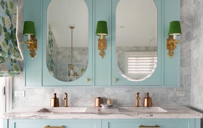
The bathroom after works.
Materials palette
Interior palette
Materials palette
Interior palette
- Caesarstone Symphony Grey on the kitchen and bathroom benchtops.
- Laminex Winter Sky laminate on the kitchen and bathroom joinery.
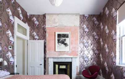
The bedroom before works.
Paint colours
Paint colours
- Dulux Whisper White on the walls and ceiling.
- Dulux Lexicon Half on the doors, architraves and skirtings.
The bedroom after works.
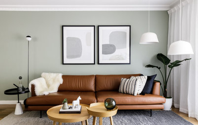
Furniture and fixtures
Your turn
What features here catch your eye? Tell us in the Comments below, like this story, save the images for inspiration, and join the conversation.
More
Keen to see another home made beautiful with blue? Check out this Before & After: A Blissfully Serene Apartment Makeover
Furniture and fixtures
- West Elm sofas, dining table and chairs, coral armchair, coffee table, floor lamp, media console and arched metal-framed mirror.
- Life Interiors Parker bar stools in the kitchen.
- About Space Upor 5 pendant light in the kitchen.
- About Space Forte bathroom wall light.
- West Elm Sphere & Stem chandelier in the dining area.
Your turn
What features here catch your eye? Tell us in the Comments below, like this story, save the images for inspiration, and join the conversation.
More
Keen to see another home made beautiful with blue? Check out this Before & After: A Blissfully Serene Apartment Makeover

Sponsored
Answers by Bo Chu, creative director at Pitch Architecture + Design.
Who lives here: A retired couple
Location: Kew, Victoria
Number of bedrooms and bathrooms: Three bedrooms and two bathrooms
Size of the house: 210 square metres
Budget: Around AU$250,000
Architect and interior designer: Bo Chu at Pitch Architecture + Design
Did you use Houzz for this project?
Yes, we used Houzz to show the clients our previous projects and we used Houzz Ideabooks to share design ideas.