
Decorating

Interior Design
Book Review: 'Design With Colour and Style' by Shaynna Blaze
This award-winning interior designer gives the inside scoop on colour trends and how best to find your own style

Shaynna Blaze has been creating stunning interiors in homes and commercial premises for more than 20 years and if you’ve ever seen The Block, you’ll have seen Blaze on the judging panel. In this, her second book, she helps us understand colour before learning how best to apply it to our own homes. Far from encouraging a cookie-cutter approach, Blaze’s book is all about helping us determine our own sense of style, and working out which colours will make our home not only look amazing, but feel fabulous, too.
Personal style
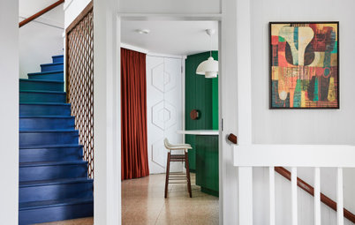
There is a big difference between copying a period or era’s style and copying someone’s personal style, Blaze says. “A copied personal style in a home lacks real soul, as it never truly captures the essence of the person who lives there.”
An authentic personal style, on the other hand, evolves. “It grows and it tells stories of a life lived.”
There’s nothing wrong looking to a particular era for inspiration – it’s a way of tapping into history and finding a beautiful platform to add your personal touches to.
“Your personal style will be a pinch of your past, a lot of your present and ever-evolving into the future,” Blaze says.
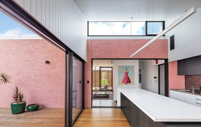
Framed artwork: Designer Boys Collections; white cross box and gold banana bud vase: Coco Republic; console table: Boyd Blue; chair: Meizai; flamingo cushion: Sparkk Shop; wall colour in ‘Sheffield Grey’: Taubmans
There is a big difference between copying a period or era’s style and copying someone’s personal style, Blaze says. “A copied personal style in a home lacks real soul, as it never truly captures the essence of the person who lives there.”
An authentic personal style, on the other hand, evolves. “It grows and it tells stories of a life lived.”
There’s nothing wrong looking to a particular era for inspiration – it’s a way of tapping into history and finding a beautiful platform to add your personal touches to.
“Your personal style will be a pinch of your past, a lot of your present and ever-evolving into the future,” Blaze says.
Framed artwork: Designer Boys Collections; white cross box and gold banana bud vase: Coco Republic; console table: Boyd Blue; chair: Meizai; flamingo cushion: Sparkk Shop; wall colour in ‘Sheffield Grey’: Taubmans
Colour
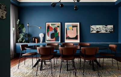
What makes one person smile can irritate another so it pays to think about how you react to different colours before deciding on a colour scheme for your room or home. Blaze suggests creating a personal colour chart where you look at each colour, then write down as many emotions, descriptive words, objects and anything else that colour brings out for you.
Memories often come into play and influence our feelings about a particular colour. Brown to one person might be drab and depressing, but can remind another of the delights of chocolate. “There is no right or wrong with how you feel about a colour,” Blaze says. “Express in words two colours that ignite your smile or make you feel cocooned, colours you feel at peace with. Make that connection to your happy colours and you will find a small key to unlocking your personal colours.”
To Blaze, the emerald in this image is “as beautiful as the peacock that symbolised the era of Queen Victoria.”
Successful colour choices
MONOCHROMATIC: Using a singular colour is a safe bet for getting started with colour, Blaze says, because it’s the simplest. “You can lay different levels of that single colour in many ways, with your wall colour, fabrics, artwork, lighting and flooring.” While it may be the simplest, it also carries the greatest risk of being bland and one-dimensional.
COMPLEMENTARY: When two colours that are on opposite sides of the colour wheel are paired together, they’re known as complementary – blue and orange or pink and green, for example. Although complementary colours risk being ‘in your face’, they can be used to great effect when you want to create a focal point in the room or direct attention away from less attractive aspects of a room. “You can use colour as a cheeky diversion as it’s the perfect way to drag focus in the direction you want, rather than where the eye will naturally fall,” Blaze says.
ANALOGOUS: A harmonious colour scheme, drawn from hues that sit side by side on the colour wheel, is an easy one to get right no matter how bold or soft the tones. Blue and green, for example.
TIP: Warm colours advance and cool colours recede. This is your number one tool to create little tricks with your interior without doing massive renovations. Using blue or green in a small room will make it feel larger and create a restful environment, for example. In a large space, Blaze suggests using timber surfaces in flooring or furniture to prevent it feeling too clinical. “Textures in timber grains and the pile and grains in fabrics can have a big impact on making a room feel warmer, as they are tactile and create a connection to the space. Fabrics that make you want to feel them create an instant invitation to bond with a space.”
Copper candle holder, saddle chair and rose gold bowl: Meizai; brass and marble side table: Bisque Interiors; artwork: Tim Wise
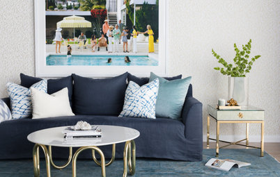
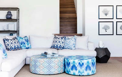
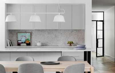
Style influence
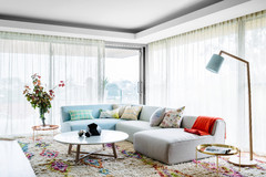
One of the great things about this book is that it delves into popular decorating styles and how to adapt them for the modern lifestyle. Coastal style, as illustrated in this image, is influenced by the elements.
The house you live in won’t always be in the style you want it to be. “To work out your own personal style and respect the envelope of a building, you need to go back in ‘style time’,” Blaze says. “This will help you to truly understand why certain elements are present and to feel confident in the elements you change with an existing building.” It’s easy to get caught up in a look or ‘theme’ of your interior rather than be inspired by the home’s style and colours, she explains.
“Existing styles generally have predetermined colour schemes [Victorian, for example] that work with the time and place the style originated from … but the great thing about creating individual style is that when you tweak an original interior style by using your own personal palettes, it starts to take on a whole new look.”
MORE BOOK REVIEWS
Book Review: ‘The Tailored Interior’ by Greg Natale
Book Review: ‘A Place Called Home’ by Mr Jason Grant
Book Review: ‘Gypsy’ by Sibella Court of The Society Inc

DID YOU KNOW? Colour trends used to emerge out of change, religion, war and social movements, but these days they are more artificially constructed. According to Blaze, professional trend forecasting is big business. Colour forecasters set the trends for what the colours in manufacturing will be on the basis of ‘this is what people want’. Manufacturing is about reducing commercial risk, so many companies follow these trends in an effort to lessen the risk. Fortunately, trends are now multi-faceted and a palette of colours is presented rather than a single shade, and there is room to move when it comes to personal interpretations of suggested schemes. “You don’t need to be dictated to,” Blaze says. “The colours you embrace now are the colours that express you, and when presented with a palette you can take the bits that work for you.”