Room Of The Week
Popular Houzz Series
Popular Houzz Series
Appears in
See also
Fun HouzzFrom The ProsHouzz Around The WorldProject Of The WeekStickybeak Of The WeekQuizzesCreatives At HomeAt Home With...Best Of The WeekRoom Of The WeekDesigner Profiles3 Things I Wish My Clients KnewHow Do I...Buyer's GuidesExpert EyeInnovation AlertSo Your Style Is...Spotted!Picture PerfectBefore & AfterBudget BreakdownHome TimeMade Local
Exterior of the Week: Curvy, Cream Brickwork for Zen-Like Vibes
Soft curves and creamy bricks allow this new multi-generational Melbourne home to snuggle into the landscape

In a Q&A format, we talk to the designers – and examine the creative thinking – behind some of Houzz’s most loveable rooms and outdoor areas.
What was your brief?
The client came to us with a few general ideas around their project brief. It quickly became clear that this house needed to support three very distinct functions: one, be a home for the client as a retired couple; two, house their young adult children; and three, accommodate visiting friends and family, who often stay for extended periods.
Through our discussion and analysis of the brief, the client began to feel the only solution was to build two separate dwellings. But we were able to illustrate another possibility – creating flexible spaces and combining function where appropriate, while creating ‘breaks’ between the private spaces with courtyards, glazed corridor links and material changes.
Tell us about the design of the outdoor space
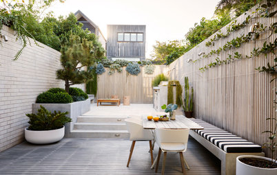
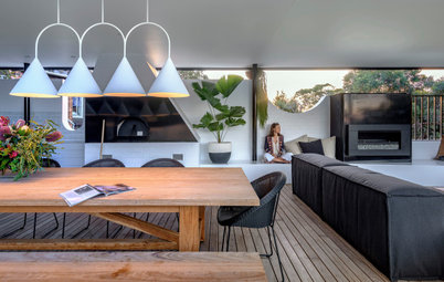
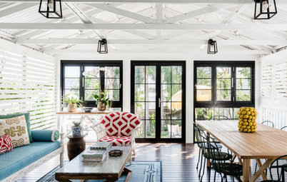
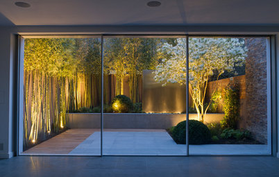
Although the house is large, we designed it so every room connects to an outdoor space. While you move through the home, it never feels overwhelmingly large, but more like a progression of spaces and moments.
Having the main courtyard allowed us to achieve this. The two floors interlock to form a two-level central courtyard. The idea is that as you move through the house, you are constantly looking into the courtyard, and eventually it naturally becomes a shared backdrop for everyone – both as a way to create a constant connection with the landscape and as a visual anchor throughout the home.
Inspired to embark on your own knockdown-rebuild? Find an architect near you on Houzz
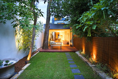
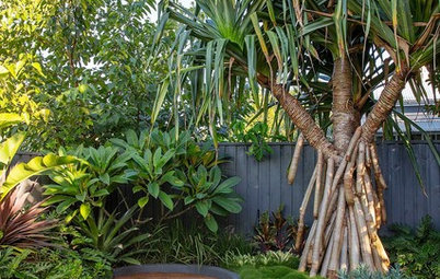
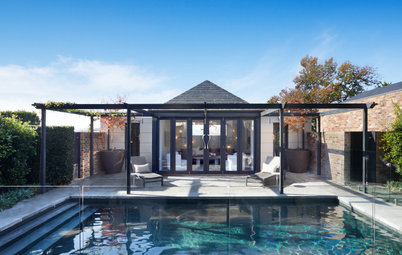
By utilising the first-floor structure, we were able to create a covered outdoor space that connects to the courtyard. This links to an outdoor fireplace, pool area, putting green and the rest of the garden.
Instead of the traditional distinction between house, front yard and backyard, we were able to weave the garden through the design to create a house that is bonded to its surrounding landscape.
The linking curved glass corridor doubles as a sun room on cooler days. In warm weather, the steel pivot doors and louvre windows can be opened for a smooth indoor-outdoor connection.
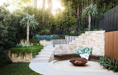
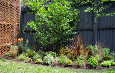
A series of silver birch tress in the courtyard add softness and a sense of tranquillity, helping create a space for contemplation and quiet relaxation. We included a curved concrete bench in the courtyard to encourage you to slow down – a little rest stop, if you like.
Instead of the traditional distinction between house, front yard and backyard, we were able to weave the garden through the design to create a house that is bonded to its surrounding landscape.
The linking curved glass corridor doubles as a sun room on cooler days. In warm weather, the steel pivot doors and louvre windows can be opened for a smooth indoor-outdoor connection.
A series of silver birch tress in the courtyard add softness and a sense of tranquillity, helping create a space for contemplation and quiet relaxation. We included a curved concrete bench in the courtyard to encourage you to slow down – a little rest stop, if you like.
What was your starting point?
Aesthetically, we wanted this house to belong to the landscape.
Formally, the composition of the house appears both natural and sculptural, and evokes a sense of wonder and curiosity.
Aesthetically, we wanted this house to belong to the landscape.
Formally, the composition of the house appears both natural and sculptural, and evokes a sense of wonder and curiosity.
From the street, the ground wall is designed to appear embedded in the land, with the landscape falling towards the house.
The black timber elements sit above to further accentuate the weight and visually push the form down even further. This ‘embedded’ design allows the house to feel naturally rooted in the land, akin to a rock half-submerged.
The corners are rounded to give the building a soft, sculptural form, while the windows and doors are carefully positioned away or hidden from the street to remove a sense of scale and architectural elements – again, emphasising the form as a sculpture rather than house.
What materials did you use?
The project is largely made up of two materials. On the lower level, the house is wrapped in warm white concrete bricks (Adbri Architectural Smooth bricks in Ivory), while the floor above is clad in a black-stained, thermally modified timber (Cambia Ash shiplap boards finished in WOCA black).
The modified timber is incredible – it is very durable, stable, and requires minimal maintenance. It looks as good today as the day it was installed.
The bricks provide the house with weight and help root it in the landscape. The warm white colourway is a perfect canvas for capturing the shadows in the garden.
By restricting the number of materials, we allowed the forms and ideas of the house to be clearly expressed and understood.
What drew you to these ivory concrete bricks?
We wanted a style of brick that could accentuate the subtly curved forms of the building and highlight the textural interplay between the solid walls and the hit-and-miss brick pattern. The soft tones of these bricks do the job perfectly, and their light colour feels warm and inviting.
Why did you use the one brick throughout?
Using the same material throughout helps to highlight the subtle changes in the brick detailing, for example the curves and the hit-and-miss layout.
Tell us about the curved ledge
This cantilevered concrete ledge multi-functions as a fireplace hearth, bench seat and step.
Browse more images of contemporary Australian facades on Houzz
This cantilevered concrete ledge multi-functions as a fireplace hearth, bench seat and step.
Browse more images of contemporary Australian facades on Houzz
Tell us about the hit-and-miss brickwork you’ve used
There is a beautiful moment every afternoon when the setting sun filters through the courtyard. We wanted to highlight this moment, so we pulled out the bricks above the fireplace to accentuate the long shadows.
We’ve used the same layout on the facade too. This is a large house and we knew it was important to find ways to provide visual relief in the form. We used a hit-and-miss brick pattern to reduce the scale of the wall to make the entrance feel lighter and more welcoming.
This guest bedroom and the adjacent gardens are located along the street frontage, so we needed to allow both light into the gardens and create privacy and screening. Again, the hit-and-miss brick detail works wonderfully.
What challenges did you work around?
Contextually, we understood we were introducing a house that is very different to the others in the area, so we wanted to make sure it respected the surrounding architecture and landscape.
By following the contours of the site, the house is one of the lowest on the street. From the top of the street, you can see over the house completely. The setback is generous and we moved the majority of the first-floor form away from the street to minimise visual bulk.
There is no front fence, just as there wasn’t with the previous house that stood here.
How important was curved detailing to this project?
The curves are simple but so important; they soften the overall form and provide a sense of fluidity.
On the lower level, the curves allow the landscape to wrap around the building and anchor the house within the context of the site. We then used the same curved detail on the first floor to soften its overall form.
Why do you think the house works so well?
We always think about how design will age and grow with a family, and I think this house has settled deeply into its site and context, giving it a sense of ease and belonging.
Your turn
What’s your favourite feature here? Tell us in the Comments below. And don’t forget to save your favourite images for inspiration, like this story and join the conversation.
More
Keen to see another stunning outdoor space? Check out this Before & After: From Chaotic Courtyard to Lockdown Oasis

Who lives here: A retired couple and their two adult children
Location: Mount Waverley, Victoria
Architecture and interior design: Michael Ong Design Office
Landscape design: Bush Projects
House size: Around 600 square metres