Room Of The Week
Popular Houzz Series
Popular Houzz Series
Appears in
See also
Fun HouzzFrom The ProsHouzz Around The WorldProject Of The WeekStickybeak Of The WeekQuizzesCreatives At HomeAt Home With...Best Of The WeekRoom Of The WeekDesigner Profiles3 Things I Wish My Clients KnewHow Do I...Buyer's GuidesExpert EyeInnovation AlertSo Your Style Is...Spotted!Picture PerfectBefore & AfterBudget BreakdownHome TimeMade Local
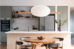
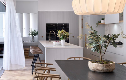
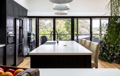
Room of the Week: A ’70s Horror Kitchen Gets a Modern Makeover
No storage, bad laminate, poor light – this dated kitchen is unrecognisable after being gutted and strikingly redesigned

In a Q&A format, we talk to the designers – and examine the creative thinking – behind some of Houzz’s most loveable rooms.
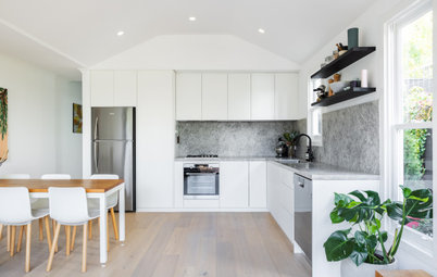
The kitchen before works
What wasn’t working about the kitchen originally?
Everything. The kitchen was dated, closed off from the rest of the dining/living space, and it had arches and dated ’70s laminate.
What exactly did you do?
I reconfigured the kitchen layout, specified new joinery, and selected new finishes, hardware, lighting and furniture.
Dreaming of a new kitchen? Find a local kitchen designer on Houzz and make it happen
The new floor plan after works
Brief
The client wanted a low-maintenance, family-friendly kitchen with space for all four family members to dine at the breakfast bar.
What were the client’s must-haves?
Brief
The client wanted a low-maintenance, family-friendly kitchen with space for all four family members to dine at the breakfast bar.
What were the client’s must-haves?
- A feature splashback.
- A clean and contemporary feel.
- Space for four bar stools at the island/breakfast bar, preferably with the ability to take in the view.
Starting point
The kitchen’s existing footprint, window and distant water views.
Challenges you worked around
Working within the kitchen’s small original footprint while making it seem more spacious, improving functionality, and boosting storage.
The kitchen’s existing footprint, window and distant water views.
Challenges you worked around
Working within the kitchen’s small original footprint while making it seem more spacious, improving functionality, and boosting storage.
Where did most of the $35,000 budget go?
On the joinery and the benchtop and splashback materials.
Was storage a concern here?
Storage is always paramount – and with a young family, you can never have enough.
We took the cabinetry all the way to the ceiling and split the overhead units into two sections. This allows for easy reach at the bottom and some longer-term storage at the top.
I also recommended matching joinery in the dining area to complement the kitchen. This will be carried out in the next phase of the renovation.
Tell us about the colour and materials palette
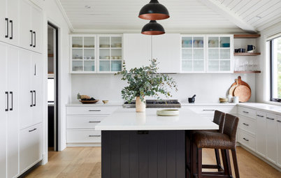
I love using clean, crisp neutrals such as grey, warm white and black, and softening them with warm timber tones.
Here, I punctuated the palette with black – in the tapware, lighting, range hood and custom-made pantry handle. The kitchen stools in black leather, timber and steel also work well to bring the colour scheme together.
We love the oversize black cabinetry handle – tell us about it
The original brief was to keep the look clean and handle-free, but I decided that one feature item would provide a focal point and complement the kitchen’s black highlights.
I had this handle custom-made and stained black. Its round shape provides softness and it contrasts with all the straight lines in the kitchen, while mirroring the rounded light fittings overhead.
Why did you choose roller blinds?
There is quite a bit of direct sunlight streaming into this space, which we had to control without compromising the view. I selected sunscreen roller blinds that allow you to see out, while providing good sun protection.
Why do you think this space works so well?
It’s very light and airy, with easy traffic flow around the central island and a clear line of sight to the water outside.
Key design aspects
Colour palette: Grey, black, white and timber tones.
Materials palette:
Colour palette: Grey, black, white and timber tones.
Materials palette:
- Cabinetry finished in Polytec Prime Oak satin polyurethane in Dulux Natural White.
- Polytec Venette Black to the rangehood canopy.
- Essastone Ash Concrete benchtop with a Matt finish.
- Artedomus Maximum Michelangelo porcelain sheet to splashback.
- Walls and architraves in Dulux Natural White.
Key pieces of fittings/fixtures:
Your turn
Are you as inspired by this striking redesign as we are? Tell us in the Comments below. And don’t forget to save your favourite images, like this story and join the conversation.
More
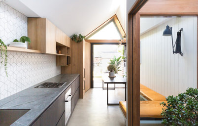
Want more kitchen inspiration? Don’t miss this Room of the Week: An Industrial-Style Kitchen Custom-Made for One
- Armando Vicario Tink kitchen mixer in matt black.
- DCW Editions Acrobates pendant lights.
- Pigeon Bar Stools in oak/steel/leather from Trit.
- Custom-designed round handle in Tasmaniam oak by In-Teria.
Your turn
Are you as inspired by this striking redesign as we are? Tell us in the Comments below. And don’t forget to save your favourite images, like this story and join the conversation.
More
Want more kitchen inspiration? Don’t miss this Room of the Week: An Industrial-Style Kitchen Custom-Made for One
Answers by Maria Roussos, interior designer and owner of Schemes & Spaces
Who lives here: A family with two young children
Location: Oatley, NSW
Room purpose and size: An eat-in kitchen measuring 12.5 square metres
Budget: $35,000 including appliances
Interior designer and stylist: Maria Roussos of Schemes & Spaces
Builder: Zero Two Constructions
Did you use Houzz for this project?
Yes. The client had already collated ideas and images from Houzz with several Ideabooks set up when we came onboard – one for each room of the house. These Houzz ideabooks were a great starting point for us to talk about the direction of the interior.