Contemporary Kitchen with Subway Tile Splashback Design Ideas
Refine by:
Budget
Sort by:Popular Today
1 - 20 of 22,669 photos
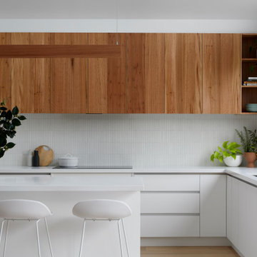
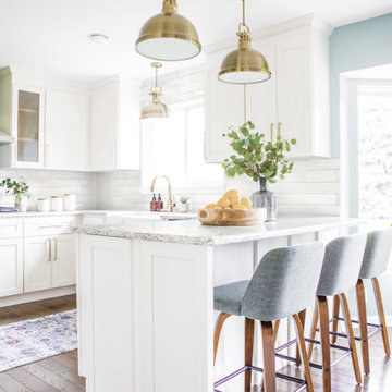
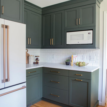
A light and bright minimalist design featuring two-pack painted cabinetry to match the clients freshly painted walls, subway tile stack-style, and feature timber components bring warmth into the space. 20mm Caesarstone 'Ocean Foam' benchtops in a polished finish help to reflect overhead light. A small kitchen packed with functionality.
Project: Kitsilano House
Builder: Grenor Homes
About this Project
When our clients asked us to design their new house in the heart of Kitsilano, they wanted a space that showcased their personalities, travels, and experiences. Naturally, our team was instantly excited and eager to make this house a home.
Layout:
Prior to the renovation, the family room was adjacent to the kitchen and the formal living room at the other end of the space; in the middle was the dinning area. We looked at the main floor as an entire space and decided to combine the two living spaces into one and move the dining area towards the kitchen.
The Kitchen:
had always been an L shape with an island; previously there was a kitchen table by the windows. In the space planning period, we decided to eliminate the kitchen table to increase the overall size of the kitchen, giving us a bigger island for casual eating.
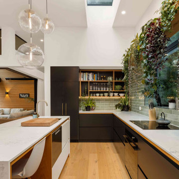
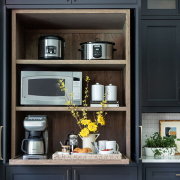
The perimeter of the kitchen has many great features; a coffee nook, a freezer column, double ovens, a cooktop with drawers below, an appliance garage in the awkward corner, a pantry with ample storage and free-standing fridge.
The Island also has many key features; a built-in unit for garbage/recycling/compost, a slide out tray underneath the sink for easy access to cleaning products, a dishwasher, and a bank of four drawer. On the outside of the island is an open shelf for cookbooks and display items. Below the countertop overhang is additional hidden storage for the items not accessed frequently.
Dinning Area:
we utilized the pre-existing niche by incorporating floating shelves in an asymmetrical design, which became the perfect area for the clients to display the art collected during their travels.
Bar Area:
The space between the kitchen and powder room became the perfect place to add a bar. Storage, counter space, and 2 bar fridges brought this little entertaining area to life.
Fireplace:
Using existing fireplace unit we cladded the surround with Dekton material, paneled the wall above with Walnut and a mantel made from Quarkus. These materials repeat them selves through the entire space.
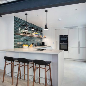
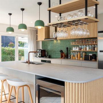
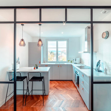
The kitchen accommodates a full set of Neff appliances, and an Air Uno vented hob.
We also installed this Ceasarstone Quartz worktop, and behind, metro style tiles to the splashback in teal, to add a pop of colour against the white cabinetry.
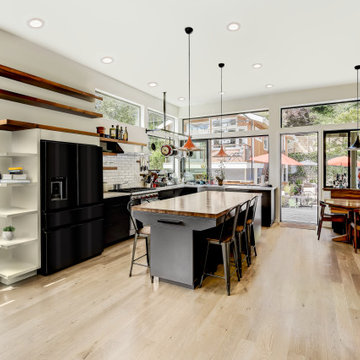
We also exposed the original metal beams which became a feature of this apartment.
Transforming key spaces in a home can really change the overall look and feel, especially in main living areas such as a kitchen or primary bathroom! Our goal was to create a bright, fresh, and timeless design in each space. We accomplished this by incorporating white cabinetry and by swapping out the small, seemingly useless island for a large and much more functional peninsula. And to transform the primary bathroom into a serene sanctuary, we incorporated a new open and spacious glass shower enclosure as well as a luxurious free-standing soaking tub, perfect for ultimate relaxation.
Sutton Signature from the Modin Rigid LVP Collection: Refined yet natural. A white wire-brush gives the natural wood tone a distinct depth, lending it to a variety of spaces.
Built in 1949, this Edina home had a strong horizontal presence on the site, but through subsequent renovations the overall massing was lacking clarity and refinement and the entry was diminutive and uninviting. The roof and siding materials were aging, and important interior spaces were cramped and closed in. The house needed better light, better connection internally and out, and exterior updates to clarify and enhance the strengths of the home.
The primary design evolved out of a celebration of the existing horizontality of the home and a recognition that a bigger home was not needed. By layering materiality and color, a new identity was created. A new cedar entry canopy slips out from under the previous roof line, extending further towards the street. This added warmth at the entry is echoed along the facade, creating a graceful rhythm and texture. The previous additions were re-clad with a darker material palette in order to anchor and unify the ends of the home. As the grade slopes down towards the back yard, horizontal bands are exposed, revealing the layering top to bottom. Combined, these few shifts in color and materiality allowed for a complete transformation of the home.
The interior is reflective of the material and color palette used outside. The main living spaces are opened up and connected while strengthening the original symmetry of the more formal linear alignment of rooms. A whole new kitchen relocates the center of the home and makes more fluid the daily life of this young family. The house is fully transformed inside and out, all without adding more square feet.
Project Team:
Ben Awes, AIA, Principal-in-Charge
Nate Dodge
Contemporary Kitchen with Subway Tile Splashback Design Ideas
1