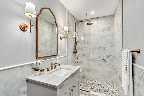
Love the mirror! Where is it from and/or what is manufacturer name?
pasandvick
4 years ago
Featured Answer
Sort by:Oldest
Comments (7)
 PRO
PROIvory & Oak Remodeling and Millwork
4 years ago
pasandvick
4 years agoRelated Discussions
Entranceway needs to be more wow
Comments (33)Thanks for posting new views of your room. You are right, nothing can go in front of the paneling, and we won't block the built-in cubby. In that case let's work with the rest of the space. I found a picture on Houzz for your gallery wall. I think this will allow you to bring in color and texture and interest to your wall without taking up space like furniture would. Try to play with portraits and a couple of paintings in there too - mix it up. Otherwise I would not put anything at the top of that landing (I'd remove that console table). That picture wall should be enough visual interest to your space and it'll draw the eye to the furthest wall as you walk in your house. I would try a small piece with closed storage between the bottom steps and that door by the entry. It looks like the space is no wider than 26", so it'll be a challenge to find something that fits and is tall enough. I would not use the wooden piece you showed above because you want wider proportions and fairly narrow depth so you don't bump into it as you walk by. (something like this ) I would hang a mirror on top of primping. By the cubby you could add a single seat stool. I'm not particularly suggesting these colors for the stool and bombe chest but something along these shapes. At this point if you do that big picture wall and add these two pieces of furniture and a mirror, you might not need to hang anything on the wall above the cubby. Also, I noticed your chandelier is quite substantial for the space and hanging pretty low. Would raising it a little or replacing it by something a little smaller be an option?...See Morewhat to do with this dated and uncool exterior?
Comments (24)If you use masonry paint, we could head in a warm greige direction for all of it - not so yellow . .. something that can give you a bit more contrast against the white windows and trim - even 40 does a lot for us . . . what about a blue green gray? You will get a coastal / mod vibe and it will relate to the farmhouse look .. .above bm silver mink http://www.benjaminmoore.com/en-us/paint-color/silvermink and below . . . gilbraltar cliffs . . http://www.benjaminmoore.com/en-us/paint-color/gibraltarcliffs Shingle look siding on the side dormers would be neat to get that cottage mod. . . you can stick with yellow but I don't think it complements the roof tone. With the blue-green grays, the white windows and trim will really pop beautifully. . . You can also go more neutral with a warm gray - greige . . . here's the siding tone http://www.benjaminmoore.com/en-us/paint-color/capemaycobblestone paired with this for brick - http://www.benjaminmoore.com/en-us/paint-color/graystone potential future red windows . . .aluminum pits over time, so if you have just one side you want to try, you don't have to powder coat, you can take a small brush and just do them by hand with latex paint if they are 10 yrs old or more. . . one advantage to gray . . future see [houzz=]...See MoreSize of artwork...
Comments (20)Hi There, Not sure if you are still looking for art/canvas for your space, but I'd thought id share my work with you. I'm a contemporary Aboriginal Artist located in Newcastle NSW. My works have been commissioned for a number of personal and commercial spaces including John Hunter Hospital, OPSM (Luxottica) Australia, St Vincents Hospital Sydney and Taronga Zoo, to name a few. My artworks have also won a number of prizes including Singleton Art Prize, OneSight Global Ray-Ban Wayfarer Indigenous design which saw my artwork produced on Ray-Ban Wayfarers and Wild at Taronga where I painted a full size rhino. The following artwork is a 2 panel piece and tells the story of our nations’ journey and the coming together and sharing of culture. Large red meeting circles, central within the design, are connected reflecting unity and reconciliation across cultural diversity. The continuous unbroken smaller circles woven throughout the piece are symbolic of community, Government and Corporate and the commitment to work together around shared vision to create better futures for our children. Linked to together the circles are also representative of the inevitable flow of future generations and a passing on of the baton to our youth. Size: 600 x 1200 x 2 http://www.saretta.com.au/collections/online-gallery/products/cross-cultures-series-2 I also have a number of other artworks at www.saretta.com.au. All the best with your design. Saretta...See MoreNot sure what to do to my kitchen
Comments (17)Lighting - pendants over the servery bench should be another feature that complements your chosen kitchen surfaces. So whilst I love the copper pendants in picture 1.. They could work depending on the rest of your decor and would be a highlight in a neutral white/timber kitchen = Good! If you choose copper you would complement it with a couple of copper bench top items. These are beautiful! (I collect copper because I love it, my kitchen pendants are silver, I renovated to sell in the next 3-5 years) You will see a picture starting to form in your mind and there is nothing wrong with making a statement with your lighting. I found that when I wasn't sure I would get a very strong sense of what was right and what was wrong for a space, then common sense or passion would determine the outcome! Here are another couple that might work, look her on Houzz under lighting, search pendants, then have fun looking!Timber tones with black or white to complement your cabinets... or Statement white pendants for a bit of quirky fun! Your personality can be reflected in your lighting and accessories creating that point of difference from the predictable white on timber look. Plus don't forget the power of greenery to punctuate the theme!...See More
Sherron Martin
3 years agohomehaven16
3 years ago
Dorothy Craft
3 years agomnor311
2 years ago


edithmoates