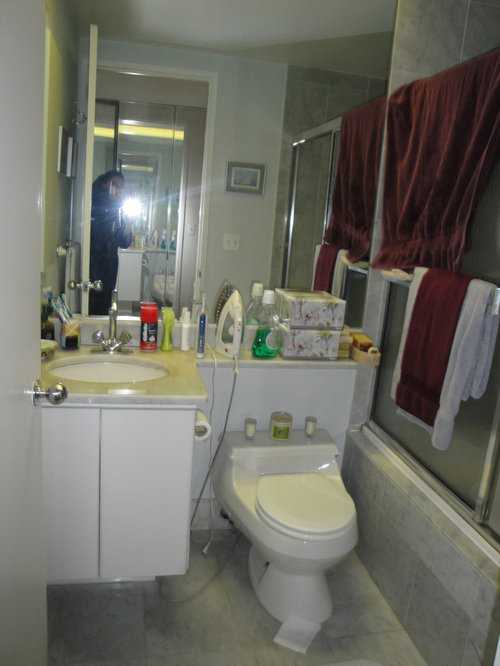
Manhattan Bath: Before & After
Tesi Design, Inc. Interiors and Cabinetry
4 years ago
last modified: 4 years ago

Featured Answer
Sort by:Oldest
Comments (21)
Related Discussions
Looking for help on bedrooms layout
Comments (29)I think the first layout is fine. You might want to consider moving the door for the storage room of the master bedroom so that it opens into the hall. That way the kids can use it for overflow storage. Also, that hallway is big enough that I think it could hold a large armour, providing more closet space. (There's no need to sleep in the same room as your clothes, so long as they're not too far off.) Also, don't forget that while the drawing shows kids in double beds, this need not be the case, so there will be more room for furniture (dressers or whatever) in their rooms. Finally, that step to bedroom 4 will not be odd at all. I've seen it in other homes. It looks clumsy in the drawing but it isn't. What you'll see when you come up the stairs is a bedroom door on a slight diagonal. It's only an odd jagged step if you walk like a robot, in straight lines along the wall, which is what your eye is doing on the drawing but you won't do in real life....See MoreChairs and carpet?
Comments (32)Oh I have not even touched the surface of fabrics that are available and beautiful. But, best to qualify further if you are recovering or buying new chairs before we get too excited or caught up in the beauty of the products. I love fabrics and the chemistry and technology that goes into modern day fabrics would astound most people. I'm not even talking about the residential fabrics like the Robert Allen collection I showed you. I'm talking about the fabrics for the hospitality and medical care industry. Now if you are interested in MODERN look fabrics I would send you to Maharam to look at their 20th Century Modern collection. Some of those are the real deal by Eames and Girard. Anyway, when you get further along in your plans then I can give better input....See MoreThe Ultimate Investment - Before and After
Comments (0)We began this renovation process, first looking at a range of photos of the bones of the home with our client and about her expectations and "Ultimate Investment Goals" for her project (family home or rental, long occupancy or flicking property, ideal uses, pets bedrooms required etc). We then looked at the structure of the existing home and its potential. With a few tweaks to the layout, we could gain 30sqm and by pushing the exterior wall out at the back and side on the ground floor we could gain another 40 sqm by taking a 3 bed 1 bath single car garage to a 4 bed 3 bath, two lounges and study with double garage. There where some aesthetics that benefited also - the house was brick base with nobly brown brick. Our extension removed most of this and the remainder we rendered, the upper floor cladding was leaking and had a heavy concrete tile over it by changing to weatherboard and tin (longrun) roof the loading's on the existing foundation where similar so no existing foundation needed upgrading. To give it a modern spin we used a block for the fire boundary wall and used stack bond pattern to front and back. Our client Debbie works with raw food as her job, making gluten-free vegan food, so her kitchen space was very important. With the kitchen landing close to an internal corner we decided to make it wider than normal along the back wall hiding a step in the exterior wall and helping connect the two living rooms with a Stainless bench on the island this helped to break up space and provide a central gathering point for entertaining. Finally, we upgraded all the wiring and plumbing and gave it a good paint and carpet throughout. We conducted weekly meetings throughout the entire process of the renovation, not only to discuss options and check we where on the right path with the design but to enable a spread out approach to the loads of decisions that go into a build/renovation. Check out the before and after images below. Along with a video of the final product. Before: After: https://www.youtube.com/watch?v=6CvHS6nNxzk&feature=youtu.be Check out the entire project here!...See MoreKitchen Makeover - Before and After
Comments (0)Miramar Kitchen Makeover Getting from a Then to a Now takes commitment and we could not be happier for our delightful clients. They tell us they pinch themselves every morning and what an utter privilege it has been to contribute to a space filled with joy. Before: After: As with any meaningful transformation, this one started with thoughtful consideration of space planning. This previously busy space now feels relaxing and spacious whilst also adding a laundry, having more kitchen storage AND accommodating uncluttered display features. It's a great example of the power of a good layout and bringing in the light :-) Before: After: One 21sqm room contains three zones that are cohesive but also occupy a distinct space practical for their function. The new kitchen layout is a galley (meaning no corners), the dining table that was against a wall is now centralised giving access from all sides, and a laundry occupies a corner formally filled with unused fireplace. Before: After: The new layout is a galley style kitchen with the main benchtop extending the full length of the outer wall. It comfortably accommodates space for a long working bench, storage cabinetry, main kitchen appliances, as well as the contained laundry unit. No corner goes wasted with this particular layout. Tall elements such and fridge freezer and pantry are located on the opposite wall so they don’t block light or views. Adjusting the existing windows allowed for maximum bench space and a clear wall for cabinetry, hob and extractor as well as a succinct shape for a feature tile. Before: After: The former kitchen and dining room didn’t utilise the space as efficiently as it could. We removed the fireplace, reconfigured the room layout, added a laundry, tweaked existing windows to allow for a more open and accessible kitchen design and brought more natural light into the space through skylights. Before: After: NEW LAUNDRY The ‘Laundry in a Cupboard’ is in an accessible area with plenty of room around it when in use but able to be shut away and appear as one with the kitchen. SPECIFIC FEATURES • Enclosed cupboard space to fit washing machine and ventless dryer. • Space to accommodate a dirty laundry basket and a laundry basket for clean washing. • Tall and narrow cupboard for ironing board, floor mop and Dyson vacuum cleaner. • Higher additional shelving for infrequently used storage e.g. Christmas decorations. Before: After: SKYLIGHTS The wall was able to be used by deleting an ineffectual window and raising the height of another so a bench to run underneath. The natural light was generously supplemented with the inclusion of three fabulous skylights that bathe the whole space in light. Before: After: For this kitchen, the transformation was quite remarkable. The room went from a worn, dim and makeshift set up to a well functioning, modern and attractive space. Before: After: DISPLAY SHELVES The display shelves on the cabinetry corners facing the table create a comfortable feeling for dining, enhanced by the low feature pendant over the inviting round table. Before: After: AESTHETICS The overall palette aimed to be refreshing and a balance of pretty and smart. Some of the key features: ‘Contemporary character’ achieved through matte surfaces and clean lines. Precise, elegant and simple cabinetry. Colours and materials that balance fresh light walls bathed in natural light with cool and warm in balance. Cool tones from the subtle sage green/grey coloured cabinetry and detail in the marble splashback tiles Light, warm timber tones used on floor, furniture and joinery details. Before: After: PENDANT having low over dining table helps to create an intimate gathering space in an open plan area Before: After: OPEN STORAGE The custom timber joinery designed for the tall open shelving unit and above the sink visually create a sense of the space appearing larger. Purposefully placed on the corner of a block of cabinetry, the tall open shelving doesn’t completely block off the view from the dining area. At the same time the open shelving is useful for placing items and small appliances that are frequently used, adding to the range of storage possibilities within the space....See More PRO
PROLion Windows and Doors
4 years agoTesi Design, Inc. Interiors and Cabinetry thanked Lion Windows and Doors PRO
PRONorwood Architects
4 years agoTesi Design, Inc. Interiors and Cabinetry thanked Norwood Architects PRO
PROK Interior Design Group
4 years agolast modified: 4 years ago PRO
PROTesi Design, Inc. Interiors and Cabinetry
4 years ago PRO
PROPRM Custom Builders
4 years ago- PRO
K Interior Design Group
4 years agoTesi Design, Inc. Interiors and Cabinetry thanked K Interior Design Group 
jslazart
4 years ago- PRO
Tesi Design, Inc. Interiors and Cabinetry
4 years ago  PRO
PROPurewal Contractors, Inc
4 years agoTesi Design, Inc. Interiors and Cabinetry thanked Purewal Contractors, Inc


Jora