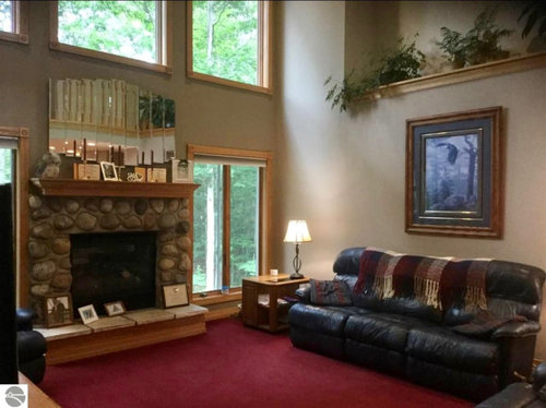
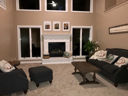
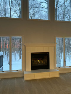
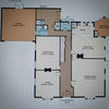
before & after living room
newhomeowner49684
4 years ago

Featured Answer
Sort by:Oldest
Comments (32)
 PRO
PROPurewal Contractors, Inc
4 years ago
Te Tenille
4 years agoRelated Discussions
Bathroom & Laundry Renovation - Before & After
Comments (0)This project required a small renovation, where my clients wanted to create something simple and light, without costing a fortune. In the guest bathroom we were able to leave the plumbing as is and worked on replacing the WC, Shower and Vanity. In the laundry the area in the room behind the counter, storage area was pushed back allowing for a larger space within the narrow room. A new door was put in and a new window. Before: After: This extension of space allowed for the guest bathroom to be extended out as well to allow for a larger vanity and all round larger and more accommodating space. The counter top in the laundry is bamboo, the simple black tiles above and perhaps later down the clients will put up cupboards and shelving as suggested. Before: After: The light grey ceramic tiles on the floor replaced the dark ones that made the space feel small and cramped. The white on the walls and new lighting give a totally different feel to the room and makes it a far more welcoming space to work in. Check entire project here!...See MoreKitchen Makeover - Before and After
Comments (0)Miramar Kitchen Makeover Getting from a Then to a Now takes commitment and we could not be happier for our delightful clients. They tell us they pinch themselves every morning and what an utter privilege it has been to contribute to a space filled with joy. Before: After: As with any meaningful transformation, this one started with thoughtful consideration of space planning. This previously busy space now feels relaxing and spacious whilst also adding a laundry, having more kitchen storage AND accommodating uncluttered display features. It's a great example of the power of a good layout and bringing in the light :-) Before: After: One 21sqm room contains three zones that are cohesive but also occupy a distinct space practical for their function. The new kitchen layout is a galley (meaning no corners), the dining table that was against a wall is now centralised giving access from all sides, and a laundry occupies a corner formally filled with unused fireplace. Before: After: The new layout is a galley style kitchen with the main benchtop extending the full length of the outer wall. It comfortably accommodates space for a long working bench, storage cabinetry, main kitchen appliances, as well as the contained laundry unit. No corner goes wasted with this particular layout. Tall elements such and fridge freezer and pantry are located on the opposite wall so they don’t block light or views. Adjusting the existing windows allowed for maximum bench space and a clear wall for cabinetry, hob and extractor as well as a succinct shape for a feature tile. Before: After: The former kitchen and dining room didn’t utilise the space as efficiently as it could. We removed the fireplace, reconfigured the room layout, added a laundry, tweaked existing windows to allow for a more open and accessible kitchen design and brought more natural light into the space through skylights. Before: After: NEW LAUNDRY The ‘Laundry in a Cupboard’ is in an accessible area with plenty of room around it when in use but able to be shut away and appear as one with the kitchen. SPECIFIC FEATURES • Enclosed cupboard space to fit washing machine and ventless dryer. • Space to accommodate a dirty laundry basket and a laundry basket for clean washing. • Tall and narrow cupboard for ironing board, floor mop and Dyson vacuum cleaner. • Higher additional shelving for infrequently used storage e.g. Christmas decorations. Before: After: SKYLIGHTS The wall was able to be used by deleting an ineffectual window and raising the height of another so a bench to run underneath. The natural light was generously supplemented with the inclusion of three fabulous skylights that bathe the whole space in light. Before: After: For this kitchen, the transformation was quite remarkable. The room went from a worn, dim and makeshift set up to a well functioning, modern and attractive space. Before: After: DISPLAY SHELVES The display shelves on the cabinetry corners facing the table create a comfortable feeling for dining, enhanced by the low feature pendant over the inviting round table. Before: After: AESTHETICS The overall palette aimed to be refreshing and a balance of pretty and smart. Some of the key features: ‘Contemporary character’ achieved through matte surfaces and clean lines. Precise, elegant and simple cabinetry. Colours and materials that balance fresh light walls bathed in natural light with cool and warm in balance. Cool tones from the subtle sage green/grey coloured cabinetry and detail in the marble splashback tiles Light, warm timber tones used on floor, furniture and joinery details. Before: After: PENDANT having low over dining table helps to create an intimate gathering space in an open plan area Before: After: OPEN STORAGE The custom timber joinery designed for the tall open shelving unit and above the sink visually create a sense of the space appearing larger. Purposefully placed on the corner of a block of cabinetry, the tall open shelving doesn’t completely block off the view from the dining area. At the same time the open shelving is useful for placing items and small appliances that are frequently used, adding to the range of storage possibilities within the space....See MoreHow to Create a Successful Seating Layout Before/After
Comments (0)Does your lounge need an update? Take a look at the images down below and see how the use of pattern, colour, texture, and furniture placement can transform a room from an outdated and impractical space to a sophisticated, welcoming, and simply put gorgeous area that is perfect for entertaining. This project has beautifully pieced together a rug from Designer Rugs, David Shaw seating, Fabrics by James Dunlop, and a coffee table specially designed by yours truly, DesignworX. Often I see seating in a lounge area placed awkwardly. Sometimes the furniture is all against one wall so you sit in a row like in a movie theatre, sometimes all the seating is pushed to the perimeter of a room and the space between seating is too far away, or all facing into the TV corner when you have the potential of seeing the trees. The key to successful furniture placement is creating a comfortable connection, with the people you are communicating with, and with the focal point of the space. It's not easy to communicate when you are all in a row, so having seating at right angles or opposite means you can connect. If you have an outdoor area, then orientate the furniture to connect with that, if you have a large room... pull the furniture off the walls so you can speak without having to yell across a room. My pet hate is having the TV as the only focal point, a fire or outdoor area is far more inviting. Let's talk YELLOW... Did you know that the yellow wavelength is relatively long and essentially stimulating. The stimulus is emotional, therefore yellow is the strongest colour, psychologically. The right yellow will lift our spirits and our self-esteem and is often seen and used as a bright happy colour. Too much of it, or the wrong tone in relation to the other tones in a colour scheme, can cause self-esteem to plummet, giving rise to fear and anxiety. It can create too much energy in the muscles by activating the motor nerves a some shades of yellow can heighten your anxiety levels and heart rate within about 45 seconds! In the featured lounge, we used yellow in a rich bronze grounding shade to work in with other aged brass elements in the space. It feels warm and cozy and makes a design statement. Check out the entire project here, as well as a walk-through!...See MoreFamily Forever Home - Before/After
Comments (0)Our clients came to us explaining that their home was just not working for their growing family. They loved their home but the living area was a long narrow space from the lounge through the kitchen, the children shared bedrooms and everyone in the family needed space of their own. Tailored Building Solutions undertook a site visit to chat with our client, addressing their main wants and needs, and what their compromises were. The musts were: Open plan living, the children needed their own bedrooms, and ideally a separate laundry and pantry. Tailored Building Solutions worked closely with our architect to achieve these wants and what had been to date only dreams. Utilising the space the family already had, but cleverly pushing up the home to another floor, the end project speaks for itself. Not only did we manage to create a beautiful indoor/outdoor flow, an open plan living space but also an additional bedroom on the same level. We also created the owners a beautiful new master suite, encompassing beautiful views of the ocean and valley. From design to the finished home the owners are LOVING the result. Check out highlights, before/after images of the projects, as well as what the clients have to say about their new home: https://www.houzz.co.nz/hznb/photos/family-living-just-got-bigger-phvw-vp~190056686...See More
Valerie M
4 years ago
newhomeowner49684
4 years agoValerie M
4 years ago
Jora
4 years agoDaniel Cluley (Orlando, FL 9b)
4 years agoDaniel Cluley (Orlando, FL 9b)
4 years agonjmomma
4 years agoKim Mac
4 years ago PRO
PROVanguard Development LA
4 years agoUser
4 years agolast modified: 4 years ago
Stacy
4 years agoAnne Duke
4 years agokootenaycapable
4 years agoJora
4 years agodanal6411
4 years agoDaniel Cluley (Orlando, FL 9b)
4 years agokootenaycapable
4 years agoStacy
4 years agomgkmelanie
4 years agosandeeteedee
4 years agonewhomeowner49684
4 years agomotupeg
4 years agonewhomeowner49684
4 years ago PRO
PROM&R Custom Millwork Inc
4 years agonewhomeowner49684
4 years ago PRO
PROPRM Custom Builders
4 years ago
viola reyna
4 years ago PRO
PRO123 Remodeling Inc.
4 years agojbtanyderi
4 years ago


newhomeowner49684Original Author