Project Of The Week
Before & After
Before & After: A Clunky & Dated Victorian Terrace Reborn
Rising damp, sagging floors and a dysfunctional layout were just some of the challenges this tired terrace offered up
In this Q&A series, we turn the spotlight on one thought-provoking renovation, redesign or new build each week. Here, Alex Stone, creative director at Revamper Kitchen & Bathroom Design, reveals how he streamlined and updated a tired and awkward Sydney terrace.
Ground-floor plans before (top) and after (bottom) the renovation.
What was the house like originally?
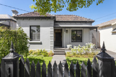
This narrow Victorian terrace in Sydney’s Erskineville was incredibly dated and had an impractical floor plan with a small kitchen in the middle of the house, a second bedroom in the attic and a tiny, virtually unusable bathroom and separate laundry at the rear. It also had terrible damp issues and sagging floors.
Demolition of the original kitchen.
The back of the house was split into two levels, with a step down from the kitchen/dining room to a conservatory-style space with sliding doors that led outside.
Ready to rework your home? Find an architect near you on Houzz
The back of the house was split into two levels, with a step down from the kitchen/dining room to a conservatory-style space with sliding doors that led outside.
Ready to rework your home? Find an architect near you on Houzz
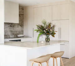
Kitchen joinery painted in Purple Empire: Dulux; Carrara Classic benchtops: Talostone.
What was your brief?
The client wanted a bright and open home that flowed seamlessly from front to back.
Which rooms did you focus on?
The kitchen, bathroom, dining room, two bedrooms, study area and laundry.
What was your brief?
The client wanted a bright and open home that flowed seamlessly from front to back.
Which rooms did you focus on?
The kitchen, bathroom, dining room, two bedrooms, study area and laundry.
All internal walls and the white kitchen joinery painted in Lexicon Quarter: Dulux.
What were the client’s must-haves?
What were the client’s must-haves?
- To retain period details, such as arched doorways, and integrate them into the new scheme.
- A new kitchen with a pantry and decent bench space.
- Space for a large dining table measuring around 1800 millimetres to accommodate six to eight people.
- A functional, hidden/enclosed laundry.
- A new bathroom with a bath and shower.
- New built-in wardrobes in the two bedrooms.
- A clever built-in storage solution for the attic bedroom, which has a pitched ceiling.
- A study area with book storage.
What key changes did you make?
We reworked the ground-floor plan by removing the internal walls and original laundry and levelling the floors.
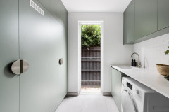
We moved the kitchen to the rear of the house, with glass patio doors leading onto a new deck, and added a concealed, European-style laundry.
We shifted the bathroom to the middle of the house where the old kitchen used to be.
These changes simplified the layout and created a lovely sense of flow from the front entrance through to the rear deck.
Tell us about the kitchen
The original U-shaped kitchen, which had dated laminate benchtops and no storage, was in the centre of the house.
The client wanted a kitchen big enough to accommodate a pantry, good storage and a workable amount of bench space.
We moved the kitchen to the rear of the house and designed one side so it incorporates a European-style laundry, pantry, fridge and breakfast nook. In the other side we fitted the sink, cooktop and food-prep areas.
We chose a rich aubergine (Dulux Purple Empire) as the hero colour for the joinery on the cooking side, with white joinery (in Dulux Lexicon Quarter) on the opposite side to balance it out.
Timber joinery in Natural Oak: Polytec; brushed-copper hardware: ABI Interiors; Carbonised Oak engineered floors: Woodcut.
The practical, European-style laundry in the kitchen can be closed off behind cupboard doors when not in use.
The practical, European-style laundry in the kitchen can be closed off behind cupboard doors when not in use.
How did you squeeze in a spacious dining area?
As the house is so narrow (2.9 metres at the rear), we needed to be creative with our use of built-in furniture and furnishings.
To save space, we specified banquette seating on one side of the dining table, which created a clear path through the dining space to the kitchen. It also connected the kitchen with the dining room and the new home-office area.
Demolition of the original bathroom and laundry.
We set up a new study area at the end of the dining area where there was a nib wall to separate the space from the side entrance. This gave the new study privacy without impeding traffic flow to the kitchen and dining spaces.
We incorporated a custom bookcase at the end of the banquette and shelving above the desk and inside the guest bedroom wardrobe to accommodate the client’s growing book collection.
The original step down to the rear of the house, which was levelled out in the renovation.
The original bathroom at the rear of the house.
Tell us about the bathroom
We designed a new bathroom and positioned it in the middle of the house where the kitchen was originally.
Our goal was to create a functional, light-filled space that incorporated the bath, shower and heated towel rail the client requested.
Tell us about the bathroom
We designed a new bathroom and positioned it in the middle of the house where the kitchen was originally.
Our goal was to create a functional, light-filled space that incorporated the bath, shower and heated towel rail the client requested.
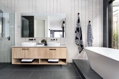
The new bathroom.
We wanted the bathroom to have its own personality while also speaking to the design of the new kitchen and dining room. We achieved this by carrying through brushed-copper fixtures, natural oak in the vanity and mint-green penny-round tiles that are the same colour and finish as the kitchen splashback.
We wanted the bathroom to have its own personality while also speaking to the design of the new kitchen and dining room. We achieved this by carrying through brushed-copper fixtures, natural oak in the vanity and mint-green penny-round tiles that are the same colour and finish as the kitchen splashback.
A back-to-wall corner bath with an overhead shower made the best use of space and allowed us to incorporate a back-to-wall toilet with an integrated cistern and a 900-millimetre vanity and shaving cabinet.
We added a skylight to boost natural light and to allow the client to look up at the stars when lying in the bath.
We added a skylight to boost natural light and to allow the client to look up at the stars when lying in the bath.
Basin: ABI Interiors; Picasso Bloom Pale Green floor tiles: Tile Mall; marble mosaic penny-round feature wall tiles in Ming Green: Tile Mall.
Browse more images of contemporary Australian bathrooms
Browse more images of contemporary Australian bathrooms
Where did you focus your budget with this renovation?
We focused the budget on updating the floor plan to remove the walls, on the engineered-timber flooring, new custom joinery, the new bathroom and engineered-stone benchtops.
A significant portion of the budget also went on dealing with structural issues, such as resolving the sagging floors and damp problems.
What was your starting point?
A shade of purple that I found online. I really wanted to create a space with this colour as it is unique yet luxurious, especially when paired with copper or brass.
A shade of purple that I found online. I really wanted to create a space with this colour as it is unique yet luxurious, especially when paired with copper or brass.
Was there anything fixed you had to work around?
I had quite a lot of free rein with this project, but I was mindful that I didn’t want to make too many structural changes, other than to the internal walls. I therefore had to work around sliding doors at the side of the property and a side entrance.
This limited the size of the kitchen and the bathroom so I had to be creative to ensure that both spaces worked around these fixed elements.
What do you think made the biggest difference?
Opening up the internal walls, adding the glazed patio doors to the kitchen, and the skylights in the kitchen and bathroom.
Opening up the internal walls, adding the glazed patio doors to the kitchen, and the skylights in the kitchen and bathroom.
The original attic bedroom/storage area.
Tell us about the new main bedroom in the attic
This room had previously been used as a bedroom and for ad-hoc storage. We wanted to make it a luxurious main bedroom with great, built-in storage, including a wardrobe and open shelves.
Tell us about the new main bedroom in the attic
This room had previously been used as a bedroom and for ad-hoc storage. We wanted to make it a luxurious main bedroom with great, built-in storage, including a wardrobe and open shelves.
New storage and the custom-designed wardrobe in the main bedroom.
The challenge was the pitched ceiling and the position of the balustrades. We designed narrow storage with sliding doors and shelving behind the balustrades to ensure access could be maintained while still utilising the space.
We then used the natural intersection of the pitched roof as a starting point for the wardrobe section. As the cabinetry gets shorter, the internals change from hanging space to internal drawers and shelving.
Demolition of the guest bedroom wardrobe on the ground floor.
The guest bedroom after works, with new built-in wardrobe.
Your turn
Which features impress you most in this renovation? Tell us in the Comments below. And don’t forget to save these images for your own renovation inspiration, like this story and join the conversation.
More
Keen to see another great reworking of a dated home? Catch up with this Before & After: From Dump Zone to Cosy ‘Welcome Home’ Living Area

Who lives here: A homeowner
Location: Erskineville, NSW
Bedrooms and bathrooms: Two bedrooms, one bathroom
Width: 2.9 metres wide at the rear of the terrace
Budget: Around AU$300,000
Designer: Alex Stone, creative director at Revamper Kitchen & Bathroom Design
Project completed: Early 2022
How did you use Houzz for this project?
I used Houzz Pro, the business management software for designers, to share images of products, colours and fixtures with my client. I also used the Proposals and Invoicing tools.