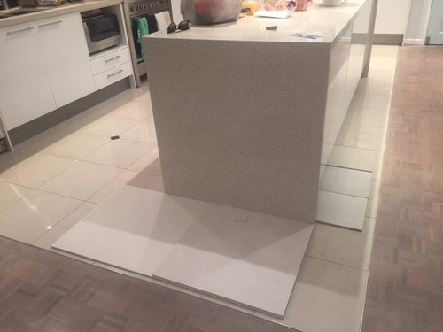
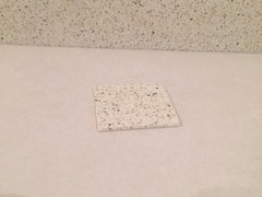
Floor tile colours and effect of lighting throughout the day
champagne4lulu
8 years ago
last modified: 8 years ago
Featured Answer
Sort by:Oldest
Comments (12)

champagne4lulu
8 years agochampagne4lulu
8 years agoRelated Discussions
1940's NZ kitchen - small, awkward-ish layout.
Comments (121)I would suggest you take out the cabinet that is to the right of the stove and use it elsewhere in the house -- perhaps in the bathroom or dining room with a hutch above it. Then, I would suggest you have someone install a lazy susan cabinet in the corner between the sink counter and the stove, meaning you would move the stove down a bit and have a small cabinet/counter top to the right of the stove. I would suggest you have the cabinets refinished in white and then paint the walls a pastel you like. If you would prefer white walls, then add white-painted crown molding and paint the ceiling a light neutral blue, such as Sherwin Williams Niagara Falls Blue. Then, I would suggest you choose a favorite accent color and use this sparingly in accessories like towels, pot holders, small vases or floral arrangements, and a valence above the triple windows. For a genuine 1940s look, you might have white ceramic square tiles with a rectangular red border installed as a back splash behind and above the stove. If you are replacing counter tops, I would suggest a light color such as white with a beige or light grey vein or striation for some sort of pattern. You might be able to find the same color and design in floor tile OR opt for a wood floor as another poster suggested....See MoreBest method to stop polished concrete from cracking on floors ?
Comments (20)Hello people, Question time again. Im trying to match indoor and outdoor colour to my project around the living and pool area. I have 10 Meters of space to work with which includes 5 meters width of the living area. If i break the colours indoor v's outdoor it will make my area look smaller, more confined ? If i use polished concrete inside and try and match the colour outside, the surface will get hot. Soooooo... I have added some photos here. I went and purchased a box of man made granit tiles 80x 80cm. Keeping the shiny for the inside and tried "honing" the surface of the other tile as a test so i could use it outside and keeping the surface of the 'honed tile" slightly textured to ensure not so slippery and matching the inside colour. After coating this honed tile it has gone slightly darker which is ok. What im wanting to know, is this ok to do ? will there be any down the line effects of the tile if its outside in a wet area ? it maybe only wet for 3 months of the year for a few hours at a time. My challenge here is price V's product / Styling / practacality -Timber is too expensive for outdoor application / requires maintenance -Marble expensive -Natural stone expensive also if anyone has any solutions / kmowledge / advice it its ok to hone an indoor tile and add a protective coating for the outside. this would be much appreciated. Thanks Houzz'ers! Justin :)...See MoreANY SUGGESTIONS PLEASE WITH MY LONG DARK HALLWAY
Comments (5)Hi eclipse 66 I'm sorry to hear about your break in. This is quite tricky to picture as I wasn't certain which walls related to which, but I will give this a go. I wonder if your ceilings are around the 2.4mtr mark, as your doors suggest. Although you have many windows that are probably floor to ceiling, each room is sectioned off by this central corridor, so no real natural light gets down there, is that right? The little natural light that might filter through would be absorbed by the walls, and the colour you have on these walls would not be easily seen. Without. Sounding too mainstream here, I would absolutely paint an offwhite wall the entire corridor and each adjoining living area off that, with exception to your kitchen. All ceilings purest ceiling white along with the window frames and all internal doors. The walls in a satin finish to help the light reflect a little, and move around the wall without being too shiny. You haven't mentioned your floor? Try to keep it consistent in all the living areas including your hallway, and only carpet the bedrooms as these doors would be closed often. With the door filled hallway being a white gloss finish, and a white ceiling in a flat white, the walls will feel a little warmer in comparison, although still a white, perhaps something like a hog bristle 1/4 strength by dulux. In your main living room, and kitchen, paint the hog bristle in full strength, so it feels warmer, as these spaces flow onto each other, feeling larger as a whole. With your doors being so tall, (or the ceiling being comparably low), hang your window rods if any right at ceiling level, use a sheer curtain that even when partly closed let's light filter through, they dress the window but won't block light, for that install roller blinds that will roll right up exposing as much daylight as possible, and if privacy is a factor, the sheer will provide a buffer and still seem light filled. Even if these are never used, framing the window will place an emphasis on the window frame, and more importantly the light they provide, swell as an illusion of vertical space even without it. Aother suggestion for that hall is to use this principle to heighten the ceiling, visually, is to use lining boards vertically, or a wallpaper with a strip or vertical print. Drawing you eye upward toward the end, with a wallpaper, I'm thinking of one I've seen many times over, it's a white or cream background, with an image of birch trunks, the base or top of the trees arent revealed in the picture so it doesn't make the space feel from a low or high perspective. This would provide a creative distraction to the corridor, evoke a feeling as you have walking through a beautiful place, and is graphic but still very neutral. You can even paper you doors so when they're closed, the hallway won't feel so busy. I would remove carpet in the hall if you have any, because a warm closed in space without proper airflow, or light feels stuffy, and carpet absorbs sound and lint, where floorboards or hard surface atleasts has a sound walking down it, which amplifies noise and feels bigger again by comparison. Against this neutral, cohesive space, your furniture andpersonality pieces can really stand out, particularly the red. I would also use this in the kitchen somewhere, maybe a gingham check fabric on the kitchen window or just your accessories. The less is more theory also extends to colour, particularly in smaller busy spaces, minimize these elements, like the repeat of doors and architraves on your walls, by tying them in with single colour, and keep your decorations either in a theme or single colour hue. Scatter your colour around so visually you have somewhere your eye is drawn to around the space. If you get pictures I will know if I'm way off track, but if any of them resonate with you, then great. Good luck. Ml design...See MoreNeed help deciding on what colour to stain floor boards
Comments (8)Get the professional sander guys in to repair the living areas and kitchen but don't go too dark with the stain as it will kill the lovely grain in the matai. I'm thinking a couple of tones richer than the timber knots showing in your photo, definitely no yellow tone at all. In NZ stepping on to carpet especially in a kiwi winter is so much nicer than a cold floor board shock!!! A nice area rug for the lounge and you're done....See Morechampagne4lulu
8 years agolast modified: 8 years agochampagne4lulu
8 years agochampagne4lulu
8 years agobigreader
8 years agochampagne4lulu
8 years agochampagne4lulu
8 years agochampagne4lulu
8 years ago PRO
PRODon Osborne & Associates
8 years agokooky_karen
8 years ago


Kate