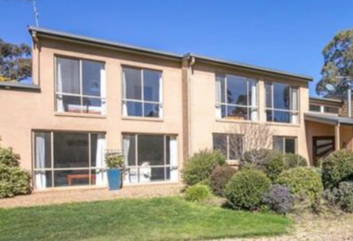
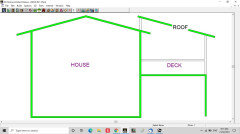
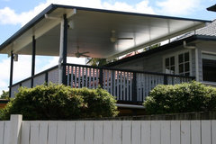
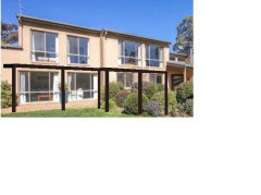
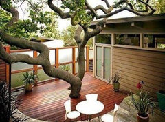
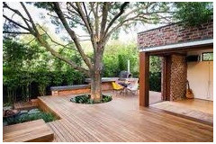
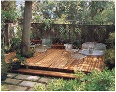
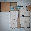
Covered Deck Design Issue
Rose Ellis
3 years ago
Featured Answer
Sort by:Oldest
Comments (30)
Related Discussions
1940's NZ kitchen - small, awkward-ish layout.
Comments (121)I would suggest you take out the cabinet that is to the right of the stove and use it elsewhere in the house -- perhaps in the bathroom or dining room with a hutch above it. Then, I would suggest you have someone install a lazy susan cabinet in the corner between the sink counter and the stove, meaning you would move the stove down a bit and have a small cabinet/counter top to the right of the stove. I would suggest you have the cabinets refinished in white and then paint the walls a pastel you like. If you would prefer white walls, then add white-painted crown molding and paint the ceiling a light neutral blue, such as Sherwin Williams Niagara Falls Blue. Then, I would suggest you choose a favorite accent color and use this sparingly in accessories like towels, pot holders, small vases or floral arrangements, and a valence above the triple windows. For a genuine 1940s look, you might have white ceramic square tiles with a rectangular red border installed as a back splash behind and above the stove. If you are replacing counter tops, I would suggest a light color such as white with a beige or light grey vein or striation for some sort of pattern. You might be able to find the same color and design in floor tile OR opt for a wood floor as another poster suggested....See MorePlease Help!! How can I arrange/design this small living space?
Comments (13)Try this. Hang the television to the right of the wood stove on the wall opposite the french doors. Use the wall with the high windows for a looong sofa and add two chairs across / angled slightly - low back so you can look over one to television. use console / sofa table on entry /bed door wall just past where entry door opens so you have a lay down surface. Forget glass, it isn't for this era and won't make it feel bigger. Paint ALL french doors inside and out and small windows and entry door same color and trim same color too. Try a charcoal rather than a black - something in the blue-green-gray shades like new providence navy. do all the walls in kitchen and living in a warm white - this tone has the wood as an undertone - http://www.benjaminmoore.com/en-us/paint-color/woodash then, for the cabinets . . do a bungalow thing and go deeper on the cabinets to a classic drabware tone - with the wood walls and floors / try bm bracken biscuit http://www.benjaminmoore.com/en-us/paint-color/brackenbiscuit these will all go together like gangbusters, keep it light and bright but interesting and work with a new blue green gray back door in a tone like bm beach glass http://www.benjaminmoore.com/en-us/paint-color/beachglass templeton gray as a counterpoint on some craigslist piece of furniture . . add warm undertone tan and oatmeal nubby tweed upholstery to start . . the teal navy gray will work with the black iron stove and accents without going black. start keeping the left door to the kitchen closed and get a door stop to hold the other one open permanently . . this will work because you need a little more wall to make the tv work well - in the kitchen, pull your table away from the wall just a tad - consider a padded bench on the wall to provide a kind of sitting space in there and put the chairs across - if you shift your television to the wall (high enough the heat is not an issue , you can still have big speakers work well - and remote the media equipment - run the wire and patch the holes. Hang it mid-height - eye level when you sit plus 15 degrees . . check out the amazing sconces you can put on the entry wall - shades of light petersik pendant with home-made trim wood brace to pump it out from the wall since the power is high? over the console? round wood table in middle - even a hd butcherblock round on a painted drum base in trim tone? With those tones - teal gray, biscuit, creamy off-white, muted blue-greens - paint your white chairs and a hand me down bench wythe blue and find a graphic sunbrella print with a little blue green, chocolate and orange for cushions and pad skirts with velcro at the table . . make a galvinized pipe leg / plank 1 x 12 / clear finish console for behind the door . . now you are cooking with gas . ....See MoreANY SUGGESTIONS PLEASE WITH MY LONG DARK HALLWAY
Comments (5)Hi eclipse 66 I'm sorry to hear about your break in. This is quite tricky to picture as I wasn't certain which walls related to which, but I will give this a go. I wonder if your ceilings are around the 2.4mtr mark, as your doors suggest. Although you have many windows that are probably floor to ceiling, each room is sectioned off by this central corridor, so no real natural light gets down there, is that right? The little natural light that might filter through would be absorbed by the walls, and the colour you have on these walls would not be easily seen. Without. Sounding too mainstream here, I would absolutely paint an offwhite wall the entire corridor and each adjoining living area off that, with exception to your kitchen. All ceilings purest ceiling white along with the window frames and all internal doors. The walls in a satin finish to help the light reflect a little, and move around the wall without being too shiny. You haven't mentioned your floor? Try to keep it consistent in all the living areas including your hallway, and only carpet the bedrooms as these doors would be closed often. With the door filled hallway being a white gloss finish, and a white ceiling in a flat white, the walls will feel a little warmer in comparison, although still a white, perhaps something like a hog bristle 1/4 strength by dulux. In your main living room, and kitchen, paint the hog bristle in full strength, so it feels warmer, as these spaces flow onto each other, feeling larger as a whole. With your doors being so tall, (or the ceiling being comparably low), hang your window rods if any right at ceiling level, use a sheer curtain that even when partly closed let's light filter through, they dress the window but won't block light, for that install roller blinds that will roll right up exposing as much daylight as possible, and if privacy is a factor, the sheer will provide a buffer and still seem light filled. Even if these are never used, framing the window will place an emphasis on the window frame, and more importantly the light they provide, swell as an illusion of vertical space even without it. Aother suggestion for that hall is to use this principle to heighten the ceiling, visually, is to use lining boards vertically, or a wallpaper with a strip or vertical print. Drawing you eye upward toward the end, with a wallpaper, I'm thinking of one I've seen many times over, it's a white or cream background, with an image of birch trunks, the base or top of the trees arent revealed in the picture so it doesn't make the space feel from a low or high perspective. This would provide a creative distraction to the corridor, evoke a feeling as you have walking through a beautiful place, and is graphic but still very neutral. You can even paper you doors so when they're closed, the hallway won't feel so busy. I would remove carpet in the hall if you have any, because a warm closed in space without proper airflow, or light feels stuffy, and carpet absorbs sound and lint, where floorboards or hard surface atleasts has a sound walking down it, which amplifies noise and feels bigger again by comparison. Against this neutral, cohesive space, your furniture andpersonality pieces can really stand out, particularly the red. I would also use this in the kitchen somewhere, maybe a gingham check fabric on the kitchen window or just your accessories. The less is more theory also extends to colour, particularly in smaller busy spaces, minimize these elements, like the repeat of doors and architraves on your walls, by tying them in with single colour, and keep your decorations either in a theme or single colour hue. Scatter your colour around so visually you have somewhere your eye is drawn to around the space. If you get pictures I will know if I'm way off track, but if any of them resonate with you, then great. Good luck. Ml design...See MoreKitchen Reno for Retirement
Comments (13)These houses were designed to look good from the street, regardless of what the orientation was for the Sun. Everything depends on your budget and how far your prepared to go. A friend's house in Queenstown faced the street, the toilet and bathroom had the best view of the lake and the Sun. They got a house removal Coy in, jacked it up put it on the truck drove out and turned it around and reconnected all the services. It then faced the North and West great views and warmth, doubled its value in 3 days!. I replaced my storage water cylinder with a outside gas one, picked up enormous space in our laundry. Another tip is to draw up your "dream" plan, then overlay it over the existing and see what you can really do, your then not influenced by what is already there, and often get a much better insight and removed from the existing. Good luck, its very rewarding and make it fun!...See More
Rose Ellis
3 years ago
Lyn Wood
3 years agoRose Ellis
3 years ago
siriuskey
3 years agolast modified: 3 years agooklouise
3 years agoLyn Wood
3 years agoLyn Wood
3 years agooklouise
3 years agoRose Ellis
3 years agoRose Ellis
3 years agoRose Ellis
3 years ago
Kate
3 years agooklouise
3 years agolast modified: 3 years agoLyn Wood
3 years agodreamer
3 years ago- PRO
MB Design & Drafting
3 years ago fianou luca
3 years agoKate
3 years agofianou luca
3 years ago


Kate