Project Of The Week
Popular Houzz Series
Popular Houzz Series
Appears in
See also
Fun HouzzFrom The ProsHouzz Around The WorldProject Of The WeekStickybeak Of The WeekQuizzesCreatives At HomeAt Home With...Best Of The WeekRoom Of The WeekDesigner Profiles3 Things I Wish My Clients KnewHow Do I...Buyer's GuidesExpert EyeInnovation AlertSo Your Style Is...Spotted!Picture PerfectBefore & AfterBudget BreakdownHome TimeMade Local
Renovating
Dreary to Dreamy: A 1960s Home Gets a Modern Coastal Makeover
With its awkward layout and dated finishes, this 1960s home was itching for a makeover – see what it looks like now

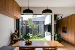
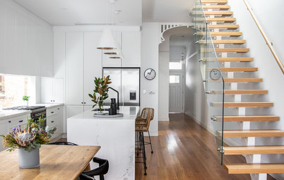
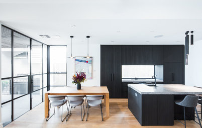
In this Q&A series, we turn the spotlight on one thought-provoking renovation or extension each week. Here, interior designer Shellie Nielsen at Nimmo Nielsen Collective and architect Matthew Power at SketchArch reveal how they worked their design magic on a tired and poorly laid out property in Sydney, NSW. What was once a four-bedroom, two-bathroom house is now a chic and functional four-bedroom, four-bathroom home with a study, fit for a busy young family.
The original facade of the house
Gained
Nielsen:
Gained
Nielsen:
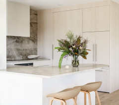
- A reconfigured ground-floor layout that allows for a spacious, new open-plan kitchen and living area.
- A powder room and guest bathroom on the ground floor.
- A renovated laundry.
- A wall of bespoke joinery to the open-plan living area with a gas fireplace.
- A second storey housing a second living area, three bedrooms (including a master suite with a walk-in wardrobe and ensuite), two more bathrooms and a large balcony.
- A laundry chute (which our clients call a godsend!) from the first floor to the ground-floor laundry.
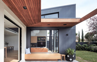
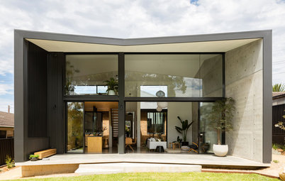
The facade after works
Who did what?
Nielsen:
Architect Matthew Power did the building design, and Nimmo Nielsen Collective designed the laundry, bathrooms, joinery, vanities, walk-in wardrobe, the other wardrobes and the fireplace joinery. We also selected all the soft and hard finishes.
Looking to extend? Find a local architect on Houzz and chat about your plans
The original floor plan
What was the house like originally?
Power:
A single-level 1960s house with four bedrooms and two bathrooms. It was in a decent state, but the layout and finishes were dated.
What was the house like originally?
Power:
A single-level 1960s house with four bedrooms and two bathrooms. It was in a decent state, but the layout and finishes were dated.
The ground-floor plan after works
What was your brief?
Power:
What was your brief?
Power:
- Design a new first-floor addition that would complement the original house.
- Revamp the ground-floor layout and position the bedrooms upstairs so they could capitalise on the beautiful view.
- Modernise the home without losing its original character.
The first-floor plan after works
What were the client’s must-haves?
Power:
Nielsen:
What were the client’s must-haves?
Power:
- Natural light.
- Enhanced views.
- Good-size rooms.
- A large walk-in wardrobe.
Nielsen:
- A fresh and contemporary feel.
- More space.
- Plenty of storage.
What problems or limitations did this project address?
Nielsen:
A lack of bedrooms and living space.
Nielsen:
A lack of bedrooms and living space.
What exactly did you do?
Power:
Nielsen:
Power:
- Modified the ground-floor layout and put in a new first-floor addition.
Nielsen:
- Maximised the functionality of the new floor plan.
- Designed new bathrooms and a new laundry.
- Designed the built-in joinery and vanities.
- Specified all materials and finishes, furnishings, window coverings and internal and external paint colours.
The children’s upstairs bathroom
How does the new work address the problems identified above?
Nielsen:
The clients now have a spacious family home, with an extra bedroom and more living spaces.
How does the new work address the problems identified above?
Nielsen:
The clients now have a spacious family home, with an extra bedroom and more living spaces.
What challenges did you have to work around during this project?
Nielsen:
None. The project ran smoothly.
Powers:
It was a challenge fitting in everything the clients wanted while complying with development regulations.
Where did most of the budget go?
Powers:
On the beautiful finishes throughout the home.
Nielsen:
On the custom joinery.
Nielsen:
None. The project ran smoothly.
Powers:
It was a challenge fitting in everything the clients wanted while complying with development regulations.
Where did most of the budget go?
Powers:
On the beautiful finishes throughout the home.
Nielsen:
On the custom joinery.
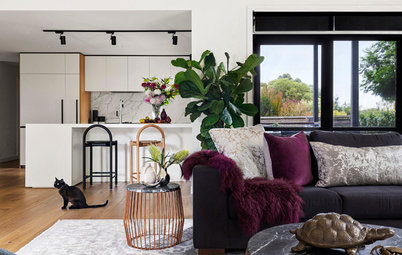
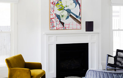
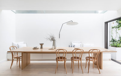
Tell us about the beautiful joinery
Nielsen:
The clients wanted joinery that was as beautiful as it was functional – and it needed to provide plenty of storage – so we took the joinery the full width of the wall.
We centred a gas fireplace in the middle of it and clad it in white v-groove panelling to give it a contemporary coastal feel.
We designed shelving for the left side of the unit to give the clients somewhere to display family photos and styling pieces.
To the right of the fireplace, we put in a bench seat with space above it for a television. We painted this section of wall in Dulux Domino so the television screen would visually disappear into it.
The upper cabinetry is crafted from American Oak in a natural finish. We used a darker charred finish on the lower cabinetry for contrast.
The upper cabinetry is crafted from American Oak in a natural finish. We used a darker charred finish on the lower cabinetry for contrast.
We’ll Fly Free artwork by Fern Siebler: The Block Shop; Max armchair in Seagreen: Schots Home Emporium
Why do you think this home works so well?
Power:
It has a great ground-floor plan, amazing views, beautiful finishes, well-sized rooms and it ticks every box for a family.
Why do you think this home works so well?
Power:
It has a great ground-floor plan, amazing views, beautiful finishes, well-sized rooms and it ticks every box for a family.
Nielsen:
Our clients were very trusting in our suggestions, and were thrilled that we could manage the joinery design and installation for them. We were also very lucky to work with a clever builder with an eye for detail.
As the house is fairly elevated from the street, including a second level was an added bonus as it offers incredible views, which the owners get from the first floor.
Key features
Power:
Nielsen:
Power:
- Stunning views from the first-floor balcony.
- The thoughtful design of the second level makes it look and feel like part of the original build.
- A vastly improved layout makes life easier for this busy family.
Nielsen:
- Generous storage.
- Additional bedrooms.
- Enhanced views.
- Spacious open-plan living.
- Bespoke joinery.
- A timeless design.
Broadway sofa: Harvey Norman
Interior materials palette
Paint colours
Dulux Natural White Half.
- Laminex American Oak veneer in natural and charred finishes to the living-room joinery.
- Laminex Elegant Oak to the bathroom joinery.
- Smartstone in Ceniza to the vanity benchtops.
- Talostone Calacatta engineered stone to the kitchen splashback.
- Blue Kit Kat porcelain tiles to the wall of the children’s bathroom (similar can be found at Italia Ceramics).
- Tiles By Kate concrete-look porcelain floor tiles in the bathrooms.
- Prestige Sherpa wool carpet in Doma from Carpet Court in the upstairs bedrooms and second living room.
Paint colours
Dulux Natural White Half.
Fixtures and furniture
- MS Interiors joinery.
- Reece Kado Lux bathtub in the ensuite.
- Reece Omvivo basins.
- Reece Phoenix Vivid Slimline matt black tapware in bathrooms.
- H+J Furniture upholstered bedhead.
- West Elm bedside tables.
- We Fly Free artwork by Fern Siebler from The Block Shop.
- Coco Republic bar stools.
Your turn
Which feature caught your eye in this charming renovation? Tell us in the Comments, like this story, save the images and join the conversation.
More
Looking for more ideas for your own renovation? Don’t miss last week’s Project of the Week – Raising the Standard: A 1950s Brick Home’s Sympathetic Extension

Answers by architect Matthew Power at SketchArch (who was responsible for the building design) and interior designer Shellie Nielsen at Nimmo Nielsen Collective (who, along with interior designer Naomi Nimmo, did the interior design)
Who lives here: A couple with two young children
Location: Seaforth, NSW
Original size: 145 square metres
Size after works: 245 square metres
Architect: Matthew Power at SketchArch
Interior designers: Shellie Nielsen and Naomi Nimmo at Nimmo Nielsen Collective