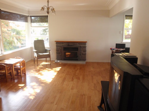
Too tidy with no design in our living room
Evelyn Goh
12 years ago
last modified: 12 years ago
Featured Answer
Sort by:Oldest
Comments (43)

Evelyn Goh
12 years ago
Chandani
12 years agoRelated Discussions
How do I design my living room around this chandelier?
Comments (22)As chookchook said in her recommendation about painting, put a drop cloth on the floor. Get a very safe ladder. remove the lightbulbs, and cover the outlets. Turn off the electricity to the chandelier. Then spray it with a mild cleaner (I use one I found at Target that's basically water with vinegar, until it's dripping wet. Start at the bottom and work your way up, so you don't have dirty spray dripping on the bottom of the chandelier.Work your way up and down until the dripping spray is clean. The chandelier may be gorgeous and expensive, but it seems totally out of place in the architecture of the room--more at home in a chalet than a sunny room with a window wall. I would probably try to find a way to get it removed, and sell it to someone who appreciated it better than I....See MorePlease HELP quick.......little living room with big dilemmas!
Comments (13)There is nothing worse than ceiling-mounted lights--harsh shadows, flat lighting. They are strictly for utility. I would put a large-ish, shallow cylindrical shade on them and put nothing more than a 15-watt bulb in them. Use them strictly for lighting your way as you walk through the room. I agree with Vincent; the chair in the corner doesn't fit at all, nor does the one under the A/C unit (put that one with its mate behind the love seat). And the curtains look smooshed. I think the problem with the bookcases is that they are uninteresting. Did you buy books-by-the-yard? What are all those identical books? They are visually uninteresting. I'd get rid of some of them and get some colorful ceramics/glass/photos. The room is absolutely overwhelmed with furniture. It needs one less love seat. Do you really need all of them? Pushing them against the walls/curtains so tightly just visually emphasizes the fact that there is too much furniture. I don't think a mirror above the fireplace will work. When people are sitting down (which is most of the time), all they will see is a reflection of the ceiling--the plain, white ceiling. Get some real art in there with some color....See MorePlease critique our house plan
Comments (17)Thanks Mel. We'll see what we can do to make the rumpus enclosed - it's probably more of a "man cave" at the moment :) Grandad had a dining table in his current place (which is bigger) and got rid of it because he never used it. He also wants more bench space than he currently has. So, this was a deliberate choice rather than a compromise due to lack of space. You've reminded me now that someone did warn us earlier in the design process about the back and forth between wardrobe and bathroom becoming annoying over time. We don't currently have an en suite so it feels wonderfully convenient for us by comparison. However, that feeling will change if we realise it could have been even better. We did have the en suite off the wardrobe in some designs but have been warned this can lead to dampness in your clothes no matter how well ventilated the bathroom is (especially in Auckland's humidity). Would love to hear people's experiences of this configuration - good and bad. On top of that, there are lovely private bush views to the south so we've tried to make the most of those....See MorePlease critique our kitchen design
Comments (6)Thanks for your comments everyone. We've taken your advice (Luke and NH) and changed the island to a rectangle (1200 x 3000). We lose one breakfast bar seat but gain storage and dining room space plus it shortens the distances from the island to the cooktops. It also removes the need for a corner carousel. We're much happier with this result. Dairy_maid, we've done what you suggested and walked through some common tasks. Overall it works reasonably well although we may keep some coffee spoons and butter knives in the scullery drawers for morning toast and coffee. We've also invested in a "silent" rangehood which has the motor on the outside of the house behind the fridge and we've upgraded the scullery sink to one that is 600 x 400 (internal size). Fabrication starts tomorrow. Woohoo. Once again, thanks so much for taking the time to respond. The design has been significantly improved with your input....See More PRO
PRODytecture
12 years ago
Rachel
12 years agoRachel
12 years agoEvelyn Goh
12 years agoRachel
12 years agoheydon2
12 years agolefty47
12 years ago
Jamieson
12 years ago PRO
PROSusan Mills Design
12 years agolast modified: 12 years agokazz125
12 years ago- PRO
Susan Mills Design
12 years ago Evelyn Goh
12 years ago- PRO
Susan Mills Design
12 years ago  PRO
PROMatt Patterson Custom Homes
12 years ago PRO
PROMarie Hebson's interiorsBYDESIGN Inc.
12 years agoRachel
12 years ago
SalvageArtisan
12 years ago
Ashley Halpern
12 years agoAubrey Huff
12 years ago PRO
PROJAN MOYER
12 years agolydia123
12 years ago
Beverley Browning
12 years agoBeverley Browning
12 years ago203kath
12 years agobeulah61521
11 years agolast modified: 11 years agoritahass
11 years agoDixie Landers
11 years agodiane_a
11 years agolast modified: 11 years agomafelion
11 years agolast modified: 11 years agomafelion
11 years agoEvelyn Goh
11 years ago
Deb Kapteyn
11 years agotcufrog
11 years agolast modified: 11 years agodiane_a
11 years agoDixie Landers
11 years ago- PRO
JAN MOYER
11 years ago - PRO
JAN MOYER
11 years ago Rachel
11 years ago
Yang Ruflo
2 years agorobandlyn
2 years ago


michigammemom